The oldest basketball team in the league, “Atlanta Hawks,” whose logo reflects its name, was founded in 1946 in Illinois. The club was named in honor of a Native American chief, paying tribute to the state’s history. The emblem symbolizes aggressiveness, bravery, and the power of intuition.
Atlanta Hawks: Brand overview
| Founded: | 1946 |
| Founder: | Tony Ressler |
| Headquarters: | Atlanta, Georgia, U.S. |
| Website: | nba.com |
No NBA team has traveled through states and cities as much as this one, one of the oldest in the league. “The Hawks” were founded in 1946 in the NBL league and were called the Buffalo Bisons. In their first season, before New Year’s Day, the team left Buffalo, landed in Illinois, and was renamed the “Black Hawks.”
More precisely, the club was named Tri-Cities Black Hawks. Tri-Cities refers to a region consisting of three cities. It’s about three small settlements on the border of Illinois and Iowa. They were named Black Hawks for the same reason as their NHL namesake – in honor of a Native American chief who led his tribe to war in the mid-19th century.
Tri-Cities was one of the few clubs to survive in its league. The NBL, which included teams such as the “Indianapolis Kautskis,” merged with the Basketball Association of America in 1949, creating the NBA. However, the “Black Hawks” didn’t stay long in Illinois and moved north in 1951.
Finding themselves in Wisconsin, an agricultural state, the leaders realized that the name of the formidable leader was inappropriate and shortened the club’s name to Milwaukee Hawks. However, this second experiment also failed, and four years later, the “Hawks” moved to St. Louis, where they retained the name and played in red, white, and blue uniforms. The design of the uniform varied: sometimes, the team appeared with images of hawks or St. Louis on their chest. There were also times when they didn’t use the aforementioned designs.
In St. Louis, the club spent 13 seasons and even became NBA champions, but then decided to move again. This was to be their last relocation. Thus, in 1968, the “Hawks” settled in Atlanta, where the team still plays to this day. The team has no championship titles but is proud of its rich history of club colors and emblems.
Meaning and History
This is a very old team, tracing its career back to the middle of the last century. Its logo, which has gone through the entire history of the franchise in the form of a fierce hawk, has existed for just as long. The predatory bird is depicted on almost all the brand emblems except for one. There are eleven in total. For the first thirty-eight days since the franchise’s founding, it was named Buffalo Bisons. Then, it moved to Moline, Illinois, and got another name. In 1973, a hawk’s head appeared on the logo, resembling the character of the computer game PacMan, which returned in 2014.
What is Atlanta Hawks?
This is a team that emerged in 1946 and changed many names before becoming the “Atlanta Hawks.” It participates in the National Basketball Association’s Southeastern Division of the North American League. As of 2021, the home games are held at the State Farm Arena, and a large part of the team’s shares belongs to American billionaire Anthony P. Ressler.
1946 – 1951
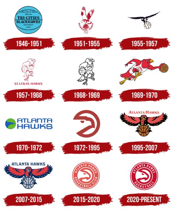
The club’s official history began with the name Tri-City Blackhawks. This term was the basis for the debut logo in the form of a basketball. On a blue background, there are three thin stripes: one in the center and two on the sides, forming an oval inscribed in a circle. It also mentions several cities: Moline/Rock Island, Illinois, and Davenport, Iowa. They are separated by the team name and arranged horizontally in two lines.
1951 – 1955
When the club was renamed Milwaukee Hawks, the logo was redesigned. Its only element became a hawk holding a ball in its talons. The bird, flapping its wings, throws it into a basketball hoop. Below is the inscription MILWAUKEE HAWKS in the form of an inverted arch. All details are outlined in red. Some areas are fully colored.
1955 – 1957
In 1955, the franchise moved again, resulting in the name St. Louis Hawks. During this period, the designers changed the arrangement of the elements and proposed a version with a black flying predator and a disproportionately large ball in its talons.
1957 – 1968
At the beginning of this period, a new emblem was approved – concise and very simple. There are no superfluous elements – only a hawk standing with a ball under its arm. It wears a sports uniform and knee pads. All elements are white with red edging.
1968 – 1969
This logo is the same as the previous one: a hawk holding a basketball. It has a sharp, hook-like beak, a serious piercing look, and the Hawks logo. The designers removed the text under the bird and replaced the red outline with black.
1969 – 1970
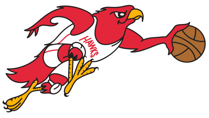
Experiments continued after the team’s relocation and transition to “Atlanta Hawks” status with an updated logo. It depicts a hawk running with the ball to the right. The position of the legs conveys movement: one stands, and the other is raised. The wing arms work similarly: the left is drawn back, and the right leads the ball. The white shirt with a red inscription and knee pads remain the same.
1970 – 1972
The emblem of this period received a radically different design. It consists of two parts: graphic and textual. The first is a round badge, inside which there is a schematic representation of a sharp-beaked hawk. It is located in a green circle with a blue outline, merging with the image of the predatory bird. On the right is the stylized name of the club, typed in round capital letters.
1972 – 1995
In 1972, a new sports complex was opened in Atlanta. At the same time, the hockey team Flames was founded. In connection with this, the “Hawks” colored their uniform in red, white, and yellow, the colors of their hockey brethren. The new logo version, proposed by the developers in 1972, has the most impressive design. It resembles PacMan – a character from a famous computer game. But in fact, on the round symbol, a hawk is drawn: its outlines are represented by a solid red line connecting the contour of the ring with the contour of the bird’s head, facing right.
1995 – 2007
In 1995, the emblem underwent significant changes: a realistic hawk is depicted in flight with spread wings. It is shown in the profile, so it looks straight ahead. The appearance is menacing and intimidating to make an impression on the opponents. In its hook-like talons, the bird holds a basketball. The beak and legs are yellow, the feathers are dark red, the tail and wingtips are black, and the ball is light brown. Above the hawk is the inscription “ATLANTA HAWKS.”
2007 – 2015
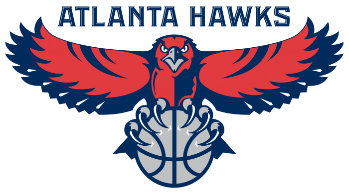
In 2007, the leaders took the next step in changing the club’s image. After the redesign, the developers left the previous logo, except for the font and color scheme. They removed yellow from the palette, replaced black with blue, and painted the ball gray.
2015 – 2020
In 2015, a new Atlanta Hawks emblem was introduced, and the organization’s official name was changed to the Atlanta Hawks Basketball Club. However, according to NBA rules, the reuse of the old copy of the emblem is prohibited. The basis for the modern version was the 1972-1995 emblem. It is made as a print with a redesigned “PacMan” in the center. Thanks to the wide lines, the hawk’s outline is now clearly visible. Behind it is a wide solid circle with the inscriptions ATLANTA HAWKS (at the top) and BASKETBALL CLUB (at the bottom). All elements are taken in a double ring.
The text is of secondary importance, so the font is simple and unobtrusive. The current logo uses a chopped grotesque because it lacks classic serifs. But on the sides of the letters, there are hook-like mini-protrusions – a reminder of the sharp beak of a predatory bird. The signature palette includes red, black, and white colors. For some time, blue and gray colors were also used.
2020 – today
The new Atlanta Hawks logo appeared on the eve of the NBA 2020-21 season. The designers kept the franchise symbol – a hawk, the head of which is depicted in a circle using negative space. This bird embodies the attacking and aggressive style of the sports team. On the outer ring, the brand name and the word “BASKETBALL” are still written. They are executed in a bold font with rectangular serifs. The red color has become much darker compared to the previous version.
Atlanta Hawks: Interesting Facts
The Atlanta Hawks are a basketball team from Atlanta, Georgia. They play in the NBA, which is a big basketball league.
- Starting Out: The Hawks didn’t always live in Atlanta. They began as the Buffalo Bisons in 1946 in Buffalo, New York. After moving around and changing names a few times, they became the Atlanta Hawks in 1968.
- Winning Big: In 1958, when they were in St. Louis, they won their only NBA Championship. They beat the Boston Celtics, which was a huge deal.
- Dominique Wilkins: He’s a famous player from the Hawks. He’s known for scoring many points and making amazing dunks. People loved watching him play. He was inducted into the Basketball Hall of Fame in 2006.
- Old Home: Before they moved to their current place, they played in The Omni Coliseum from 1972 to 1997. It had a cool roof.
- State Farm Arena: This is where they play now. It opened in 1999 and got a big update in 2018 to make it even better for fans.
- Breaking Barriers: Back in 1950, when they were called the Tri-Cities Blackhawks, they were the first NBA team to choose a black player in the draft, Chuck Cooper.
- Winning Streak: In 2015, the Hawks won 19 games in a row, the most they’ve ever won back-to-back. That year, they won 60 games, their best season in Atlanta.
- Lenny Wilkens: He coached the Hawks from 1993 to 2000 and is famous because he’s in the Basketball Hall of Fame as both a player and a coach.
- New Owners: In 2015, Tony Ressler and others, including ex-NBA player Grant Hill, bought the Hawks. They’re all about improving the team and ensuring fans have a great time.
- Helping Out: The Hawks do a lot for people in Atlanta. They fix up basketball courts, help kids play basketball, and do other things to improve people’s lives.
The Atlanta Hawks aren’t just a basketball team. They have a long history, have great players and moments, and do much for their community.
Font and Colors
Each version of the brand’s logo echoes the name “Hawks,” so they feature a hawk – from anthropomorphic to realistic. It has a menacing appearance, a sharp beak, clawed feet, and a basketball. The latest modification of the emblem is presented in the form of a classic rondel.
On the eve of the 2020-21 NBA season start, the Atlanta Hawks updated their font, which is reflected in their official logo. The basketball club’s name is now written in capital letters with large rectangular serifs. The font looks like a modified Look Serif Bold by Insigne Design. All glyphs are written in capital letters and stretched vertically.
After the redesign, the red color continued to be used but became darker. Its shade is close to #a11f28. The white color, as before, fills the gaps between elements, highlights the inscription, and creates the silhouette of the hawk’s head in the negative space.
Atlanta Hawks color codes
| Torch Red | Hex color: | #c8102e |
|---|---|---|
| RGB: | 200 16 46 | |
| CMYK: | 21 100 88 6 | |
| Pantone: | PMS 186 C |
FAQ
Why Did the “Atlanta Hawks” Change Their Logo?
In the early years, the team changed its logo due to renamings and relocations. When it became the “Atlanta Hawks” in 1968, experiments with design did not end. In 2015, the basketball club revived the iconic PacMan-style hawk head emblem because the previous version with the flying bird was too large and complex. On the other hand, today’s logos are simple and round.
Did the “Atlanta Hawks” Change Their Logo?
Yes, the “Atlanta Hawks” logo was changed in 2020. The designers preserved the overall concept and structure. They simply removed the word “CLUB,” made the font clearer for easier readability, and increased the contrast between the background and light elements, darkening the red by a few shades.
Who Designed the “Atlanta Hawks” Logo?
The bird head logo, introduced in 1972 and nicknamed the Pac-Man, was created by a young designer, Bob Wages, who had recently joined McDonald & Little. This hawk drawing was integrated into the modern emblem of the sports franchise.
Why is “MLK” Depicted on the Hawks’ Jersey?
The mysterious letters “MLK” on the Atlanta Hawks’ uniform stand for “Martin Luther King Jr.” This is a tribute to the civil rights leader born in Atlanta who became the main leader of the movement for the civil rights of African Americans. He advocated the practice of non-violent protests. At the same time, the 22 stars on the basketball shorts represent the number of times he was arrested.
