 Atlantic Southeast Airlines Logo PNG
The Atlantic Southeast Airlines logo spreads its wings as if striving to exceed limits and achieve more, reflecting persistence, hard work, and determination. The company finds new approaches and develops solutions that help it become a leader. Despite mergers and changes, the emblem still stands for travel and the people behind it.
Atlantic Southeast Airlines: Brand overview
In the late 1970s, Earl Benson, a former U.S. Air Force pilot, and his partners planned a new airline to serve the southeastern U.S. They established the company in Atlanta, Georgia, on March 12, 1979.
They started with $25 million from private investors and loans, which they used to purchase six Fairchild Metro III aircraft, hire 150 staff, and obtain the necessary licenses. Their first flight was from Atlanta to Dothan, Alabama, on June 27, 1979.
Initially, the company focused on routes within Georgia, Alabama, Mississippi, and Florida, which helped them establish a solid regional presence. By the mid-1980s, they expanded their service to Tennessee, South Carolina, and Arkansas and updated their fleet to the 30-seat Embraer EMB 120 aircraft.
1990, the airline partnered with Delta Air Lines, becoming its regional partner. This partnership allowed them to operate more routes from Atlanta and later from Washington, Detroit, and Cincinnati, among other cities. They introduced new jets like the Canadair CRJ and Embraer ERJ during this period to replace their older aircraft.
By the late 1990s, it was the first regional airline to use the new Boeing 737-600. By the early 2000s, they managed over 200 aircraft and had become a leader in U.S. regional air transport, serving Delta, United, and other companies.
In 2005, Delta Air Lines acquired full control of the airline. Economic challenges in the late 2000s led to a restructuring, and on December 31, 2011, the company merged with ExpressJet Holdings, integrating fully into the Delta Air Lines network. At its peak in 2010, it operated 263 aircraft and 950 flights.
Meaning and History
What is Atlantic Southeast Airlines?
It is a regional airline in the United States, operating as a Delta Connection carrier. Based in Atlanta, Georgia, operated regional flights to various destinations nationwide, connecting smaller cities with major Delta Air Lines hubs. The airline eventually merged with ExpressJet Airlines, continuing to operate under the ExpressJet name and maintaining its role as a prominent regional carrier in the U.S. aviation market.
1979 – 1990s
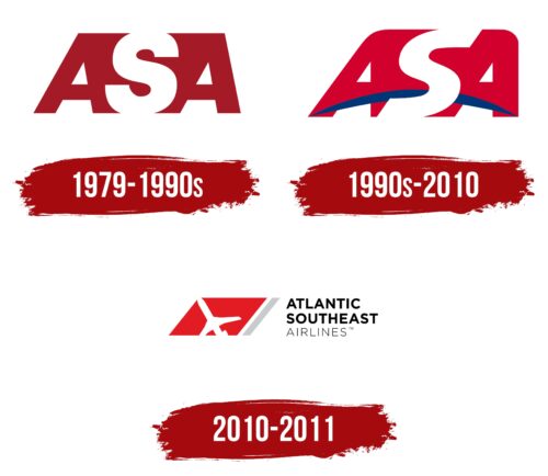
Founded in 1979, Atlantic Southeast Airlines quickly established itself as a reliable carrier, offering services that resonated well with passengers. The company gained popularity quickly due to its confident and thoughtful approach to air transportation. Its initial logo, consisting of three uppercase letters, symbolized a vigorous and assured start in the industry.
The logo was designed to be memorable and to reflect the core aspects of the brand’s identity. The two burgundies “A” s elegantly stretch out, creating a visual space that captures an “S” in the same color. This “S” appears airy and graceful, perfectly representing the image of the company’s pristine white aircraft fuselages. This design enhances brand recognition and emphasizes the elegance and quality of the services provided.
The abbreviation ASA (Atlantic Southeast Airlines) in the logo serves as a powerful symbol that, over the decades, has become associated with reliability and comfort for passengers.
1990s – 2010
With the expansion of Atlantic Southeast Airlines’ transport range, its logo underwent significant changes, reflecting a new phase in the brand’s history. These design changes symbolize the grandeur and scale of the company’s new opportunities. The “A” letters now feature a crimson hue, which adds passion and energy to the overall image, while the space between them has become more expressive and noticeable.
The letter “S” has increased and now occupies a more dominant position in the logo, confidently positioned alongside other symbols. This change emphasizes the company’s confidence in its capabilities and readiness to take on larger, more ambitious projects.
A key innovation in the logo is the blue arc at the bottom of the image, representing the globe. This element symbolizes the company’s global presence and focus, highlighting its worldwide international influence and operational capabilities. Visually, the logo appears more monumental, reflecting the company’s stability and strength.
The logo’s color palette—crimson and blue—emphasizes the carrier’s patriotic spirit. These colors symbolize pride in their country and dedication to its citizens’ well-being, an important part of Atlantic Southeast Airlines’ corporate culture.
2010 – 2011
The Atlantic Southeast Airlines logo features a white airplane taking off slightly upwardly against a red background. This red background is part of a trapezoid with wide diagonal stripes in dark gray, light gray, and red. To the right of this design is the airline’s name in black block letters, arranged in three tiers.
The upward angle of the airplane suggests progress and forward motion, reflecting the airline’s commitment to growth. The background features a tricolor trapezoid, which, in addition to red, includes dark and light shades of gray (used to color the wide diagonal stripes). The red background emphasizes urgency and passion, highlighting the airline’s dedication to timely and efficient service. The gray stripes add a touch of sophistication, suggesting the airline operates with precision and care.
The black block letters provide a strong visual foundation, suggesting reliability and solidity. The three-tiered arrangement ensures clarity and readability, making the name easily recognizable.
FAQ
What is the identifier for Atlantic Southeast Airlines?
During its operation, the airline has had several different ICAO codes. These unique identifiers distinguish each company for air traffic control and administrative purposes. Over the years, the codes have changed from ASE to CAA to ACY and finally to ASQ.
It began operations with the code ASE in 1979 when it first began flying. Later, as he grew and developed, he moved to CAA and then to ACY and ended up with ASQ. These changes occurred frequently to keep codes clear and organized as the airline industry expanded. Each code used represented the company at a different point in its history, showing its growth and changes until the merger with ExpressJet.
Is Atlantic Southeast Airlines still in business?
The company no longer operates as an independent enterprise. In November 2011, it merged with ExpressJet Airlines after the Federal Aviation Administration (FAA) allowed them to operate under the same operating certificate.
Merging these airlines smoothed their operations and made them less redundant. They formed a stronger regional airline by combining their resources, personnel, and operations. This new company continued to operate under ExpressJet, offering flights primarily to larger airlines. The ExpressJet name took over, and the merger ended the brand.
