


 Atlas Air Logo PNG
The Atlas Air logo demonstrates the company’s ability to deliver cargo anywhere. Like mighty Atlases, the planes soar through the sky to their destinations. The emblem combines lightness with strength, friendly service with power and scale. Such contrasts are achieved only by a true expert in the freight industry.
Atlas Air was founded in 1992 by Michael Chowdry, a former Flying Tiger Line executive. The company built its model around ACMI wet leasing, offering aircraft, crew, maintenance, and insurance to other carriers. This “airline for airlines” format lets clients expand cargo operations without investing heavily in fleets, crews, or technical infrastructure.
In 1993, Atlas Air selected the Boeing 747-200 as its first aircraft because of its range and cargo capacity. That same year, it signed its first ACMI contract with China Airlines. By 1995, the fleet had expanded to include Boeing 747 aircraft, and the company had contracts with major international airlines, including British Airways and Lufthansa. In 1997, Atlas Air went public on NASDAQ, raising capital for operations and fleet growth.
By 2000, Atlas Air operated more than 30 aircraft and became the world’s largest Boeing 747 cargo operator. That year, it created Polar Air Cargo for scheduled freight services. After September 11, 2001, the company continued to expand and entered military transport through a cargo contract with the US Air Force’s Air Mobility Command. In 2004, fuel prices and weaker ACMI demand led to Chapter 11 bankruptcy, but operations continued.
Atlas Air restructured and exited bankruptcy in 2006. That year, Polar Air Cargo sold a 49 percent stake to DHL Express. In 2010, Atlas received its first Boeing 747-8 freighter, and in 2011, Atlas Air Worldwide Holdings was formed. Later deals included Amazon in 2015, with 20 Boeing 767-300 aircraft for US domestic cargo service; Southern Air in 2016; NFL passenger flights in 2017; expanded Amazon work in 2018; and the final Boeing 747-8 freighter delivery in 2019.
Meaning and History
What is Atlas Air?
It is an American cargo and passenger airline headquartered in Purchase, New York. It operates a large fleet of Boeing 747, 767, and 777 aircraft, providing worldwide air cargo, passenger, and leasing services. Known for its extensive global reach, the company offers services such as ACMI (aircraft, crew, maintenance, and insurance), leasing, cargo, and passenger charters for military and commercial customers.
1992 – 2002
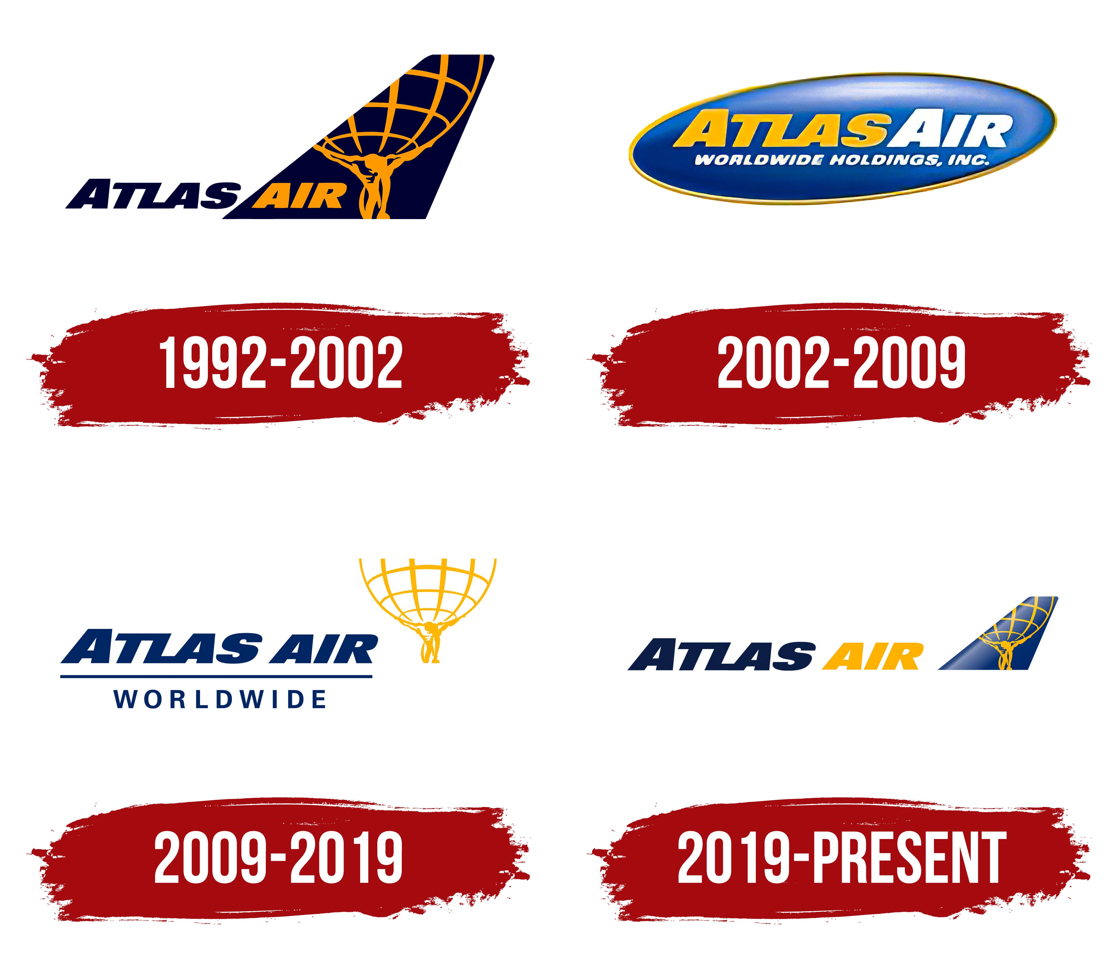
The initial emblem of Atlas Air, introduced at its founding in 1992, was designed to display the power and ambition of this cargo carrier. The main design element is the image of the mighty titan Atlas, who supports the globe on his shoulders. This symbol was deliberately chosen to represent the company: Atlas, a figure from ancient Greek mythology, is known for his strength and ability to hold up the heavens, a metaphor for the carrier’s task of transporting heavy loads worldwide.
The emblem’s dark blue background symbolizes space and evokes associations with the company’s vast, grand possibilities. This color choice highlights the scale and significance of Atlas Air’s challenges, emphasizing the global scope of the company’s operations.
Atlas Air’s brand aims to showcase its unique capability to manage long-distance transport, including flights to destinations worldwide. The emblem, featuring the titan holding the Earth, conveys this idea effectively and elegantly, highlighting the company’s status and impressive capabilities.
2002 – 2009

In celebration of its first decade, the Atlas Air brand unveiled a new corporate identity. This decision involved moving away from the image of the titan Atlas, a distinctive and recognizable element of the previous logo. Although the new logo introduces a new style and direction to the company’s visual policy, it does not fully retain the captivating, powerful character of the old symbol.
Atlas Air’s new emblem is a voluminous, light blue oval, stylistically reminiscent of a dashboard button. This design was chosen to emphasize the company’s focus on technology and innovative approaches. The oval shape symbolizes the Earth’s orbit, highlighting the company’s global presence and its ability to operate international flights.
At the center of the logo is a yellow-and-white inscription that adds an element of airiness and lightness to the emblem. The colors are purposefully chosen to evoke the ease and reliability of the company’s services, indicating that Atlas Air can transport any cargo. These color choices help create a friendlier, more accessible image for the company, which is important for attracting and retaining customers.
2009 – 2019
The carrier has returned to using its original image, which first brought brand recognition during its early development. However, the updated logo includes a few changes: the yellow silhouette of Titan Atlas holding the globe is now set against a white background. This choice makes the image less striking, as the contrast between yellow and white is not very pronounced, causing the figure to blend somewhat into the background.
The company name is in bold blue letters tilted to the right, giving the inscription a sense of dynamism and motion, symbolizing the company’s continual striving and development. The large font used for the name is well-suited for a cargo airline, emphasizing its scale and reliability. While the word “worldwide” is positioned horizontally and remains static, it represents the stability and dependability that Atlas Air offers to its clients worldwide.
The entire composition of the logo is anchored by the inscription “worldwide,” which metaphorically recalls the image of the titan holding the globe. This element highlights that the carrier maintains its position in the international market, serving over 120 countries and demonstrating its global presence and significance in the logistics industry.
2019 – today
Atlas Air’s logo reflects the design of its airplanes. It features the airline’s name, with “ATLAS” in blue and “AIR” in yellow, in a bold, right-slanted slab-serif font. The letters “T,” “L,” and “A” are connected, forming a unique shape. Next to this text is the upper part of an airplane’s tail, painted blue with a gradient. On the tail, a yellow silhouette of a man holding a stylized grid of degrees represents Atlas, the titan who supports the Earth.
The connected letters in “ATLAS” highlight unity and strength. The blue gradient on the tail symbolizes the sky and flight, reinforcing the aviation theme. The depiction of Atlas adds a mythical dimension, suggesting monumental responsibility and strength, aligning with the company’s global air transportation business.
With its rightward slant, the bold slab-serif font suggests forward movement and progress, echoing the dynamic nature of air travel. The blue and yellow color scheme enhances visibility and symbolizes reliability and energy. The gradient effect on the tail adds depth and a modern touch.
The image of Atlas holding a grid signifies the company’s global reach and commitment to carrying the world’s burdens, reflecting its extensive logistics and transportation capabilities. This mythological reference adds a timeless quality, suggesting endurance and steadfastness.