


 Atlas Copco Logo PNG
Atlas Copco’s logo is crisp, majestic, and patriotic. It positions the company as an industry leader, setting the standard for other participants. The logo demonstrates forward movement, both on land and underwater.
Atlas Copco began in 1873 in Stockholm as Atlas, founded by André Oscar Wallenberg, founder of Stockholms Enskilda Bank, today’s SEB. Its first managing director was Eduard Fränckel from Swedish State Railways. The company supplied equipment for railway construction and operation, a field in which Sweden had relied on Britain and Germany.
In the 1880s, Sweden’s recession reduced railway construction, and Atlas came close to bankruptcy. In 1890, the Wallenberg family reorganized the business as Nya AB Atlas. The company then moved into steam engines, locomotives, heating equipment, and machine tools. In 1901, after Gustaf Ryd imported pneumatic tools from Britain and the United States, Nya Atlas began regular production of them. In 1905, it launched its first portable compressor with an internal combustion engine.
In 1917, Nya Atlas merged with AB Diesels Motorer, founded in 1898 to produce engines under Rudolf Diesel’s patent. The new company became Atlas Diesel. In the 1920s, production moved to Sickla near Stockholm. In 1948, diesel engines were dropped, and the company focused on pneumatics, compressors, and drilling equipment. In 1955, it became Atlas Copco AB, and in 1956, it acquired Belgium’s Arpic Engineering in Antwerp.
From the 1970s to the 1990s, Atlas Copco expanded through acquisitions, including Mauguière in 1976, Chicago Pneumatic Tool Company in 1987, and Desoutter Brothers in 1990. In 2017, the board approved a split into Atlas Copco and Epiroc. On June 18, 2018, Epiroc listed on Nasdaq Stockholm, taking the mining and drilling business, while Atlas Copco focused on compressors, vacuum technology, and industrial equipment.
Meaning and History
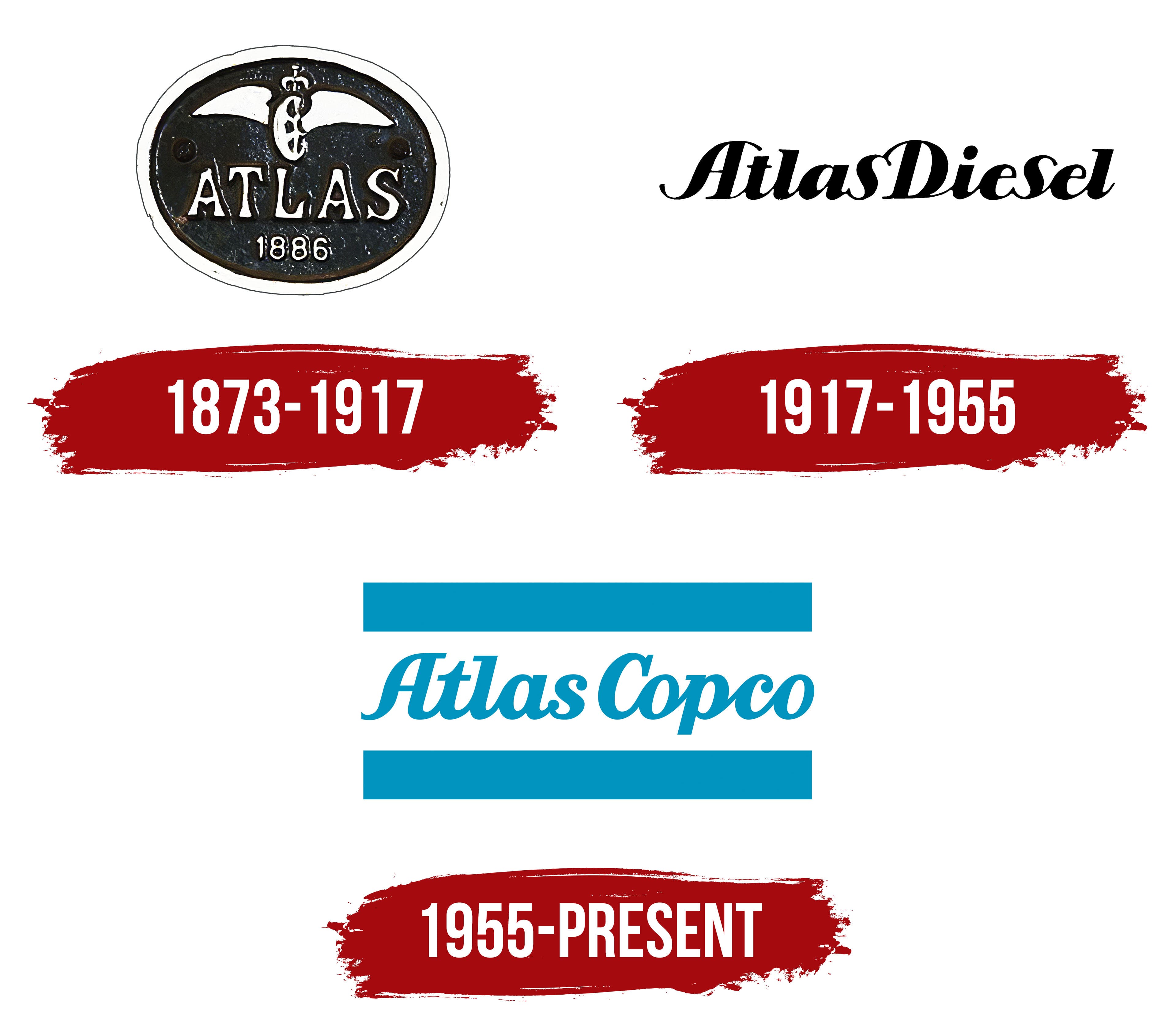
In its 150 years of existence, the company’s logo has changed only three times. The rare rebrandings represented the brand’s concept in completely different ways. The first identity was closely related to Greek mythology. The second concerned the products, and the third was as patriotic as possible, highlighting the brand’s achievements. The reason for such different approaches is related to the company’s evolution, progress, changing societal views, and changing leadership at Atlas.
What is Atlas Copco?
A Swedish international conglomerate owned by a group of investors, implementing about 40 brands of construction machinery, mining equipment, and various tools. Approximately 43,000 employees work at enterprises located in 12 countries, including Asia, Europe, and the Americas. The company’s turnover is 15 billion dollars.
1873 – 1917
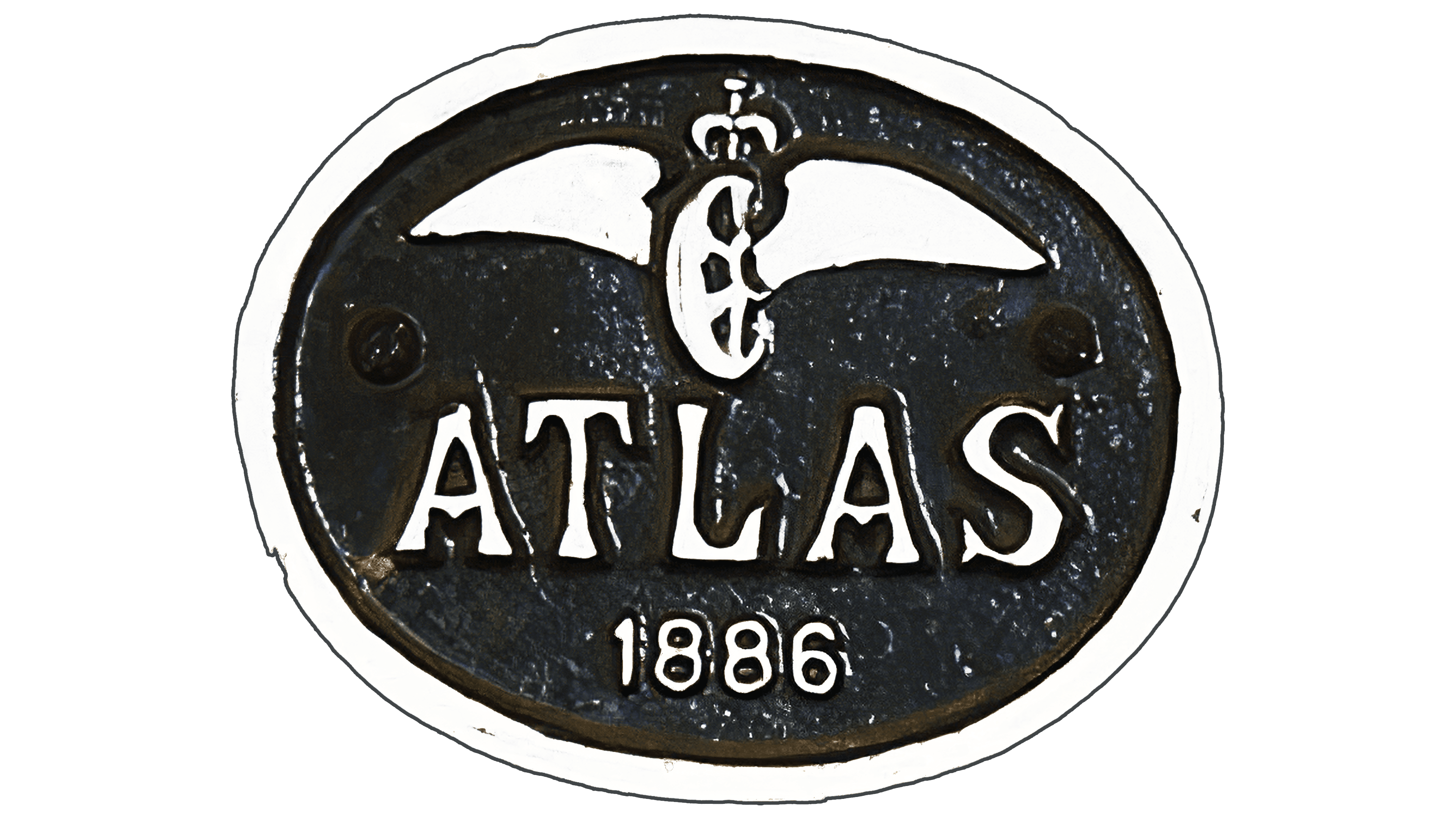
The first logo consisted of a black oval with a white border, inside which was an image of a winged wheel with a crown, the inscription “Atlas,” and the year the company was founded.
Originally, the company supplied materials for railways, as evidenced by the winged emblem used by many European railway companies. The symbol originated from the image of a chariot and was associated with Hermes, the messenger of the gods. The mythical messenger moved quickly between worlds and was considered the patron of roads and travelers.
In the emblem, the composition symbolizes progress, development, and moving forward. The company’s equipment enabled penetration of the earth’s depths with minimal effort. A single person could operate the drilling rig. Therefore, business with Atlas was significantly accelerated.
The crown is a symbol of the Swedish monarchy. The enterprise contributes to the country’s development and prosperity. The company was founded under the patronage of the state.
The name Atlas is also borrowed from Greek mythology. It represents Atlas, who held the sky on his shoulders. It indicates the mining direction and the industry’s global importance for the Earth’s development and future. The company has a significant impact on the economy and leads its industry.
1917 – 1955

1955 – today
In 1955, the company participated in the large-scale construction of a state hydroelectric power station. The firm supplied various pieces of equipment for the project. Therefore, the emblem of that time is filled with patriotic sentiment.
The logo is designed as a flag with two blue stripes on the edges and a white stripe in the middle. The company name is centered. The symbol looks like a part of the blue fabric of the Swedish flag. However, instead of a yellow stripe, there is a white one. The color scheme symbolizes water and the tunnels for which the company’s equipment was used in construction.
Unlike the first logo, the full name, Atlas Copco, is placed on the flag. The Atlas part is associated with gods and symbolizes control over the elements and intervention in Earth’s interior. The second part, Copco, originates from Compagnie Pneumatique Commerciale.
Font and Colors
The primary colors are blue and white, representing the combination of air and water. White symbolizes innovation, inventions, and developments. It also reflects concern for environmental cleanliness. The company participates in an environmentally friendly project to generate electricity from natural sources without polluting the planet. One of Atlas’s development directions is to reduce harmful emissions from its production.
Blue is the color of technology, engineering projects, and mathematical calculations. It indicates equipment and tools.
The uppercase font is similar to CaponiDisplay BlackItalic, but with a full-letter connection. The serifs are reminiscent of the past, conveying the company’s venerable age.