


![]()
The new loyalty program, Atmos Rewards, from Alaska Airlines emerged after its merger with Hawaiian Airlines and became part of the renewed identity created by the agency Interbrand. It replaced the former Alaska Mileage Plan and HawaiianMiles, combining them into a single system with access to more than a thousand destinations and partner airlines of the oneworld alliance.
Research has shown that customers often find traditional bonus schemes complicated and dull. The new program aims to change that impression. The name Atmos combines the words “atmosphere” and “most,” and the addition of “Rewards” conveys the idea of expanded benefits for travelers.
![]()
The program’s main symbol is a stylized airplane window. It merges the colors of the two airlines, with the upper part in Alaska Airlines’ blue tones and the lower part in Hawaiian Airlines’ tones. Although this shape has been used in aviation before, it looks fresh and conveys the idea of brand unification. Interbrand refers to the shape as a “window of dreams” and mentions the image of the equator line.
The sans-serif logo font resembles the popular SF Compact font known from Apple products. It is light and spacious, with increased letter spacing that creates a sense of air. The overall look of the logo evokes associations with premium airlines offering a high level of service. However, without context, the airplane window symbol appears less convincing and slightly unstable.
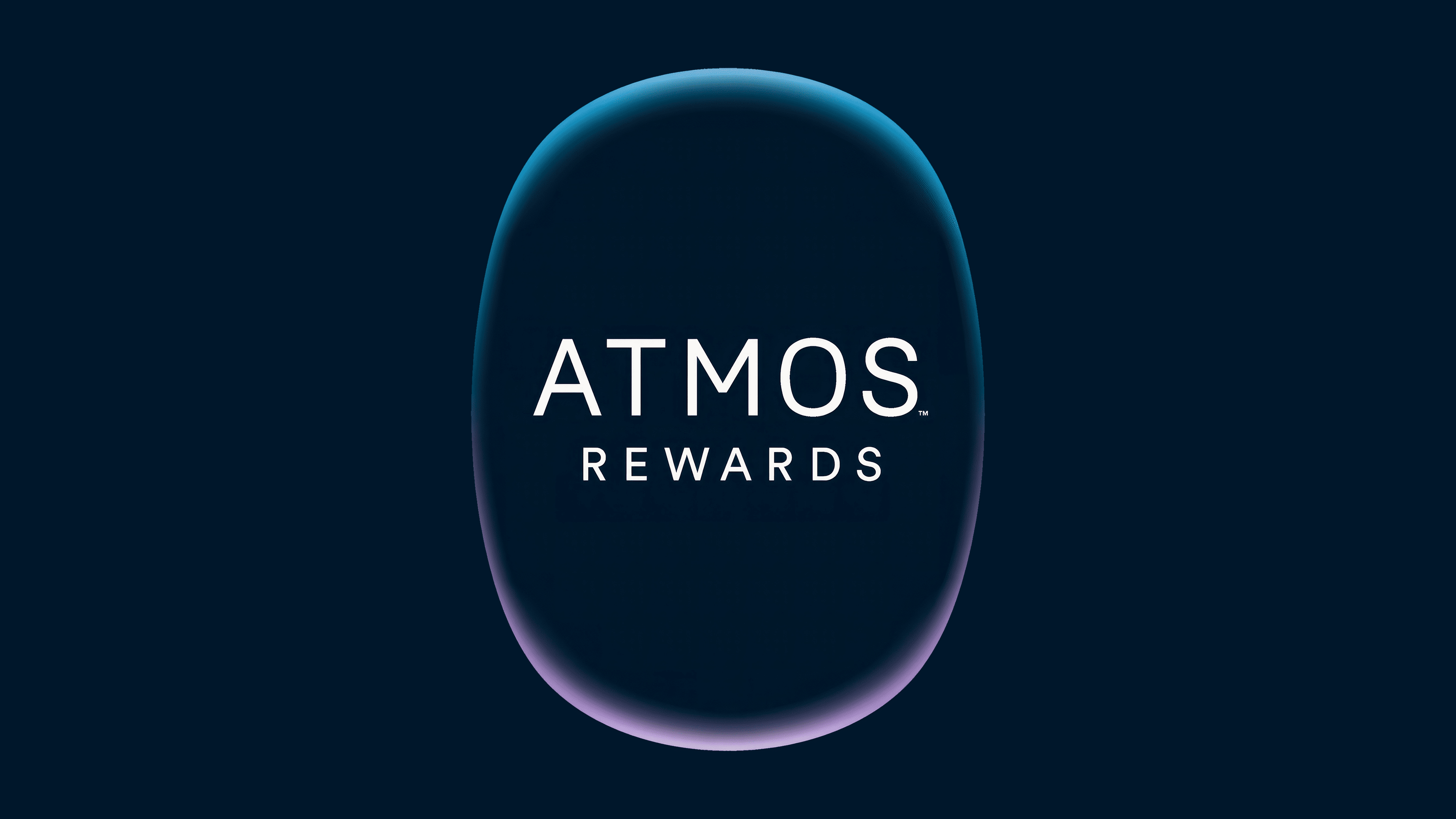
The main colors of Atmos Rewards are dark blue, light blue, and white. The tonal system fits the brand but could look livelier with a more dynamic combination of Alaska and Hawaiian shades.
An interesting detail is the typography. In addition to the main sans-serif typeface, some materials use a serif font. It looks elegant but too formal for the program’s light, friendly image. The contrast between the two styles creates a slight imbalance.
![]()
Despite a few debatable points, the new Atmos Rewards identity creates a cohesive impression. It reflects the merger of the two airlines and shows a modern approach to loyalty programs that are more open, clearer, and focused on the passenger.