The Australian Airlines logo is swift and dynamic, like a plane instantly vanishing into the sky. The symbol promises fast flights. Journeys with this carrier leave only pleasant memories, which the emblem reflects as a trail of joy and warmth.
Australian Airlines: Brand overview
Trans Australia Airlines (TAA) was rebranded and restructured to become Australian Airlines in 1986. Along with Ansett Australia, TAA was one of Australia’s two primary domestic airlines, having begun operations in 1946. To boost the company’s competitiveness and be ready for privatization, the Australian government decided to rename it. In the process, the business identity was completely redesigned, and the name was changed. To strengthen national identity, the airline painted its aircraft a new livery with a vivid, contemporary design in red, white, and blue, which correspond to the Australian flag.
The airline began offering domestic flights between Australia’s main cities in 1987 to expand its route network. Routes serving tourism areas in Queensland and the Northern Territory received extra consideration. The airline debuted a new Boeing 737-300 that year, which increased service quality and efficiency on busy routes.
The company purchased its first Airbus A300 aircraft in 1989 for its ongoing fleet renovation. As a result, the business was able to start operating international flights to Southeast Asia and join the medium-haul market. In addition, the “Australian Airlines Club” reward program was introduced for regular travelers, which was a big step toward drawing and keeping passengers in the face of growing competition.
Due to an Australian economic downturn and increased competition from Ansett Australia, the airline encountered financial difficulties in 1991. To increase the airline’s productivity, the government started looking into privatization.
Following protracted talks, the government combined the airline with the government-owned international airline Qantas in 1992. The formal completion date of the merger was September 14, 1992. During the transition phase, certain domestic flights were operated under the company’s brand, but the combined firm kept the Qantas name.
Operations were progressively incorporated into the Qantas organization between 1993 and 1994. The company’s fleet, personnel, and route network were absorbed into the larger Qantas Group. The Qantas brand replaced the company’s brand on domestic flights, and the combined firm substantially modified its corporate culture and marketing approach.
The airline was completely integrated into Qantas by 1995 when the brand was eliminated from the country’s domestic aviation sector.
Qantas decided to resurrect its brand in 2001 but in a different role. As a Qantas subsidiary, the new brand was founded with an emphasis on low-cost international travel.
The resurrected airline launched its maiden service from Cairns to Nagoya, Japan, on October 27, 2002. With a primary focus on the Japanese market, the firm positioned itself as a low-cost carrier for international tourism sites. All Boeing 767-300ER aircraft in the new fleet were configured in economy class. The airline was able to compete with other carriers in the Asian market by offering more affordable onboard services.
In addition to extending flights to additional Asian locations like Singapore, Hong Kong, and Taipei, the airline started running charter flights for tour operators between 2003 and 2005.
Despite its early success, the airline had to contend with growing competition from low-cost carriers in Asia in 2006. Following a comprehensive evaluation of its business, Qantas shut down the brand. The company stopped operations on June 30, 2006, and its routes and assets were reintegrated into Qantas’ primary business. This choice fits into Qantas’ larger plan to streamline its global operations.
Meaning and History
What is Australian Airlines?
It is Australia’s domestic airline operating as a full-service carrier. It mainly served major domestic routes in Australia. The airline was a rebranding of state-owned Trans Australia Airlines (TAA) and was designed to compete with other major carriers in the Australian market. The company was eventually integrated into Qantas, Australia’s flagship airline, to streamline operations and consolidate services under the Qantas brand. Qantas briefly revived the Australian Airlines name as a budget carrier for international leisure travel before fully absorbing into Qantas operations.
1946 – 1960
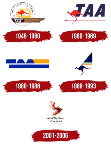
Australian Airlines, operational from 1946 to 1960, skillfully incorporated its national symbols to establish a unique identity. The kangaroo, a widely recognized symbol of Australia, was chosen as the central element of the airline’s first logo. This selection was intentional, as the kangaroo evokes immediate connections with Australia and symbolizes speed and strength, attributes the airline sought to convey through its services.
The logo featured a circular design, symbolizing the globe to underscore the company’s worldwide aspirations. Centered within this circle against a yellow backdrop are the white outlines of the Australian continent, serving as a geographic marker and reinforcing the brand’s national ties. The choice of a yellow background aims to draw attention and evoke warmth and joy, qualities associated with the sunny continent.
Two red arrows intersecting the continent illustrate time and directional movements. These arrows represent the airline’s flight routes that connect various parts of Australia, emphasizing its role as a national carrier. The red color of the arrows captures attention and denotes dynamism and vigor.
The logo’s perimeter includes black and yellow stripes that echo the symbol of air forces, adding a military and patriotic flair. A kangaroo depicted along these stripes symbolizes speed and power, reflecting the dynamic nature of air transport. Known for its quick and enduring leaps, the kangaroo metaphorically represents the airline’s swift and efficient flight services.
The logo concludes with the abbreviation TAA, standing for Trans Australia Airlines, highlighting the company’s scope and business focus. This abbreviation is informative and concise, making it memorable and recognizable.
1960 – 1969
In the early 1960s, Australian Airlines significantly simplified its logo to focus on key elements: an arrow, a kangaroo, and the large acronym TAA. These changes reflected the company’s move toward a more modern and minimalist visual style, emphasizing its dynamism and adaptability to contemporary demands.
The arrow in the new logo symbolizes direction and speed, essential characteristics for an airline. It highlights the carrier’s ability to quickly and accurately transport passengers to their destinations. The kangaroo, retained in the logo, continued to serve as a national symbol of Australia and emphasized qualities associated with the animal—speed, strength, and adaptability. Using the kangaroo as a logo element served as a reminder of the company’s roots and deep connection to the Australian context.
The acronym TAA, standing for Trans Australia Airlines, was featured in large font to enhance brand recognition. This simplified the logo’s visual perception, making it more readable and memorable for the general public.
This logo configuration effectively communicated the airline’s fundamental principles of operation: speed, reliability, and a confident knowledge of the local territory. Like local wildlife, the company felt at home on its turf and navigated the terrain expertly, which allowed it to create the fastest and most convenient routes for its customers.
1980 – 1986
The airline’s 1980s logo stands out for its unique schematic and abstract design, which conveys a coded message. This design incorporates two blue stripes central to the logo’s visual structure.
The upper blue stripe partially reveals the tops of the “TAA” letters, styled to resemble mountain silhouettes rather than conventional letters. This design choice makes the inscription almost unreadable to those unfamiliar with the airline’s name, adding an element of mystery and intrigue to the overall image. Such a design underscores the company’s unique and innovative approach to its visual style.
The stripes in the logo evoke roads or runways, symbolically reflecting the airline’s focus. The logo’s use of blue and yellow evokes the sea and sand, reminiscent of maritime voyages and adventures. These colors symbolize a new era in the company’s history, marked by the initiation of flights to New Zealand and the expansion of ocean routes.
Especially noteworthy is how the logo’s elements together create a stylized image of a crocodile’s head. This references Australian fauna and represents the airline’s strength, endurance, and dynamism. The crocodile, symbolizing resilience and survival under tough conditions, aptly reflects the airline’s ambition and character, determined to overcome any challenges to achieve its goals.
1986 – 1993
After merging with the renowned airline Qantas, the carrier adopted a new name—Australian Airlines—and updated its visual identity, marking the beginning of a new era in its history. The new livery reintroduced the image of the kangaroo, long associated with Australia and one of the country’s most recognizable symbols. This decision emphasized the airline’s national ties and cultural roots.
The symbolism included an element reminiscent of a sail or wing, representing new opportunities and the company’s commitment to innovation and growth. This element might hint at the Sydney Opera House—a key architectural symbol of Australia known for its unique ‘sails’ on the roof. This visual similarity is deliberate: it connects the airline with one of the country’s most iconic images, enhancing associations with Australia’s national heritage and cultural uniqueness.
The airline’s livery is adorned with yellow, green, and blue stripes, each symbolizing picturesque aspects of Australian nature:
- Blue represents the expanses of sky and sea.
- Yellow signifies sandy beaches.
- Green denotes the continent’s lush vegetation.
These colors add brightness and appeal to the aircraft’s appearance and evoke the beauty and diversity of the Australian landscape.
Combining the kangaroo image and the architectural symbol of the Sydney Opera House creates a powerful visual identity that resonates with the company’s operations, geographical position, and cultural identity.
2001 – 2006
The airline’s contemporary logo showcases a dynamic depiction of a kangaroo in swift motion, symbolic of both the company and Australia. This imagery is deliberately chosen: the kangaroo symbolizes activity, strength, and the distinctiveness of the continent, capturing the essence of Australia.
Surrounding the kangaroo are numerous red dots that evoke speed and movement, akin to dust stirred up by running. Each dot represents a city served by the airline, highlighting the vast network of destinations and reinforcing the carrier’s widespread presence across the country.
Below the image is a black, expansive signature that lends sophistication to the logo. This feature accentuates the brand’s distinctive identity and ambition to distinguish itself from competitors. The signature’s font is selected to underline the carrier’s individuality, recognition, and prestige.
The logo portrays the airline as deeply connected with every region it serves, integrating into the territory and becoming an essential part of Australia’s national identity, symbolizing national pride and achievement.
FAQ
What is the logo of Australian Airlines?
The airline’s logo is simple but striking: a kangaroo with an arrow pointing to the right. This design symbolizes the company’s focus on the future. The kangaroo is black with a thick, dark orange outline. It is surrounded by solid orange dots, which make the logo look vibrant and eye-catching. The choice of orange adds energy and a sense of adventure, which aligns with the airline’s goal of taking people to new places.
Which airline is AO?
The AO code was used by a company that was part of Qantas, Australia’s largest airline. It primarily catered to travelers seeking holiday destinations and began operations in 2002, following the completion of the first phase in 1992. It operated until 2006, when Qantas merged it with its core operations.
Although the airline no longer operates independently, the AO code is still used to identify flights that were once associated with the brand.
