


 AutoZone Logo PNG
The AutoZone logo looks like it’s racing down the fast lane. The emblem features roadway markings and traffic lights. The company helps move cars. With its products, broken cars can keep moving.
Joseph Reeves Hyde III, known as Pitt, came from Malone & Hyde, a Memphis grocery wholesaler his grandfather founded in 1907. After studying economics at the University of North Carolina, he joined the family company and later led it. In 1978, he joined Wal-Mart’s board, where he studied the power of focused retail chains and centralized distribution.
Hyde saw an opening in auto parts for do-it-yourself customers. He considered buying Checker Auto Parts in Phoenix, then chose to build a new chain from scratch, using Pep Boys as a reference point. On July 4, 1979, Doug Crane opened the first Auto Shack in Forrest City, Arkansas. Opening-day sales were $300, with 25 employees.
By the end of 1979, the chain had 8 stores in Arkansas and Tennessee. In 1981, it reached 45 stores and launched Express Parts for special-order items. By 1984, Auto Shack had 194 stores in 13 states and introduced an industry-first quality-control program for auto parts. That year, Hyde and Kohlberg Kravis Roberts & Co. bought Malone & Hyde for about $500 million.
After a trademark dispute with RadioShack, Auto Shack changed its name to AutoZone in 1987. By year-end, it had 459 stores in 16 states. In 1988, AutoZone launched Duralast, later a major private-label line. The company went public on the NYSE in 1991, bought ALLDATA in 1996, expanded through Auto Palace, TruckPro, Chief Auto Parts, and Express stores, entered Mexico in 1998, reached the Fortune 500 in 1999, and opened its 6,000th store in Memphis in 2017.
Meaning and History
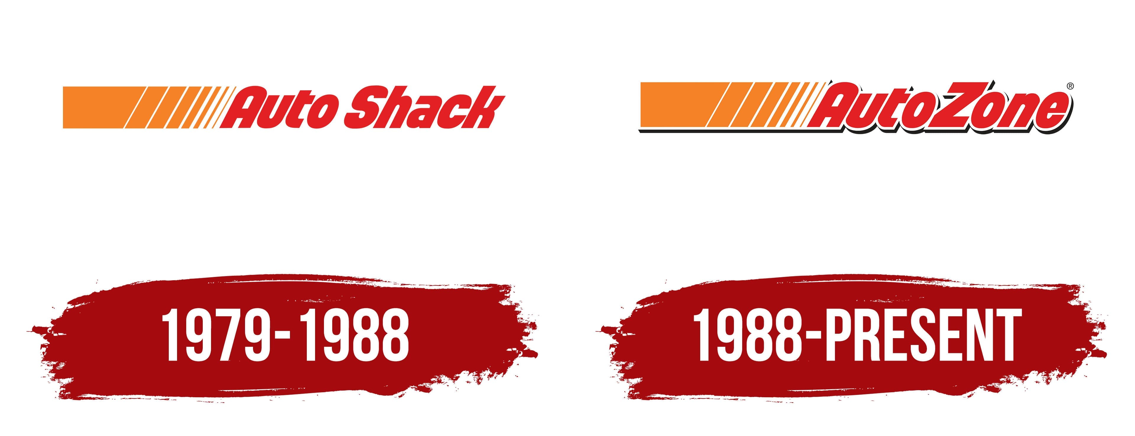
As a division of his family’s grocery business, the company was founded in 1979 by Joseph Reeves Hyde III. The firm opened its first store in Arkansas. Just three years later, the company had 74 stores and a 9,000-square-foot warehouse in operation. In ’85, Hyde sold his stock to the investment fund Kohlberg Kravis Roberts to attract additional investment, and in 1991, the stock was traded on the stock exchange. This led to the company’s separation from its parent business and to further expansion and modernization. In 2020, 6,500 units were in operation.
The firm updated its visual mark only once, and only because the first one infringed on Radio Shack’s earlier copyright, established in 1921. So, in saying goodbye to its parent company, Malone & Hyde changed its name and logo to AutoZone.
1979 – 1988
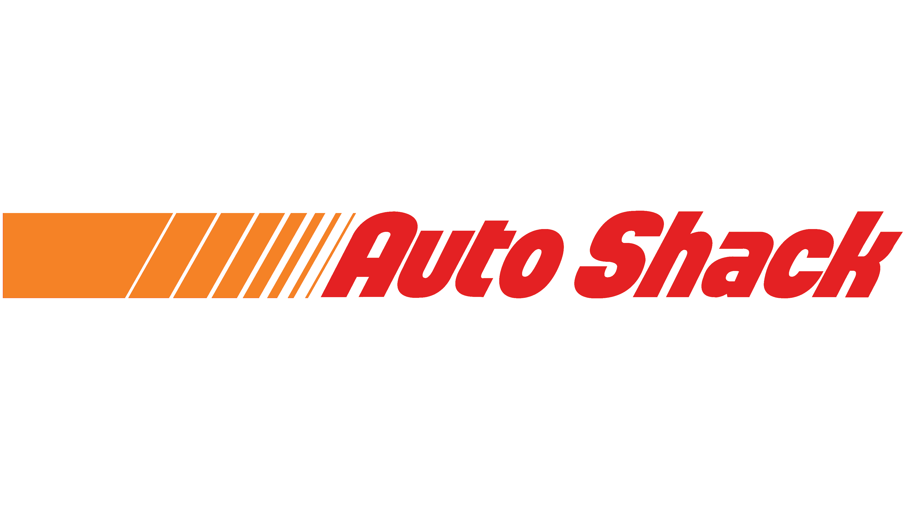
The logo was a red Auto Shack in italics. It extended the orange ribbon, divided into diagonal stripes by white lines of varying thickness.
This placement created a sense of movement. The company was moving forward, leaving behind more and more outlets and satisfied customers. The closer the lettering, the more partial the white stripes were, which visualized acceleration. The slant of the letters and the bright red color also symbolize energy and a fast ride. Active growth and promotion of AutoZone in the market. The white background and the absence of obstacles. Constant updates to the assortment and a drive for innovation. The company was the first to deliver spare parts at a driver’s call, organize tool rentals, and actively introduce new electronic and Internet technologies into its operations.
The white and orange stripes evoke the road and guardrail signs installed during repairs. The company’s name leaves these signs behind, showing that it helps cars keep going.
1988 – today
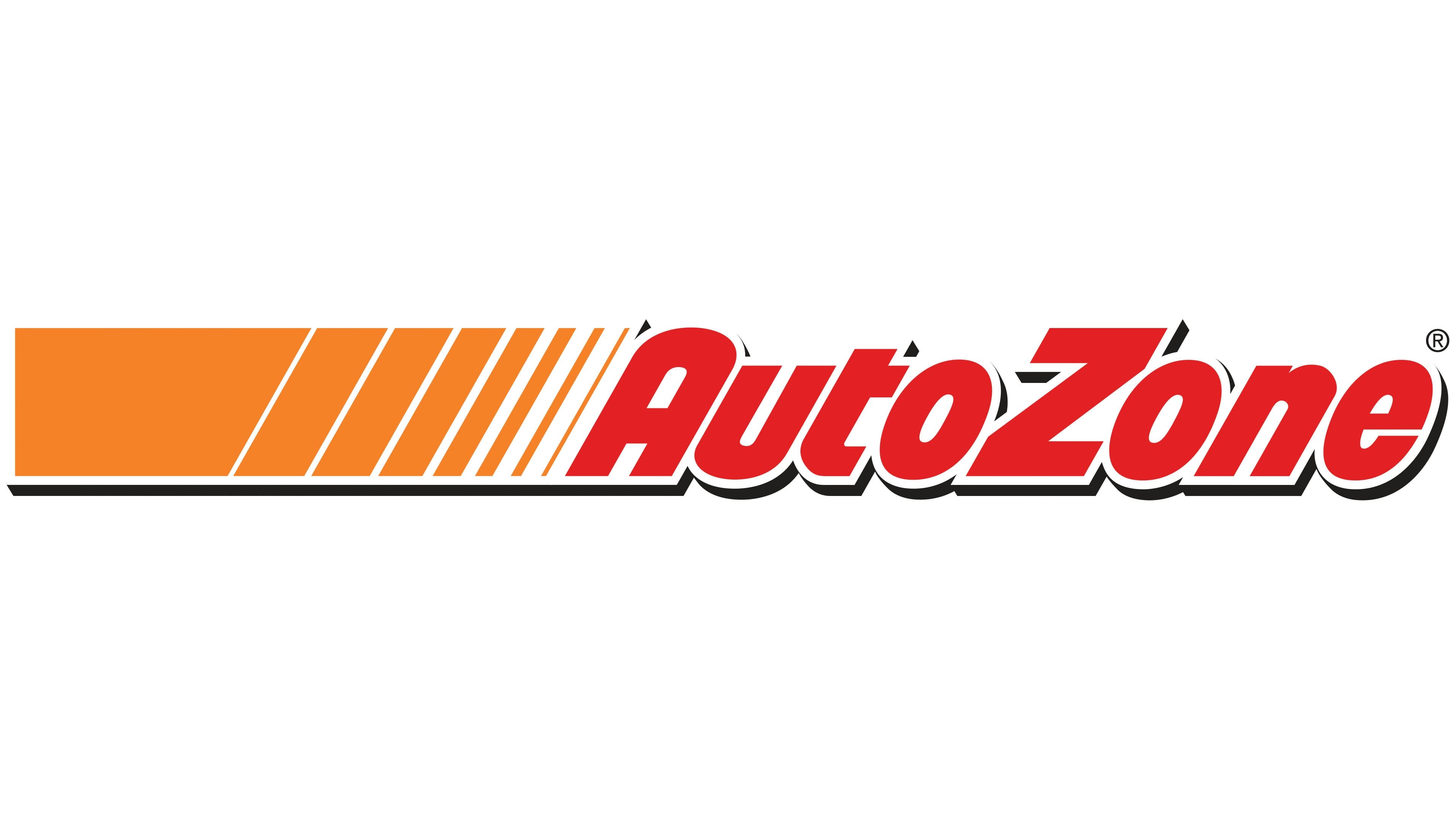
In 1986, Auto Shack severed ties with its parent company and followed that up with a complete rebranding in 1987. Along with the name change, the logo underwent minor changes. They added a shadow to the letters and orange-and-white stripes. This gave the impression that the logo was rising above the ground and casting a shadow.
This decision underscored AutoZone’s importance in the automotive world. The historical museum’s Automobile Hall of Fame entered information about Pitt Hyde and his company. Of all auto parts retailers, he is the only one honored this way. The company sponsors NASCAR and owns a baseball team. In the United States, Mexico, and Brazil, the company has 6.5 thousand service points for motorists. Therefore, the company’s contribution to the auto world is significant.
The white trim on the letters communicates the company’s positive reputation and commitment to new heights.
Font and Colors
The AutoZone logo uses three main colors: red, white, and orange.
- Red means energy, love for your business, speed, and quick problem-solving.
- Orange – care for customers, good service, the joy of troubleshooting.
- White – innovation, impeccable reputation.
The old and new logos have the same font, which resembles Sugo Pro Display Bold Italic.