


 Avatar Logo PNG
The Avatar logo is soaring and fantastic. It hints at a unique world on a celestial planet where lightness and beauty reign. The emblem’s symbols encode a dream of similarly caring attitudes toward Earth by its inhabitants.
Avatar began with ideas James Cameron had in 1976 and 1977, after his mother told him about a dream involving a very tall blue-skinned woman. The image stayed with him, and he later drew early concepts for a race of tall blue beings with golden eyes. In 1994, after Terminator 2 and True Lies, Cameron wrote an 80-page treatment for a large science-fiction film.
The project was planned for production after Titanic, around 1999. Still, Cameron delayed it because the visual-effects and motion-capture technology he wanted did not yet exist. In the early 2000s, he worked with cinematographer Vince Pace on the Fusion Camera System for stereoscopic 3D filming. In 2005, 20th Century Fox funded a $10 million concept test, but the studio hesitated over the scale and budget. Cameron then approached Walt Disney Studios, and Fox finally approved production in October 2006.
Filming began in April 2007 in Los Angeles and Wellington. Practical sets were built at Stone Street Studios in New Zealand, while Na’vi scenes were shot on a large motion-capture stage with 180 cameras. Cameron also used a virtual camera to view computer-generated environments during filming. Weta Digital handled much of the post-production, with more than 900 specialists at peak periods. The official production budget was $237 million, plus about $150 million for marketing.
Avatar premiered in London on December 10, 2009, and opened in the United States on December 18. It earned about $2.923 billion worldwide and won three Oscars. Fox announced plans for a sequel before the U.S. release, and Cameron later secured approval for four follow-ups. Disney opened Pandora: The World of Avatar in 2017. Avatar: The Way of Water arrived in 2022 and earned over $2.3 billion, while Avatar: Fire and Ash followed in 2025.
Meaning and History
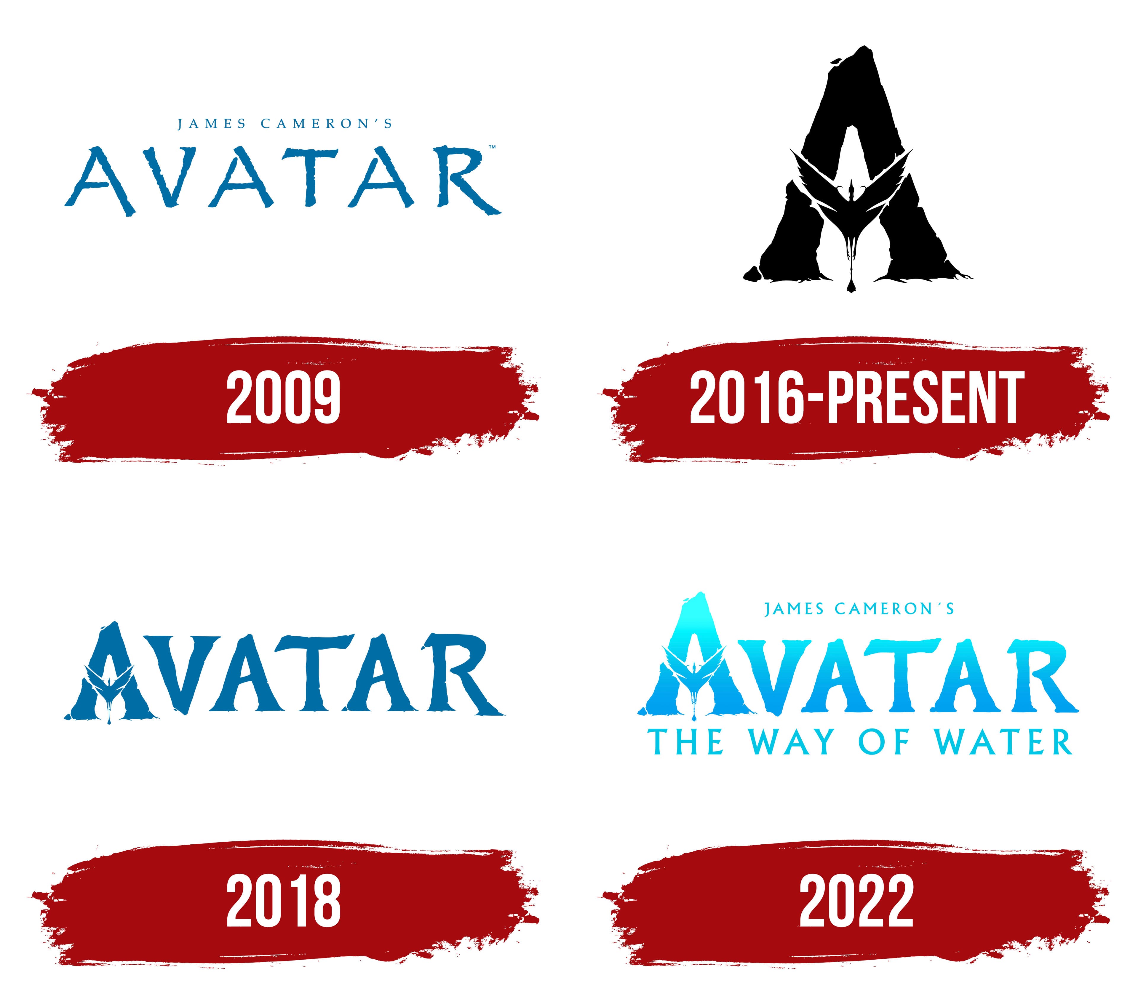
Despite the general title, each logo is tied to its history. What unites them is a franchise based on the Avatar series, signed by James Cameron with 20th Century Fox, with plans to produce three films. The first part came out in 2009. The second and third were planned for 2014 and 2015 but were delayed. Then, a third sequel was announced. In 2016, it was announced that there would be four sequels, all to be filmed simultaneously. The logos presented represent the first two stories: original and draft versions.
What is Avatar?
A fantastic five-part franchise, screened by 20th Century Fox. The idea was born in 1995, but it waited until the film industry had developed enough to provide the necessary special effects. The franchise tells the story of life and events on the distant planet Pandora. Critics and audiences rate the first two parts highly. The first part grossed $2.8 billion at the box office and won 3 of 9 Oscars.
2009
The first emblem is the movie title in blue capital letters with the director’s name in thin lettering.
The name Avatar comes from Hindu mythology. In Hindu mythology, an avatar is the physical incarnation of a deity. This created the possibility that a person’s consciousness could move into another body. The astounding connection the inhabitants feel to the planet and other creatures makes them a kind of “gods.” They are people who have achieved far greater development than earthlings have.
The palette of the emblem’s letters conveys the unusual shade of the Na’vi body. Sacred Hindu texts inspire the blue skin color of the planet’s inhabitants. Representatives of the Indian pantheon are blue, hinting at the color of their aura. Another reason is the screenwriter’s mother’s dream, in which she saw a huge blue woman. Cameron decided that the connection of aliens, size, and blue color blends very well. At the same time, it vaguely hints at Hinduism.
Such a connection between the name and appearance stems from the director and screenwriter’s interest in India’s culture and religion.
The letters’ slight roughness makes the inscription more natural and organic, reflecting Pandora’s extraordinary flora and fauna. Hence, the glyphs are asymmetric in the first and last symbols. The sticks’ elongation resembles the contact tails of the planet’s inhabitants, through which they sense all beings. Their appearance in the first and last letters speaks of the Na’vi’s openness and readiness to get acquainted with the viewer.
2016 – today
Shooting for the long-awaited second part was planned to start in 2016. The appearance of a new logo is most likely tied to this event. The trial sign consisted of a black capital letter with a black dragon bird rising in the center.
Both images contain elements that suggest an unusual world. Roots are depicted at the bottom of the glyph A as a symbol of trees. Winged birds, which the planet’s inhabitants fly on, have tails for connection. The animal in the drawing serves as the crossbar A.
The bird is reminiscent of a stork, and the trees’ roots hint at procreation and family. The main characters of the second part are raising children, and the events of the picture concern the family.
The emblem’s black color indicates it is a draft version.
2018

In 2018, the image acquired a shade inherent in the skin of Pandora’s inhabitants, and the capital A is supplemented with the rest of the inscription. The elements of the name resemble the font used in the emblem of the first part, but are bolder. Each symbol gets serifs. The method fosters deeper immersion in the planet’s life and acquaintance with its inhabitants.
2022
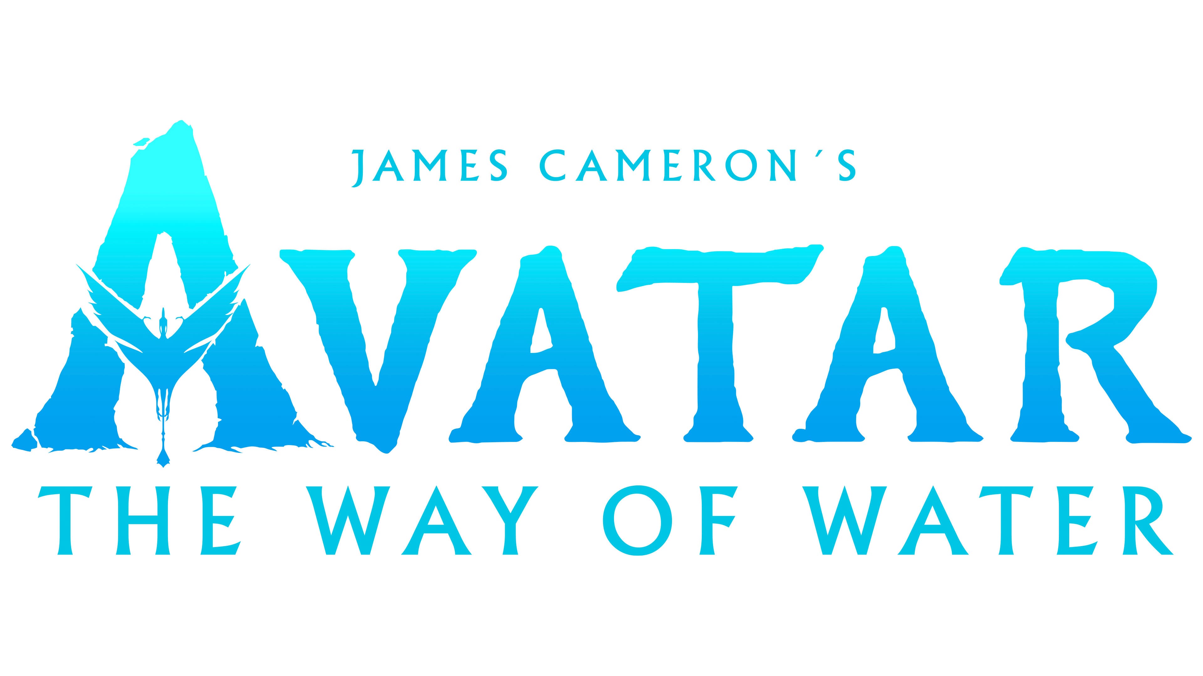
The final version of the logo appears. The inscription’s color scheme shifts, evoking the element of water. A significant part of the movie takes place underwater with the water tribe. To save his family, the protagonist seeks refuge and blends into the life of the coastal Na’vi.
The logo uses the full title, which was finally selected from many drafts. Therefore, following the word Avatar is a more delicate font inscription: The Way of Water.
The bird reflects the theme of family and migration. The heroes have left their native lands in search of a new home.
At the top, as in the first emblem, is the name of the movie’s director and screenwriter.
Font and Colors
The blue-cyan gradient of the inscription embodies:
- The water element.
- The film has many scenes of flights and battles with dragons.
- The change in shades from dark at the bottom to light at the top reflects the spiritual growth of the Na’vi and the main characters’ children: self-knowledge and a closer connection to Mother Nature.
- The thickness of the water from the dark depths to the light surface.
The title’s font is unique. Each symbol resonates with the theme of nature, and the smoother upper glyphs suggest the water’s smooth surface.