


 Avid Logo PNG
The Avid logo speaks a universal language understandable to professionals and film enthusiasts. The emblem encodes the process of creating magic on screen. The logo encourages pressing a button and controlling the emergence of a new masterpiece.
Avid began in August 1987, when former Apollo Computer marketing manager Bill Warner founded Avid Technology in Massachusetts. He developed a system that copied video to digital hard drives in real time, allowing editors to review footage and test cuts faster than with film editing tables. After Apple showed interest in 1988, the system moved to the Macintosh II. The Avid/1 Media Composer prototype was shown at NAB in April 1988, and commercial sales began in 1989.
Media Composer changed professional editing and gradually displaced analog systems such as Moviola, Steenbeck, and KEM. In 1992, Let’s Kill All the Lawyers became the first feature film fully edited on Avid. In 1994, the company bought BASYS Automation Systems’ news division and SofTECH Systems, then introduced Open Media Framework for media exchange.
In 1995, Avid acquired Digidesign for about $200 million, gaining Pro Tools and building a major audio business. The same year, it bought Parallax Software and Elastic Reality. In 1998, Avid acquired Softimage from Microsoft and later sold it to Autodesk in 2009. In 1999, the company won an Academy Award for Avid Film Composer, but also faced losses, layoffs, and management changes. David Krall became CEO in 2000.
In 2005, Avid bought Pinnacle Systems for about $462 million, expanding into consumer and semi-professional editing. The 2008 crisis led to major layoffs and restructuring. By the 2010s, Avid shifted toward software, subscriptions, and cloud collaboration. On August 9, 2023, STG agreed to buy Avid for about $1.4 billion. The deal closed on November 7, 2023, taking Avid private. Its main competitors included Apple Final Cut Pro and Adobe Premiere Pro.
Meaning and History
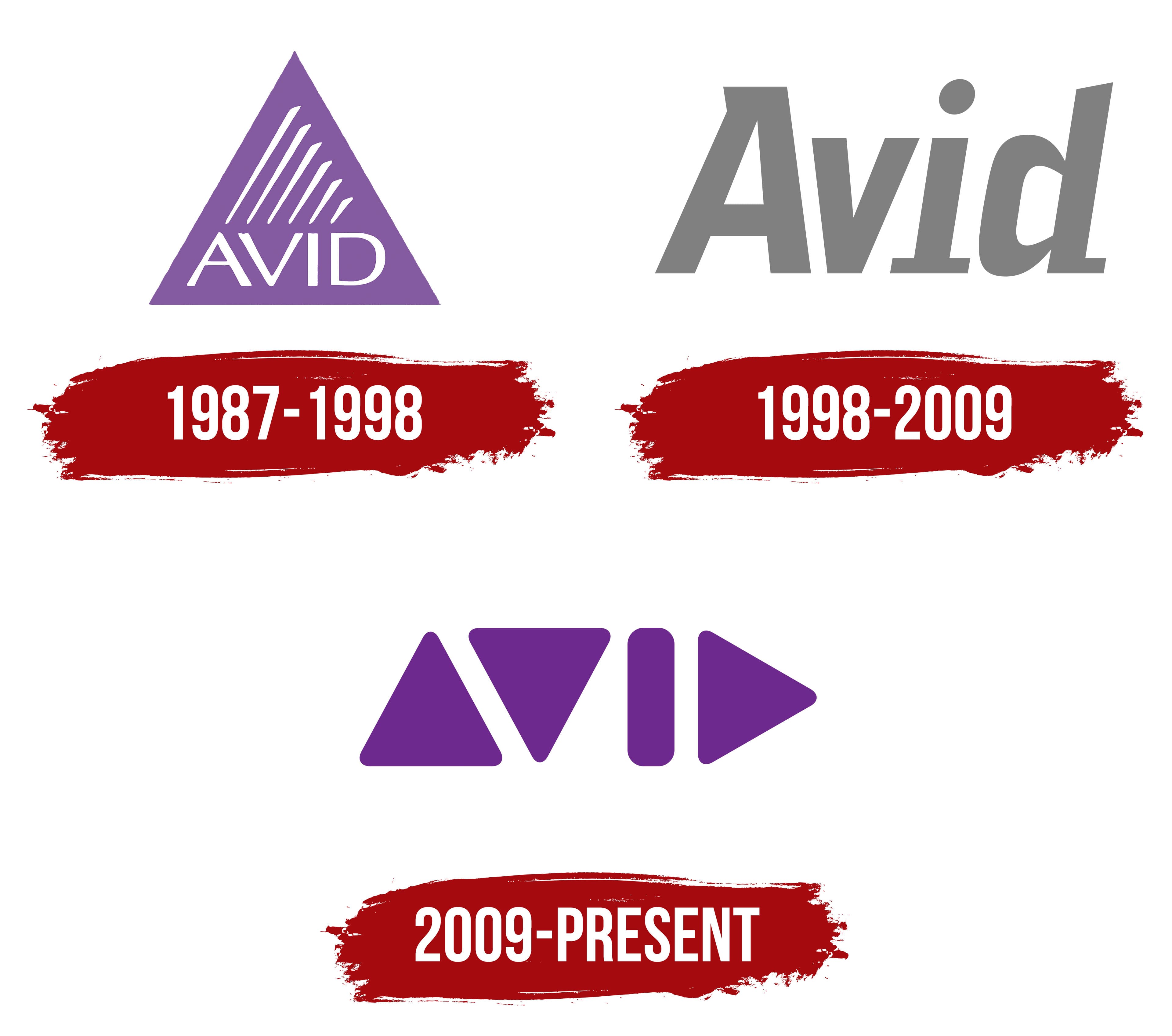
A marketing manager at Warner conceived the idea of simplifying film editing. His innovation, introduced in 1988, had replaced most technologies used in the film industry by the 1990s. Today, the company owns the best tools for musicians, directors, writers, and bloggers.
Avid logo variations convey the essence of the company’s work. Each logo conveys the main idea in its own way, revealing new facets of the technologies developed by the company’s engineers. The growth and expansion of the software portfolio are visible in the emblems.
What is Avid?
A major company that creates software and consoles for fast processing of video, sound, and text. Its products have been actively used by enthusiasts and large film studios since 1988.
1987 – 1998
The first company emblem is a purple triangle with white diagonal slits and the inscription “Avid” in capital letters at the base. The emblem illustrates the process of transforming a large mass of raw footage into a perfect result through processing and editing.
Avid can be deciphered as a synthesis of the words audio and video or as an abbreviation of the first letters: audio (audio), video (video), installation (editing), and digital (digital). The company’s main invention is NLE (non-linear editing). The first programs allowed copying the contents of a videotape to a computer, where the processing took place.
The diagonal lines represent the film cut into separate fragments, which are then used to create the final result.
The triangular shape of the emblem symbolizes the “Start” button, which begins video playback.
1998 – 2009

Avid acquired Digidesign in 1995, a move that led to a breakthrough in sound recording processing. The company now had tools for working with both video and sound. By 1999, the company introduced the Unity MediaNet network to support collaborative work among all media processing specialists. The expansion of services required a change in visual identity. The new logo is a slightly transparent gray version of the company name.
The emblem demonstrates the appearance of video from separate fragments and images. The behind-the-scenes process is invisible to the ordinary viewer: the gradual manifestation of the idea, gaining substance, clear outlines, and colors.
Avid’s programs are designed for those who create masterpieces, processing shooting “drafts.” That’s why the logo is almost colorless.
2009 – today
The company’s latest logo is entirely graphic. The symbols accurately convey the direction of the company’s work. They are universal and understandable to people, regardless of gender, race, country, or language. This approach allows Avid to reach a broad audience.
The symbols correspond to playback track control and mean:
- Moving between files in the list.
- Pausing and starting.
- Switching to the next episode.
The shapes convey the idea of non-linear editing, the main direction in Avid’s work. A finished tape is taken, and new material is created from its individual episodes. Editing occurs by moving through the base, following a developed algorithm.
Each symbol in the logo represents a letter of the name. Triangle with its base down: A; base up: V; vertex to the right: D; stick: I. Such encryption is similar to binary code in computer technology. The inscription looks very modern.
Font and Colors
Purple is the main color in the visual sign. The color embodies dreams, fantasy, and creativity. Creating new videos, programs, and films requires a non-trivial approach. Avid provides tools for such work. Choosing a purple hue is a subconscious message that with the developer’s software, dreams can come true.
The font resembles Karibu Condensed Bold Italic, but with unique serifs on the letters A, I, and d.