The Azores Airlines logo showcases the company’s versatility, helping the brand rise to the top easily. Like beautiful birds, the carrier’s planes glide effortlessly between the islands and the world, inviting travelers on an exciting journey. The logo represents the airline’s growth and readiness to connect the world to its unique islands. The color and name keep it modern while reminding people that the airline is a piece of home for those far from the Azores.
Azores Airlines: Brand overview
Airlines started in 1990 as OceanAir, connecting the nine Azores islands with mainland Portugal. It had a small fleet and limited flights but worked hard to serve these remote areas.
In the late 1990s, OceanAir grew reliable and customer-focused. By 1998, it expanded, becoming SATA Internacional, and started flying to big cities in Portugal and other parts of Europe like Madrid and Barcelona.
In the early 2000s, SATA Internacional updated its planes, adding efficient models like the Airbus A320. It started flights to North America, reaching out to the Azorean people living in Boston and Toronto. This helped make the Azores more attractive to travelers worldwide.
In 2015, the company changed its name to “Azores Airlines”. This new name highlighted its strong ties to the Azores and its role as a key regional airline.
The 2020s brought big challenges, especially with the COVID-19 pandemic. Led by CEO Teresa Gonçalves, the company adapted by changing how it operates and adding strict safety measures to keep flying safely.
Today, the company is critical to the economy and society of the Azores. It operates from Joao Paulo II Airport on Sao Miguel Island and Humberto Delgado Airport in Lisbon and continues to connect the islands to the wider world.
Meaning and History
What is Azores Airlines?
It is a regional airline based in the Azores, an autonomous region of Portugal. It operates flights connecting the Azores to the Portuguese mainland, Europe and North America. Known for its reliability and meeting the unique needs of the Azores archipelago, it provides crucial air connectivity for residents and tourists. The airline’s fleet includes several aircraft suitable for short- and long-haul routes.
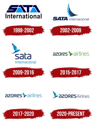
1998 – 2002
Azores Airlines, known as SATA Internacional from 1998 to 2002, actively used its logo to communicate its connection to the Azores Islands. The emblem featured the owner’s original name, emphasizing the airline’s historical ties and roots.
The logo design incorporated elements symbolizing the airline’s geographical location and main specialization. The blue trapezoids were intentionally shaped to resemble the contours of islands, effectively showing that the company serves island territories. The blue lines surrounding the company name’s letters resemble sea waves, adding dynamism to the logo and visually linking it with maritime themes, essential for airlines based in an archipelago.
The large size of the letters in the logo captures attention. It reflects SATA Internacional’s ambitions to expand its operations, strengthen its market position, and develop as a leading carrier in the region.
2002 – 2009
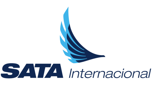
The emblem on the company’s logo illustrates a graceful bird’s wing crafted from multiple feathers arranged in two layers. This visual element enhances the logo and symbolizes flight, reflecting the airline’s primary activity. The feathers, skillfully depicted on the emblem, highlight the lightness and grace associated with the company’s aircraft.
The company name, displayed in large blue letters, occupies a central place on the logo, though its size has been slightly reduced compared to previous versions. Despite this change, the name maintains its visual impact and presence, continuing to be noticeable and striking. Adding the word “Internacional” in a light font resembles a breeze. This font lends an airy quality to the inscription. It emphasizes the company’s global orientation, symbolizing its light aircraft’s ability to cross borders and embark on long journeys.
2009 – 2016
The company’s logo features a metallic dove composed of numerous metal plates, symbolizing the strength and reliability of the new Airbus A320-200 airplanes. These aircraft are renowned for their outstanding performance and high-speed capabilities, resembling high-speed flying iron birds. Sunlight illuminates the dove, highlighting its blue color, which creates a shimmering effect, blending blue and dark shades in a dynamic light display.
The new font for the SATA inscription, bathed in sunlight, features smooth and modern lines that introduce elements of lightness and modernity to the logo design. This font enhances the logo and symbolizes the company’s dedication to innovation and continuous advancement in air transport.
As the company progresses toward its ambitious goals, this logo represents its determination to secure a leading position in the market.
2015 – 2017
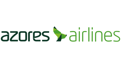
As part of the updated strategic plan for restructuring, Azores Airlines adopted a new name and required a new logo design. This change reflects the airline’s desire to refresh its image and strengthen its connection to Portugal’s cultural heritage. The choice of green colors in the new logo emphasizes the brand’s affiliation with Portugal, highlighting the richness and variety of its natural scenery.
The central element of the logo, the dove, remains a key figure in the design, yet it has been redesigned to convey a new message. The dove is now depicted with its back to the viewer, spreading its wings and surging forward. This pose symbolizes forward movement and overcoming challenges, leaving all problems behind. This dynamic and optimistic image highlights Azores Airlines’ ambitions for a new phase in its development.
The logo design’s transition from dark to light shades enhances the sense of renewal and a fresh start. This gradient emphasizes growth and rebirth, visually representing the airline’s strategic direction toward updating and improving its services and operations.
2017 – 2020
Two years after its last rebranding, the company decided to change the color palette of its emblem, returning to the use of blue and light blue tones. This choice better reflects the brand’s core aspects and geographic connection. Blue and light blue shades, traditionally associated with the sky and sea, are ideal for an airline based in the Azores, an archipelago surrounded by the ocean.
2020 – today
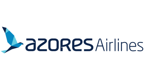
The Azores Airlines logo features a bird crafted in a geometric style. This bird comprises nine shapes: seven triangles, one trapezoid, and one complex pentagon. These shapes represent the nine islands of the Azores archipelago, which the airline connects. The bird, called Açor, symbolizes the Atlantic sky and acts as a guide, carrying people across countries, thoughts, and dreams. It is prominently displayed on the tail section of the company’s airplanes. The bird is placed in front of the company name, which uses two distinct font styles—bold and thin.
The bold font in the company name suggests strength and reliability, while the thin font signifies elegance and attention to detail. This choice complements the geometric bird, adding depth to the logo’s narrative.
The bird’s geometric design represents the islands and reflects modernity and precision. Each shape is carefully positioned to create a cohesive and dynamic figure, highlighting the airline’s commitment to innovation and excellence.
Açor, the central element of the logo, emphasizes the airline’s connection to the Azores and its guiding role in the Atlantic sky. This aligns with the airline’s mission of connecting people and places, embodying exploration and adventure.
The combination of bold and thin fonts adds sophistication to the logo. The bold font provides a solid foundation, indicating robustness and dependability. The thin font adds finesse and refinement, reflecting the airline’s focus on a high-quality experience.
FAQ
Who is the parent company of Azores Airlines?
The company is part of the SATA Group, a Portuguese airline based in the Azores. SATA Group operates several enterprises that transport passengers and cargo by air. It was founded to improve communications in the Azores and other parts of the world. SATA operates international flights from the Azores to Europe, North America, and beyond. SATA’s sister airline, Air Açores, operates inter-island flights in the Azores. This setup helps SATA Group cater to the needs of both local and international travelers.
What planes do Azores Airlines use?
The airline, part of the SATA Group, operates various aircraft, from short island hops to long international flights. The fleet includes:
- Airbus A321LR (Long Haul): This aircraft is powered by CFM Leap-1A33 engines and is excellent for long flights as it does not require frequent refueling.
- Airbus A321neo: Powered by CFM Leap-1A33 engines, this aircraft is fuel-efficient and quieter, which helps save on costs. It is well-suited for high-traffic routes.
- Airbus A320neo: This aircraft is similar to the A321neo but smaller. It is equipped with CFM Leap-1A26 engines and is suitable for medium-haul routes.
- Airbus A320: This widely used aircraft is powered by CFM56-5B engines and is known for its reliability and efficiency on short to medium routes.
- Bombardier Q400 NextGen: a turboprop aircraft powered by Pratt & Whitney Canada PW150A engines, ideal for fast flights between the Azores Islands.
- Bombardier Q200: This smaller turboprop aircraft is used on the shortest routes to the Azores, helping to connect all the islands.
These aircraft help the company serve the local community and tourists by selecting the right aircraft for each route based on distance, demand, and airport capacity.
What is the name of Azores Airlines?
The airline’s official name is SATA Internacional – Azores Airlines, S.A. It uses the ICAO code RZO and airline code 331 with the IATA designation S4. Based in Europe, it connects the Azores with locations in Europe, North America, and beyond. It helps people travel between islands and connects them with the rest of the world.
What is Azore’s airline code?
The airline uses several codes in the airline industry. Its IATA designation is S4, mainly used for flight bookings and ticketing. The company has a code 331, which is used in the information systems of specific airlines. In addition, it operates under the ICAO code RZO, which is important for air traffic control and planning. These codes are essential to the operation and help it efficiently manage flights and services, connecting the Azores with destinations in Europe, North America, and beyond.
