


 Azul Brazilian Airlines Logo PNG
The Azul Brazilian Airlines logo captures the unity of opposites and Brazil’s vibrant national identity. The emblem reflects a deep and affectionate commitment to the homeland. It highlights that the company serves all residents of the country and can connect with everyone.
Azul Brazilian Airlines was founded in 2008 by David Neeleman, a Brazilian-American aviation entrepreneur who had earlier led JetBlue Airways in the United States. He saw room for a new Brazilian carrier built around direct links between cities without regular air service, with fares aimed at a broad passenger base. The name Azul means “blue” in Portuguese and refers to Brazil’s blue sky.
The airline made its first flight on December 15, 2008, between Campinas and Salvador. Its initial fleet had three Embraer 195 aircraft, selected for passenger comfort and regional operations. By the end of 2009, Azul operated 14 Embraer aircraft and served 14 destinations in Brazil. Its model relied on regional jets and direct city-to-city routes, avoiding many large hub connections.
In 2012, Azul began flights to the United States, mainly to Florida, marking its move beyond Brazil. In 2015, it acquired TRIP Linhas Aéreas and became the second-largest airline in Brazil by passenger traffic. In 2017, Azul completed an IPO, supporting further expansion in Brazil and Latin America. In 2018, it began serving Rio de Janeiro’s Galeão airport and placed a major order for Embraer E195-E2 aircraft.
In 2019, Azul added routes to Uruguay and Argentina and expanded cargo activity with Boeing 737-400F flights between Brazil and the United States. Before the 2020 pandemic, it updated aircraft cabins with new seats and entertainment systems. In 2021, Azul restored flights under new safety rules and received a seven-star safety rating from Airline Ratings. In 2022, it focused on operations, network growth, cargo volume, digital platforms, mobile tools, and biometric passenger identification.
Meaning and History
What is Azul Brazilian Airlines?
It is a Brazilian low-cost air carrier based in São Paulo. It operates an extensive domestic flight network and is developing international routes. Known for its service and modern fleet, it connects major cities and regional destinations throughout Brazil, as well as international destinations in the Americas and Europe. The airline offers various classes of service, including economy and business class, with a focus on customer comfort and satisfaction.
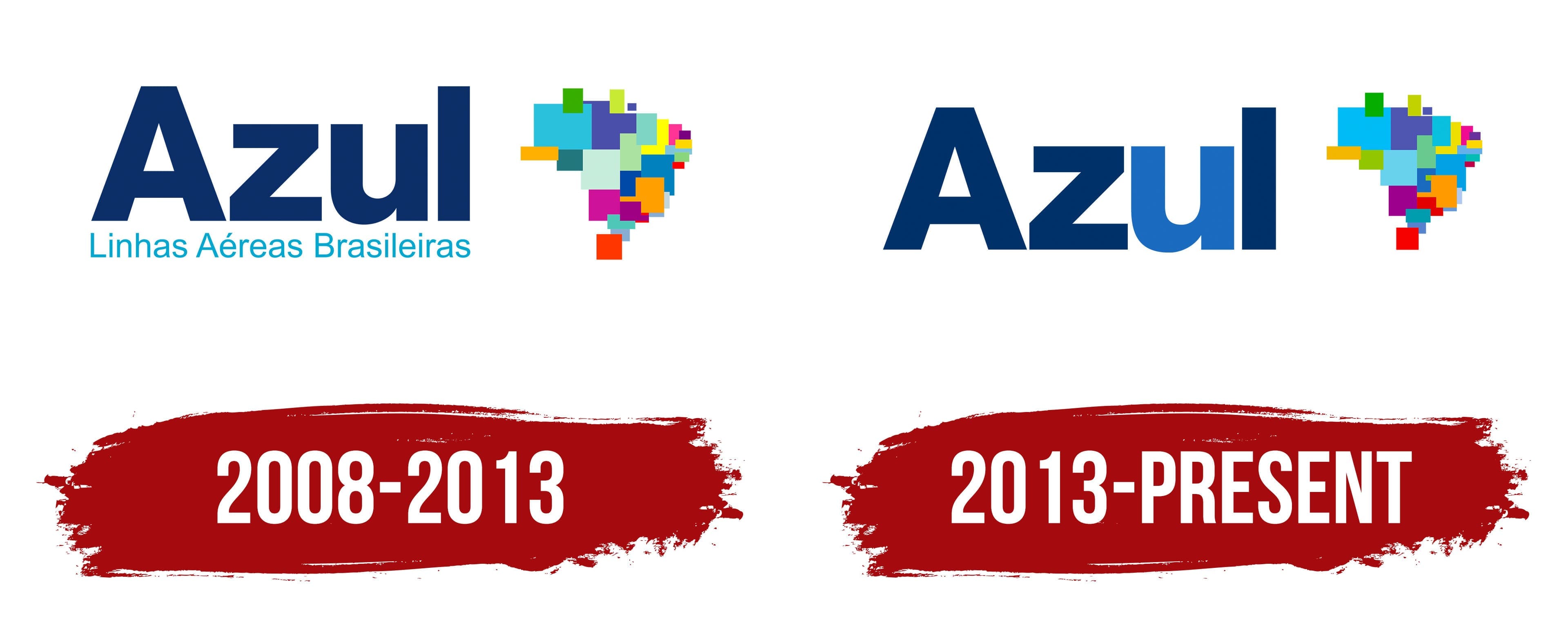
2008 – 2013

Azul Brazilian Airlines, founded in 2008, quickly became a prominent player in Brazil’s airline market. The company’s emblem reflects bright and key aspects of its identity. The company name “Azul,” which means “blue” in Portuguese, is rendered in blue. This shade is one of the colors of the Brazilian national flag and is widely used in the country as a symbol of calm, reliability, and trust.
The choice of the name “Azul” was intentional. The word is short, resonant, and memorable, which was a decisive factor in the naming contest for the new airline. The success of this option underscores the importance of the brand creating a name that is both simple and deeply symbolic, easily associated with its services and roots.
The logo design includes a map of Brazil’s administrative territories, located to the right of the company name. This element is adorned with bright-colored squares and rectangles that symbolize Brazil’s cultural and ethnic diversity. Each color and shape on the map highlights the country’s cultural and social features and underscores the company’s extensive geographic coverage of its services nationwide.
2013 – today

The Azul Brazilian Airlines logo features only the first word of the brand name, “Azul,” written in large blue letters. Specifically, the letters “A,” “Z,” and “L” are in a darker shade of blue, while the letter “U” is in a lighter shade. Next to the text are numerous brightly colored polygons. These graphics are arranged in a patchwork style, composed of many small, multicolored geometric shapes superimposed on one another. While the design may seem chaotic at first glance, it forms the shape of Brazil, the airline’s country of origin.
The patchwork design highlights the diversity and vibrancy of Brazilian culture. Using different shades of blue for the letters in the brand name adds visual interest and symbolizes the airline’s versatility and breadth of services. The juxtaposition of multicolored geometric shapes represents the various destinations served by the airline, each unique but collectively forming a cohesive image of Brazil.
The airline’s patchwork style emphasizes cultural diversity and reflects its dynamic and inclusive approach. The colorful polygons create a vibrant mosaic that captures the essence of Brazil’s rich heritage and lively spirit.
Using different shades of blue for the letters adds depth and dimension, making the logo more engaging and memorable. This color variation also conveys variety and adaptability, key attributes of a modern airline.
The multicolored geometric shapes, while individually distinct, come together to form a recognizable outline of Brazil. This clever design choice reinforces the airline’s strong connection to its home country and its commitment to serving destinations across Brazil.
The logo, with its large blue letters, patchwork of colorful polygons, and Brazilian shape, effectively communicates the airline’s diversity, vibrancy, and national pride.