The BabyFirstTV logo is bright, cheerful, and friendly. It’s designed to attract the attention of little ones and engage them in conversation. The emblem is filled with vibrant colors that immediately transport you into the world of childhood and uplift your mood.
BabyFirstTV: Brand overview
| Founded: | May 11, 2006 |
| Founder: | First Media US |
| Headquarters: | Los Angeles, California, U.S. |
| Website: | babyfirsttv.com |
BabyFirstTV is a unique American channel dedicated to the development and education of infants from six months to three years old. It’s accessible to 120 million households in the US. Programs are broadcast in 15 languages, including Spanish, Japanese, Russian, and German. It’s owned by First Media, with headquarters in Los Angeles.
Meaning and History
From the get-go, the company established its main symbol, which has remained consistent in all logos since its inception. The symbol is associated with plants, resonating with themes of life and growth. A bright flower represents diversity, early childhood, and the primary goal of the programs – blossoming and unveiling the talents and potential of children. Major logo changes mostly involve the style and color of the letters. Rebrandings are associated with expanding the broadcasting area. Each transformation of the inscription underlines the niche specialization of BabyFirstTV.
What is BabyFirstTV?
It’s an American developmental channel for toddlers up to three years old, featuring songs, cartoons, and games. Popular shows include VocabuLarry, Harry the Bunny, Tillie Knock Knock, and others. It operates an online platform with on-demand shows, educational games, and videos. Available in 33 countries.
2006 – 2008
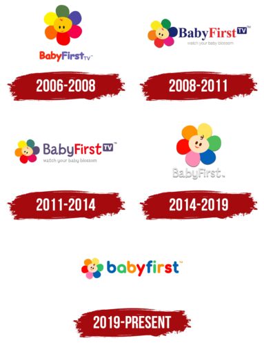
The channel’s first logo, launched in 2006 on DirecTV, consisted of a six-petaled flower with a centerpiece stylized as a baby’s head. The shades of the petals corresponded to the colors of the rainbow. This design represented:
- Educational direction of the programs. Simple lessons taught children colors and shapes and expanded their vocabulary.
- A variety of programs: cartoons, songs, tasks, and games.
- Comprehensive development. The information covered nature, art, language, mathematics, physical education, etc.
At the center of the petals is an infant’s face. The idea of associating children with flowers has two origins. The first is tied to a phrase by Maxim Gorky, and the second to the German educator Friedrich Fröbel. He invented kindergarten and compared children to flowers growing in a garden.
The image at the center of the logo communicates that the child is the main focus. The development process is individual and should be tailored to the learner’s unique traits. This also emphasized the need for comprehensive development. A child is like a blank slate and requires diverse activities and knowledge.
Beneath the image, the channel’s name is written in a two-color cartoon style. The letters seem to dance and, like children, can’t sit still. The red color of the word ‘Baby’ represents love, energy, constant movement, and the child’s central role in the learning process. The purple word ‘First’ symbolizes development.
2008 – 2011
In 2008, the channel’s broadcast expanded to China, Korea, Africa, and Latin America. This expansion was marked with a rebranding.
The label and the flower were positioned on the same level. The head of the inflorescence was slightly tilted to give it a pose of curiosity and interest. This technique emphasized the theme of children’s development and interesting content. The tilted image also encouraged viewers to interact.
The title received more strict, large letters with serifs. ‘Baby’ was done in dark blue, speaking to the process of growth and intellectual development. ‘First’ – in red tones to indicate leadership, the expansion into new niches, and rapid proliferation worldwide.
Below the name, the channel’s slogan appeared for the first time: watch your baby blossom.
2011 – 2014
In 2011, the BabyFirstTV channel became available in all European countries. A change in the logo underlined the development and distribution. The main transformation concerned the font of the inscription and its shades. The name was returned to a child-like cartoon font of thin, rounded sticks with a slight tilt of the letters in different directions. The shades were made more pastel, changing the dark blue to purple. The rebranding gave the logo playful intonations.
2014 – 2019
By 2014, the board of directors changed, which contributed to the release of a mobile application, YouTube debut, and rebranding.
The overall look of the emblem gained tenderness as a nod to the young age of the viewers. The color palette of the flower was revised. The purple petal was changed to light blue, and the lilac to pink. The other shades also lightened. The white inscription with the name of the channel emphasized the theme of the beginning of life, infancy. Placing the name on two levels added compactness to the sign.
2019 – today
The latest rebranding simplified the logo even more. The shadow disappeared. The image started to resemble a children’s two-dimensional drawing. Lowercase letters of the title brought the inscription closer to the young age of the audience. Each element received coloring in sync with the petals.
Font and Colors
The emblem is multicolored. For the elements, bright, vibrant colors are used, which resonate with the world of childhood, when everything around seems amazing. Each shade reflects one aspect of development, dedicated to broadcasts on BabyFirstTV.
- Orange – embodies communication, warmth, and family.
- Yellow – a sunny color, indicating a good mood, joy, and laughter.
- Red – speaks of individuality, mother’s love, and development.
- Green – the color of life, growth, and maturing.
- Blue – the shade of intellect, logic, and speech.
- Pink – the color of tenderness, understanding of oneself, and self-identification.
The inscription is made in rounded letters. The font is similar to Torus Bold. The absence of corners speaks to the simplicity and accessibility of the content.
BabyFirstTV color codes
| Lapis Lazuli | Hex color: | #0161b1 |
|---|---|---|
| RGB: | 1 97 177 | |
| CMYK: | 99 45 0 31 | |
| Pantone: | PMS 285 C |
| Emerald Green | Hex color: | #2dc466 |
|---|---|---|
| RGB: | 45 196 102 | |
| CMYK: | 77 0 48 23 | |
| Pantone: | PMS 354 C |
| Dark Orange | Hex color: | #ff8f00 |
|---|---|---|
| RGB: | 255 143 0 | |
| CMYK: | 0 44 100 0 | |
| Pantone: | PMS 151 C |
| Red | Hex color: | #ff0000 |
|---|---|---|
| RGB: | 255 0 0 | |
| CMYK: | 0 100 100 0 | |
| Pantone: | PMS 1655 C |
