The Back To The Future logo shows an unusual event: the ability to travel to the future and back. The sign is filled with the energy necessary for this and the desire to experience an incredible scientific discovery. The emblem guarantees that it will be impossible to take your eyes off the screen.
Back to the Future: Brand overview
| Founded: | July 3, 1985 |
| Founder: | Robert Zemeckis |
| Headquarters: | United States |
Meaning and History
Back To The Future was created by Bob Gale and Robert Zemeckis. They persistently pitched the idea for a new film to various film studios, but it was rejected more than 40 times. They managed to insist on their own, and in 1985 the sci-fi comedy still came out on the screens. It was so successful that it needed a sequel. So there were two sequels that did not bring the expected revenue. However, they also influenced pop culture because the trilogy launched a global franchise known worldwide.
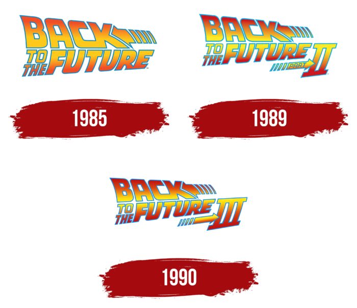
The Back To The Future media product line shares a common logo. It looks just like the one on the poster for the first movie: raised orange and blue lettering with an arrow. The decals of the sequels have a similar structure, but the part number is indicated in them.
1985
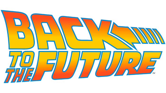
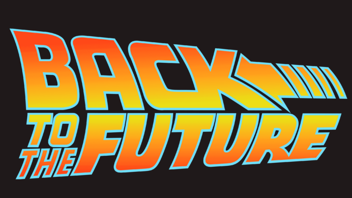
In 1985, the debut of the legendary film was about the adventures of a high school student and an eccentric scientist who went into the past in a time machine. At the same time, a multi-part logo containing the film’s name was presented. The first line contained the word “BACK,” the second – “TO THE” (divided into two rows) and “FUTURE.”
A linear gradient was used for the design: the top and bottom of the inscription were red-orange, and the middle smoothly turned into yellow. All elements had a blue outline. The letters “C” and “K,” as well as “R” and “E,” merged at the edges. On the right side of the word “BACK” was an arrow pointing to the left and matching the shape of the notch inside the “K.” She looked unusual because of the broken line.
1989
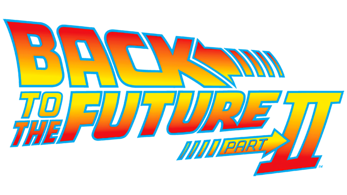
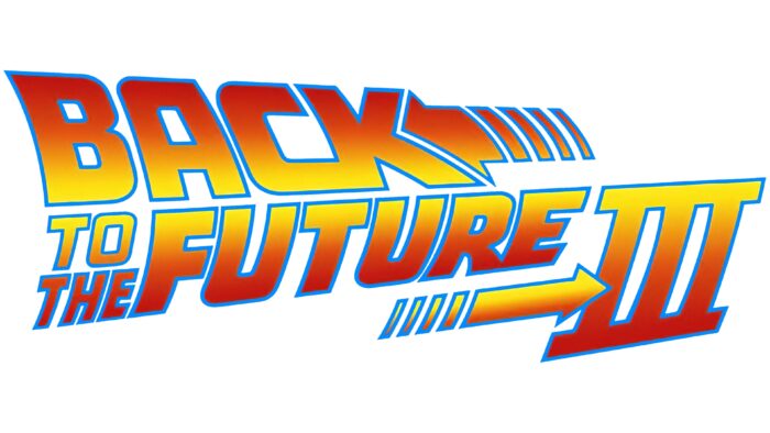
A similar logo was created for the second part of the trilogy, but with some additions. The biggest innovation was the Roman numeral “II,” located in the lower right corner. An additional arrow pointed to it, inside which was written the blue word “PART.” The blue outlines turned blue, the dark orange turned red, and the yellow took on a cold lemon tint.
1990
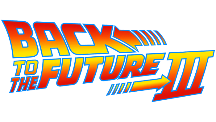
The hallmark of the third film was practically no different from the second logo. The developers only removed the “PART” inscription and slightly raised the right side of the text to achieve a diagonal arrangement of lines.
Font and Colors
The design of the Back To The Future emblem is very symbolic. The letters in the word “BACK” are laid back to the left. The arrow next to it points in the same direction. On the contrary, the phrase “TO THE FUTURE” is tilted to the right, as if it is being pulled forward, following the second arrow. Dashed lines represent movement. With the help of simple graphic techniques, the creators of the logo showed the dynamics and expressed the meaning of the trilogy.
Cyril Bourreau designed the Back To The Future typeface based on the lettering, a bold sans serif with “falling” letters. It was introduced in 2002. The color scheme of all three emblems of the trilogy is slightly different. If the first film’s palette is based on a combination of red-orange and blue, then in other cases, a combination of dark red (almost burgundy), pale yellow, and blue is presented.
Back to the Future color codes
| Racing Red | Hex color: | #dd1108 |
|---|---|---|
| RGB: | 221 17 8 | |
| CMYK: | 0 92 96 13 | |
| Pantone: | PMS Bright Red C |
| Pumpkin | Hex color: | #fe7101 |
|---|---|---|
| RGB: | 254 113 1 | |
| CMYK: | 0 56 100 0 | |
| Pantone: | PMS Bright Orange C |
| Middle Yellow | Hex color: | #ffe800 |
|---|---|---|
| RGB: | 255 232 0 | |
| CMYK: | 0 9 100 0 | |
| Pantone: | PMS 102 C |
| Dodger Blue | Hex color: | #008aff |
|---|---|---|
| RGB: | 0 138 255 | |
| CMYK: | 100 46 0 0 | |
| Pantone: | PMS 285 C |
