


![]() Badoo Logo PNG
Badoo Logo PNG
The Badoo logo features a website and application known for communication. Those looking to connect will recognize it by the distinctive emblem. This design includes a name with rounded letters, representing sweet emotions and pleasant experiences.
Badoo was launched in London in 2006 by Russian entrepreneur Andrey Andreev, born Ogandzhanyants. He had already worked on internet projects in Russia. He saw room for a dating service built with social network mechanics. The platform started with offices in Soho, London, and Limassol, Cyprus, and later added locations in the United States, Malta, and Russia.
After its official launch in November 2006, Badoo gained early popularity in Latin America and Spain. In 2007, the company began adapting the service for different markets, helping it grow beyond its initial regions. In 2008, Badoo released its first mobile version and reached 10 million users. The service later became available in 190 countries and 47 languages, via the web and Android and iOS apps.
Product updates became a major part of its history. In 2009, Badoo added photo verification to reduce fake profiles and increase trust. In 2011, it launched “Encounters,” a profile-browsing feature based on mutual interests. By 2012, the platform had more than 150 million registered users. In 2014, premium accounts became a key monetization tool, giving paid users additional visibility and features based on their likes.
From 2016 to 2018, Badoo added live video, facial recognition, “Lookalikes” search, and a refreshed logo and design. In 2019, Andreev sold MagicLab, the parent company of Badoo and Bumble, to the Blackstone Group, resulting in a corporate restructuring. In 2020-2023, the platform continued to develop safety tools, virtual communication features, and AI-based matching to meet the evolving needs of the online dating market.
Meaning and History
![]()
This dating site started working in Moscow in the autumn of 2006. During this time, it entered the ranks of the most famous and popular virtual communication services. An increase in popularity is observed in Latin America and Spain, followed by Italy and France. In 2016, the Badoo app was downloaded in 21 countries, setting a record for downloads.
The project was started by Russian programmer and entrepreneur Andrey Andreev. After a two-year rollout of the site, it received financial support from Finam Capital, a Russia-based firm, to expand its presence in the country’s dating market and worldwide. Now, she owns 20% of its shares. The web resource’s popularity came through Facebook, specifically through quizzes and social games hosted there. This service entered the American market in the spring of 2012 after several functional and conceptual adjustments that it was asked to make.
Despite the introduction of optional measures, the site was embroiled in a scandal in 2019. It dealt with drugs, harassment, misogyny, and violence. As a result, the resource became the subject of a detailed Forbes investigation but remained at the top of the rankings among the leading dating sites. He was recognized everywhere by the logo, which featured a distinctive, uneven, round font, with some letters resembling an inverted monocle.
In the spring of 2017, the company released an updated application and redesigned the emblem, which then received a heart. It remains well recognizable due to the streamlined edges. It has no sharp corners, even at the bottom, in the narrowest part. At the same time, increased security measures were taken, improving the dating site’s functionality.
The Badoo website uses a friendly logo with no sharp corners to match the original idea. In the first years, it was cheerful. Still, after entering the American market, designers added a sense of seriousness, emphasizing it with the same font size, a strict style, and minimal color.
What is Badoo?
It is a social networking and dating site developed by Russian-born programmer Andrey Andreev, also known as Ogandzhanyants. It exists as a website and apps for Android and iOS, available in 47 languages. The brand was founded in 2006 and is headquartered in London, the capital of the United Kingdom. It is registered in Cyprus and has offices in Russia, Malta, and the United States.
2006 – 2017
![]()
In the debut logo, an attempt was made to combine text with graphics so that the sign has a unique style, inspires confidence, and looks good on any medium. The developers used “jumping” letters, increasing some and reducing others, to do this. Despite this, all characters are in lowercase. The “b” and the penultimate “o” with a dot in the ring look larger than the rest. The smallest ones are “a,” and the one at the end is “o.” Moreover, the signs are multi-colored: blue, green, orange, and red.
2017 – 2019
![]()
After updating the identity and approving the new slogan, the Badoo logo became modest and minimalist. The name of the dating site is made in unified black characters. All the letters are the same size, and the red dot that made it look like an eye has disappeared from the “o.” The cuts on the legs are even and not rounded. The designers left only an orange heart for the round before the text part. It attracts visitors’ attention by highlighting the resource’s key aspect, fostering spiritual connection and love among acquaintances. In addition, this is a declaration of the company’s love for its users.
2019 – 2022
![]()
The current Badoo logo is completely purple, including the name and the heart. The style of the letters has remained the same: streamlined, rounded, without sharp transitions and corners, which subconsciously inspires confidence in the resource. But the designers added a little to the heart: they depicted a wide smile, like on a smiley face. It looks like an inverted white arch in the center of the graphic sign. At the same time, the authors removed the lower corner (where the sidelines converge).
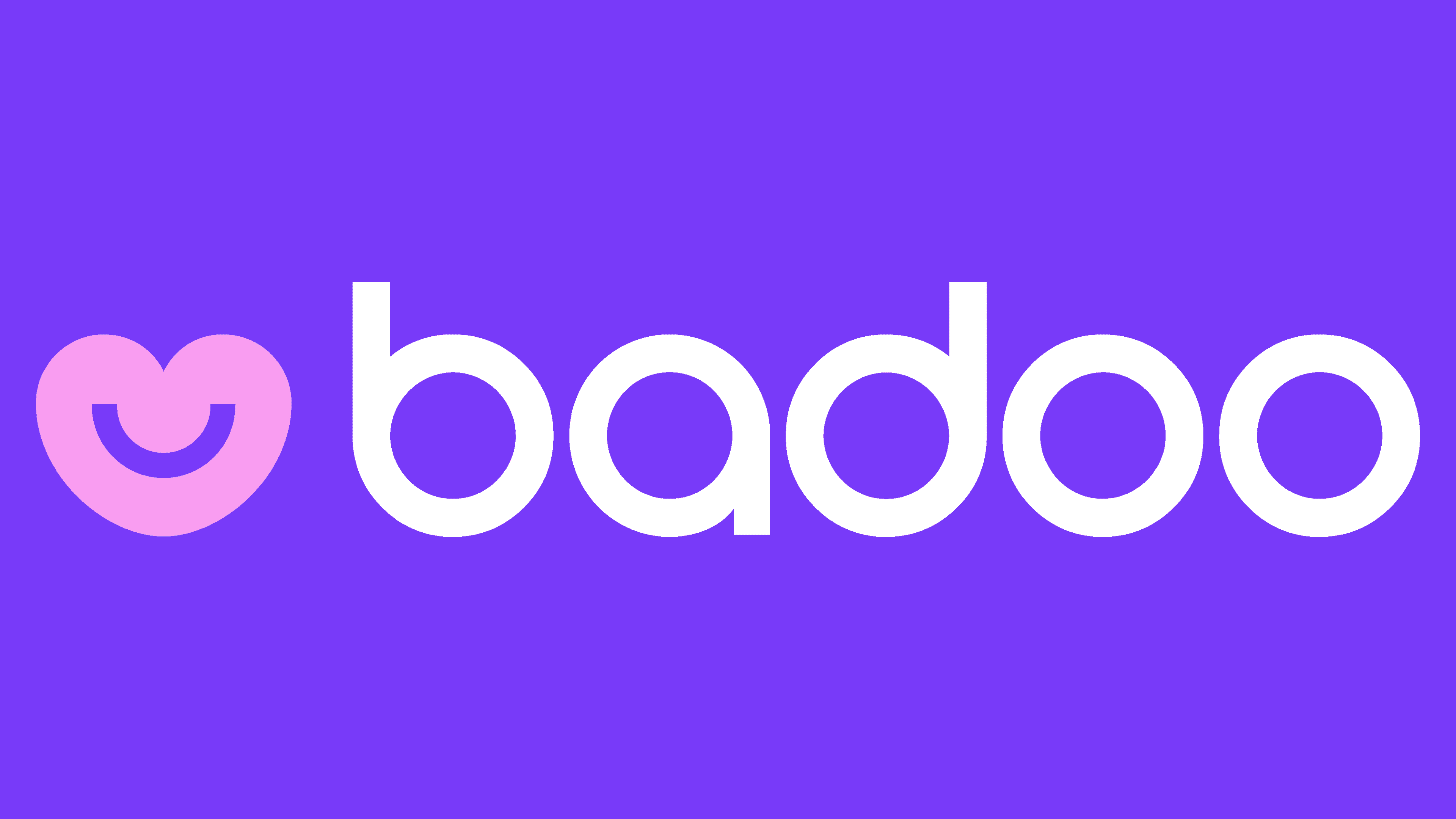
2022 – 2023
![]()
The logo has changed compared to previous versions, becoming softer and more welcoming. The company emphasized lightness and positivity, aiming to be a place where people can connect and communicate without hesitation.
One of the main changes is that the emblem is now light pink, evoking warmth and positivity. Pink symbolizes tenderness and romance, making it an ideal choice for a dating app.
The font has remained the same, still rounded and simple, without unnecessary details. These letters are easy to read and create a sense of comfort and safety. Everything about this logo suggests it’s a place where users can relax and be themselves.
A heart symbol to the left of the name is rendered in the same pink color and consists of two parts: the overall shape resembles a heart, while the inner part forms a smiling face. These elements symbolize the joy and love that users can find on the platform.
2023 – today
![]()
Badoo emerged as one of the first platforms to offer new ways to communicate and meet people online, and its logo needed to reflect this innovation and energy. The design’s simplicity and brightness helped the brand stand out from competitors and attract millions of users worldwide.
The new Badoo logo is a bright and memorable symbol that draws attention with its simplicity and expressiveness. The visual mark’s design captures the brand’s essence and aims to create a user-friendly, welcoming dating social network.
The font is bold and rounded, with large, smooth letters that appear soft and friendly. This shape symbolizes openness and accessibility, suggesting that the platform welcomes each new user.
The color scheme is entirely monochromatic, featuring a rich red hue. Red symbolizes passion, energy, and strength, perfectly aligning with the company’s goals.
The letters in the emblem seem to interact with one another. For example, the letters “a” and “d” share similar rounded elements, creating a sense of harmony and unity within the logo. This arrangement, in which the letters seem to “embrace” each other, conveys the idea of connection and communication, which is central to Badoo’s concept. The letters “o” appear to be holding hands.
The emblem symbolizes the connection between people worldwide, helping them discover common interests and build new relationships.
Font and Colors

In all Badoo logos, the inscription is set in the Circa Bold typeface and rendered as a smooth, rounded ring. This font first appeared in K-Type and is included in two typographic groups: Art Deco and display sans.
The color scheme is very diverse, and one might say it goes from one extreme to the other. In the early version, it is very bright, and in the later version, it is restrained. Therefore, the main palette includes orange, red, and blue in two shades, as well as green, black, purple, and soft pink. The background is plain white.