


 Banana Republic Logo PNG
The Banana Republic logo embodies a brand focused on serious, business-minded, and affluent individuals. This brand’s clothing helps shape the image of a successful person, helping them appear solid and respectable. The emblem’s design blends classicism and respectability, emphasizing the brand’s commitment to high standards and refined style.
Banana Republic began in 1978 in Mill Valley, California, when Mel and Patricia Ziegler opened a small store selling military surplus and safari-style clothing. Mel had worked as a reporter for the San Francisco Chronicle, while Patricia was an artist. Their early idea was built around altered army gear, travel-inspired catalog stories, and illustrations that gave the shop a distinct sense of adventure.
The first catalog, published in 1978, became one of the brand’s strongest early tools. Its humorous descriptions and drawings helped turn ordinary surplus items into part of a fictional travel world. In 1983, Gap Inc. acquired the company and began changing its direction. The military-surplus roots were gradually reduced, while Banana Republic moved toward a more upscale fashion format.
During the 1980s, the brand opened stores across the United States. Many locations used tropical decor, palms, jeeps, and safari references, keeping the original adventure mood alive. By the late 1980s, the company moved away from safari clothing. It began focusing on business and casual wear for middle-class professionals. Mel and Patricia Ziegler left in 1988, and the brand continued with a more conservative fashion line.
In the 1990s, Banana Republic expanded through accessories, shoes, fragrances, and an “accessible luxury” position. Its first website appeared in 1995. Later growth included the first store outside North America, in Tokyo, in 2005; a home line in 2007; a Mad Men collection in 2012; Banana Republic Monogram in 2013; and BR/K.Love-18 in 2017, Style Passport in 2018, a 40th-anniversary collection in 2019, stronger online sales in 2020, new store concepts in 2021, and an updated image in 2022.
Meaning and History
What is Banana Republic?
It is a global retailer specializing in high-end clothing and accessories for men and women. Known for its stylish, functional, and superior clothing, it sells everything from casual wear to more formal pieces suitable for special events and the workplace. The brand’s style is characterized by a blend of modern and traditional elements, often showcasing precise cuts and elegant fabrics. The brand caters to a market that seeks elegant, sophisticated casual wear at reasonable prices. It is known for its seasonal lines, designer partnerships, and flexibility to respond to changing fashion trends without sacrificing a sophisticated, unified look. As a Gap Inc. family of brands member, it benefits from a strong retail network and widespread awareness in the fashion industry.
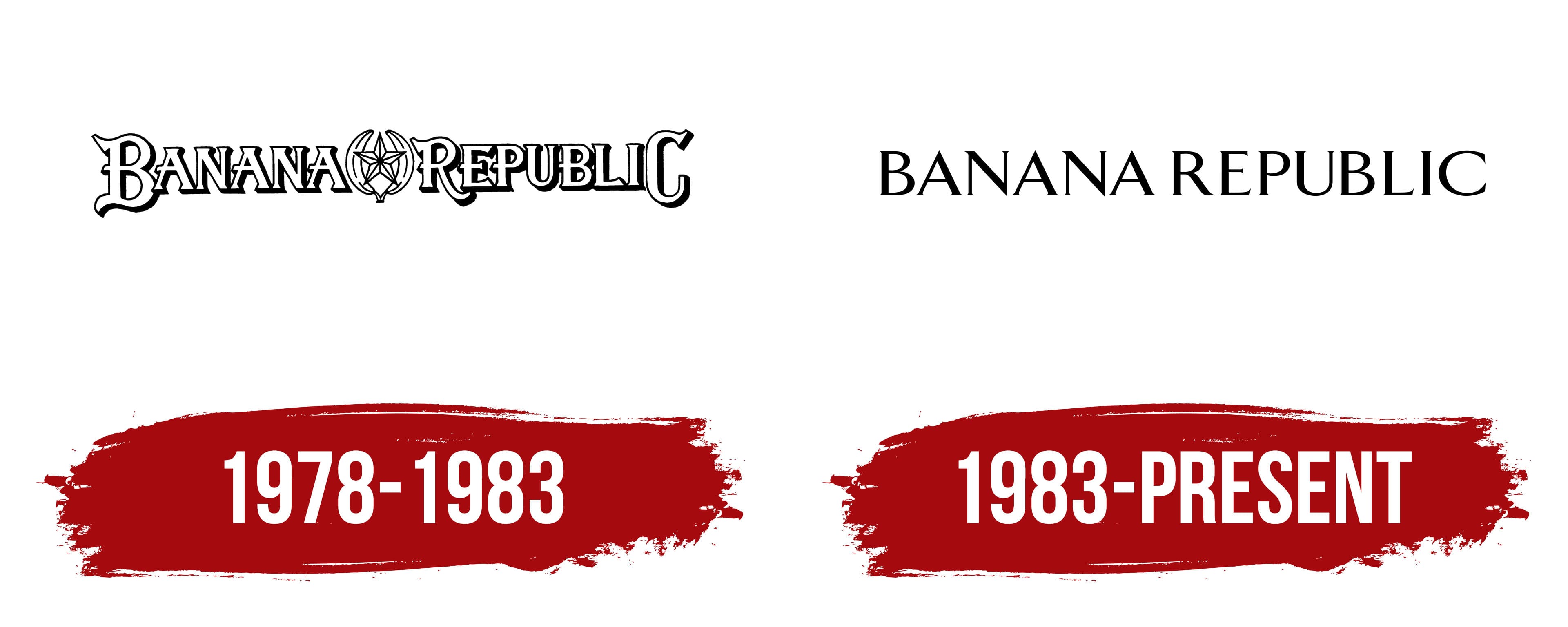
1978 – 1983

The first emblem stood out for its extravagance and uniqueness. The central element resembled a socialist crest, emphasizing the “Republic” in the name. At the core of the design were two bananas forming a crown, with the star in the center replaced by a banana flower.
The name and image evoked associations with uninhabited islands, natives, and travel, pointing to the extravagant clothing items originally offered in the boutique. The white, three-dimensional letters of the name created the effect of being placed at the top of a palm tree, so the viewer saw the image from the ground up. The compactness of the words emphasized a cohesive clothing style, allowing the buyer to stand out from the rest. The emblem conveyed a sense of good vibes, lightness, and refined chic.
1983 – today
The Banana Republic logo, introduced after the brand’s acquisition by Gap, was updated to reflect a new direction toward a more restrained, classic style. The black, all-uppercase lettering with refined serifs emphasizes the elegance and respectability inherent in the brand’s products.
Replacing the former, more exotic style with this minimalist, formal logo indicates a shift in the product range. The brand is now associated with classic and luxurious clothing, symbolizing a wealthy, successful lifestyle.
The black font adds seriousness and solidity, while the sharp serifs impart a sense of formality and elegance. The new logo design highlights the brand’s commitment to quality and refined taste, shifting from the “leisure travelers” image to a more mature, sophisticated positioning.