


 Pierre Cardin Logo PNG
The Pierre Cardin logo creates the perfect brand image in the audience’s perception. The identity fulfills its mission: it advertises, reminds, and revives the brand’s best collections in the target audience’s memory. This is why the modern emblem is filled with information and exudes high style, allowing for a full appreciation of each element’s beauty and the placement of key accents.
The identity expresses confidence and conveys the brand’s reliability. Absolute stillness and stability are its defining features, underscoring its strength. The letters and image appear unified, creating a harmonious whole.
The restrained color palette is a model of style. The visual symbol is not burdened with unnecessary lines or patterns, and meaningful accents are minimized. The black-and-white tone is an optimal color choice for different eras and styles, keeping the identity relevant.
Pierre Cardin was born Pietro Cardin near Venice in 1922. His family fled Mussolini’s regime for France in 1924, and he began a tailoring apprenticeship at 14. After World War II, he moved to Paris. He worked for Jeanne Paquin and Elsa Schiaparelli before joining Christian Dior in 1946, where he contributed to the New Look period.
Cardin founded his fashion house in 1950, first producing theatre costumes before moving into couture. His debut collection appeared in 1953, followed by the Eve boutique in Paris in 1954. In 1957, he released a ready-to-wear collection, challenging couture traditions and making designer clothing available to a wider market.
The 1960s brought futuristic forms, synthetic materials and the 1964 Cosmos collection, including the bubble dress. During the 1970s, Cardin expanded through licensing, placing his name on furniture, cars and other products. He staged the first Western designer fashion show in China in 1979, bought Maxim’s restaurant in 1981 and later developed the name internationally through stores and licensed goods.
Cardin opened stores worldwide, including in the Soviet Union in 1991. He joined the French Academy of Fine Arts in 1992, marked 60 years of his house with a Beijing show in 2011, and opened a Paris museum in 2016. He died on December 29, 2020, aged 98. New collections followed in 2021 and 2022, while the company remained active in clothing, furniture, licensing and design through 2023 across international markets.
Meaning and History
What is Pierre Cardin?
This French fashion brand revolutionized the industry with its avant-garde and futuristic designs. It is known for geometric patterns and space-age aesthetics that broke traditional fashion standards. As one of the first luxury brands to embrace ready-to-wear collections and licensing agreements, the brand made high fashion accessible to a wider audience. Its range includes clothing, accessories, fragrances, and furniture, distinguished by sculptural shapes and creative combinations of materials. Iconic designs, such as bubble dresses and unisex clothing, have greatly influenced modern fashion. The brand continues to combine creativity with commercial success, remaining a symbol of modernist architecture and the democratization of fashion.
Old

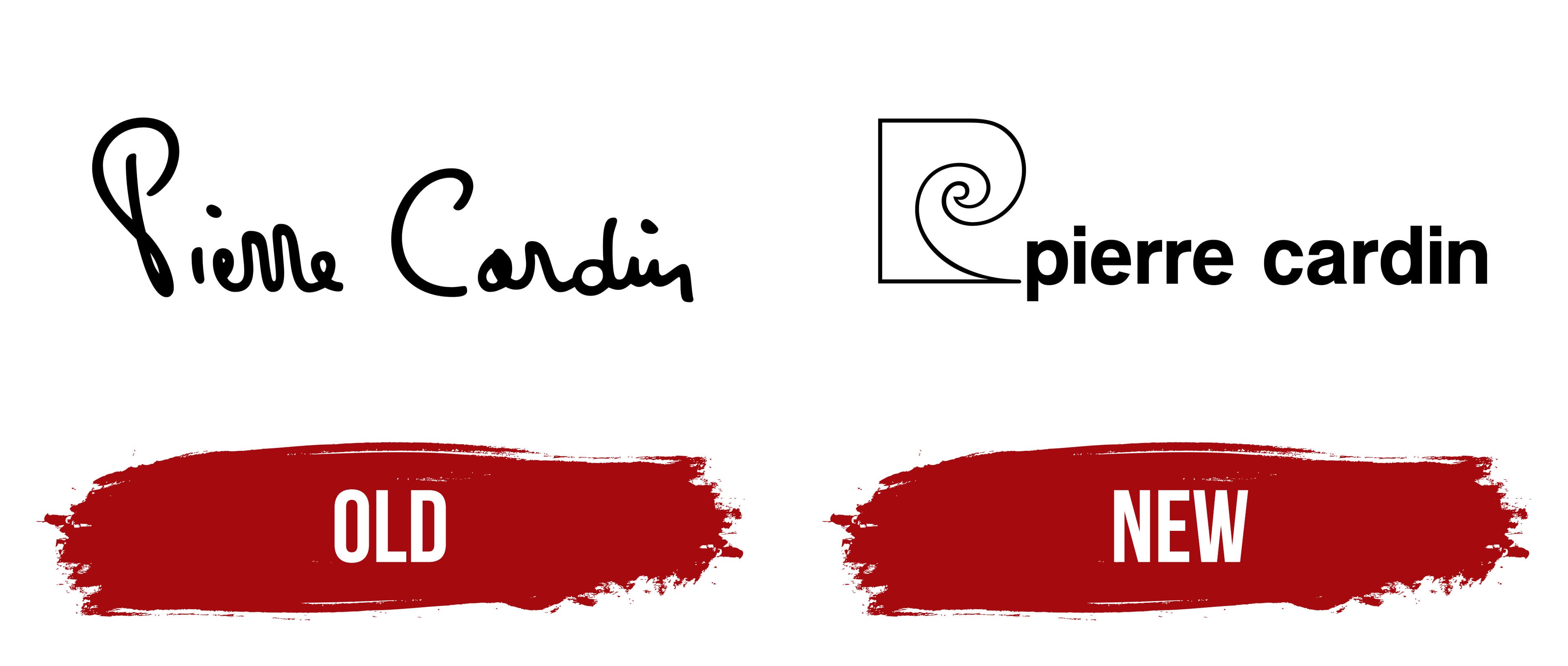
Since the brand’s inception, individuality has remained the founder’s top priority. This is why the first logo was Pierre Cardin’s original signature. Against a clean white background, his name was drawn in bold ink, each letter crafted by the designer’s hand, aiming to convey his ideas, creative approach, the uniqueness of the brand’s products, and their distinct style.
The brand name takes on a special beauty and charm through this creative approach and attention to detail, turning the text block into a true work of art. The logo is rich with visual effects: capital letters stand out with smooth lines, and the first letters of each word are spaced at a specific distance from the others. In some places, the letters blend, while in others, they separate, creating interesting accents.
Over time, the logo became easily recognizable, which became its primary advantage. This design’s elegance and charm were beyond question, giving the brand a distinctive appearance.
New

The modern version of the Pierre Cardin logo is filled with graphic elements, lines, and subtle details that, while appearing simple, collectively create a complete image. Meaningful accents and information intertwine, with graphics and fonts fitting together like puzzle pieces into a unified design.
The identity of the new era combines an image with a text block. A design reminiscent of a wave or a spiral rises above the text, creating a striking focal point. This beautiful symbol stands out, as its scale is optimally chosen. Black and white colors are harmoniously combined in the logo, highlighting contrast and enhancing the overall look.
At the bottom, under the image, the brand name adds completeness and proportional harmony to the entire composition. Neat, bold, large letters relate evenly to each other. Gradually winning over customers, the brand emphasizes its durability and reliability. The dense letters “shine,” symbolizing stability and steadfastness, while soft curves and serifs add visual appeal, underscoring the identity’s stylish character.