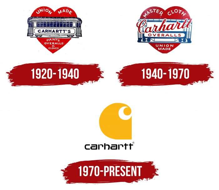
The company’s emblem is original and unusual. The Carhartt logo looks like the work of an artisan, with handmade stitching and color overlays. The image alludes to creating clothes for hardworking and creative people—using special cuts and materials.
Carhartt: Brand overview
Meaning and History
At first, the sewing studio had only two sewing machines and their owner. At first, researched the consumer market, directly asking railway workers about what work clothes should be. The result was Carhartt’s signature jumpsuit, quickly becoming the standard for quality workwear.
In 1910, the company expanded significantly, opening two factories in South Carolina and Georgia and many sewing workshops in other cities in the United States. Gradually, the company entered the international level, locating its ateliers and warehouses in Walkerville (Ontario), Toronto, Vancouver, Liverpool, Paris, and New York.
The company’s management was inherited, and each representative contributed to the garment industry: some introduced innovations, others improved their technical base, and others opened a global e-commerce business. For example, in 1975, a heavy-duty hooded jacket called the Active Jac was introduced, and it is still the best-selling jacket in the world. Therefore, the Carhartt emblem is highly recognizable among the population. Moreover, its products are in demand not only among workers but also among young people.
What is Carhartt?
It is a legendary American workwear and footwear brand founded in 1889. He is engaged in producing jackets, overalls, vests, jeans, shirts, boots, fireproof overalls.
1920s – 1940s
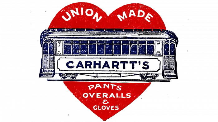
The debut emblem depicts a railway carriage with double-sided doors and hinged steps. It is painted realistic – with wheels, fasteners, windows, and a massive sloping roof. The car is in the background of a large red heart. There are several informational inscriptions: at the top – “Union Made” on each half of the heart, and at the bottom – “Pants Overalls & Cloves” at its tip. The company’s name takes center stage – along the carriage wall, under the windows. It is written in chopped type. The logo’s main colors are dark blue, red, and white.
1940s – 1970s
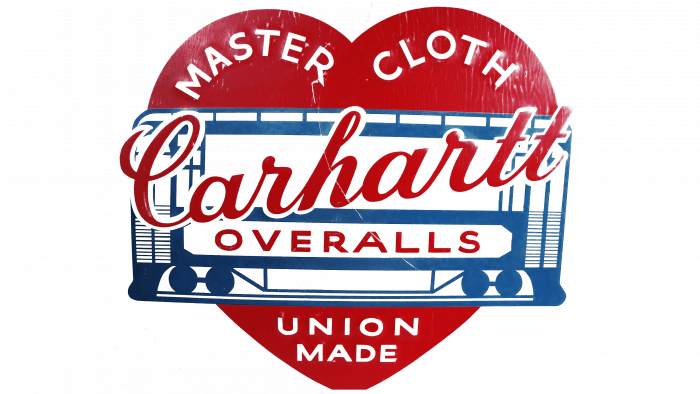
During the redesign, the text part was rearranged. Above appeared the phrase “Master Cloth,” in the center – “Carhartt Overalls,” below – “Union Made.” The developers highlighted the trademark name in coherent italics and placed it diagonally. Changes took place in the color palette: the authors of the logo lightened the blue by several tones and, on the contrary, darkened the red, adding a purple tint to it. They also corrected the car and made its contour of horizontal and vertical strips of different lengths. The wheels have become schematic and look like large blue circles (two on each side).
the 1970s – today
The logo of this trademark consists of an icon and a wordmark under it. The brand name is in unique lowercase letters with small curves and short strokes. The different elements from which the text symbols are formed show the company’s working direction since, in shape, they resemble tools or parts of various mechanisms.
Both “t” look like a welding electrode holder with an electrode, “r,” and “c” look like straight and bent pipes, and “h” looks like a cab of special equipment – a high-rise crane or heavy-duty transport. In some, the vertical stripes are separated from the horizontal segments, emphasizing the concept of working mechanisms and building materials.
The graphic emblem consists of a single piece in a rounded wave-like shape. This design gives it movement since dynamics are hidden in the image. The beginning of the “wave” is wide, and the end is narrow, with a large dot at the top. A white crescent in the negative space is visible on the right side, which forms this point. To be always recognizable, Carhartt does not change or adjust the logo.
Carhartt: Interesting Facts
Carhartt, Inc., started by Hamilton Carhartt in 1889 in Detroit, Michigan, is an iconic American clothing brand known for its durable and practical workwear. Originally made for railroad workers, the brand has expanded its appeal to a broader audience, including urban fashion fans.
- Early Days: Hamilton Carhartt began with just two sewing machines and five workers, focusing on making strong work clothes for railroad workers. The brand’s commitment to quality and durability has never wavered.
- Proudly “Union-Made”: Carhartt has a long history of producing “union-made” goods in the USA, showing its dedication to American craftsmanship and fair labor.
- Carhartt WIP: In the 1990s, Carhartt launched Carhartt WIP for the European market. This line blended workwear with urban style, appealing especially to the streetwear scene.
- Iconic Products: Famous items like the Chore Coat, Duck Pants, and Acrylic Watch Hat have become favorites beyond traditional workwear, loved for style and functionality.
- Cool Collaborations: Carhartt has partnered with brands like Nike and APC, merging workwear with fashion and expanding its reach.
- Broad Fanbase: While still popular with workers, Carhartt has also become a staple among skaters, hip-hop artists, and urban fashion enthusiasts, showing its wide-ranging appeal.
- Sustainability: Carhartt is working on being more environmentally friendly, using sustainable materials, and saving water.
- Celebrity Wearers: Even without focusing on celebrity endorsements, many famous people wear Carhartt, adding to its cool factor.
- Giving Back: The Carhartt Foundation supports community projects and nonprofits, underscoring the brand’s social conscience.
- Symbol of Authenticity: Carhartt represents realness, resilience, and the dignity of hard work, appealing to people as a mark of personal identity and style.
From its Detroit roots to global recognition, Carhartt’s story is one of adaptability, quality, and universal values, making it a significant and respected brand in various walks of life.
Font and Colors
The lowercase word has an original font—modern, innovative, and geometric—but without sharp corners or protrusions. Almost all the letters are smoothed and streamlined to resemble a Conradi or Controller Four typeface with minor tweaks. The color scheme in the Carhartt brand emblem is stable and usually consists of black (lettering), yellow (wave), and white (background).
FAQ
What does the Carhartt heart logo mean?
The heart-shaped logo, known as the “Car in the Heart,” embodies the brand’s core values and philosophy. It is a visual identifier that reflects the company’s commitment to its employees and consumers and the innovative spirit of its founder, Hamilton Carhartt.
Hamilton Carhartt strongly advocated for workers’ rights and dedicated himself to improving their lives. This emblem represents the values and heritage of Hamilton Carhartt, ensuring that the brand remains true to its founding principles while continuing to grow and evolve.
Is Carhartt a luxury brand?
It is not a luxury brand, but its influence and recognition in the luxury fashion industry are significant. The brand’s genuine appeal and high-quality products have allowed it to expand beyond its workwear roots and become a modern fashion staple. It is famous for its durable, practical, and high-quality workwear. Over time, its image has evolved, creating a unique place in a fashion that combines functional workwear with stylish clothing. The brand’s ability to inspire luxury fashion while staying true to its roots demonstrates its exceptional place in the industry.
What does the Carhartt symbol mean?
The symbol has a distinctive wave-like design that reflects the brand’s values. Inspired by the cornucopia, an ancient symbol of prosperity and nature’s bounty, the logo aligns with the brand’s commitment to providing high-quality, reliable workwear.
The wave in the logo is visually striking and suggests a continuous flow of benefits and positive results that the company provides to its users. It forms the letter “C” to represent the brand name. This design choice ensures the logo is meaningful and functional, making it easily recognizable and directly associated with the brand. Its simplicity and elegance make it stand out, resonating with longtime customers and new generations alike. Customers recognize the wave logo as a sign of quality, knowing it represents a brand with over a century of experience producing durable, reliable workwear. This trust is crucial to maintaining customer loyalty and expanding the brand’s reach.
What is the slogan of Carhartt?
Founded by Hamilton Carhartt, this family-owned company is based in Dearborn, Michigan. The brand’s slogan, “Recycle ’em All,” demonstrates its commitment to creating durable, reliable workwear for hardworking people. Known for its quality and functionality, the brand has earned a strong reputation for clothing that withstands harsh conditions. This commitment has made it a name trusted by workers in many industries.
What is Carhartt known for?
The brand is known for its workwear, including practical overalls, fire-resistant suits, and durable jackets. It offers vests, jeans, and shirts and designs clothing for anglers and hunters. The brand’s reputation is built on the durability and functionality of its products, making it a popular choice for reliable performance and outdoor gear.

