


 Barney Logo PNG
The Barney logo delightfully represents the brand’s commitment to fostering imagination, fun, and learning among young children. Often, the logo includes an illustration of Barney himself, the jolly purple Tyrannosaurus Rex. This iconic character, with his broad, warm smile and inviting, friendly eyes, reinforces the brand’s message of fun, friendly learning, and imagination.
In some versions, a subtext like “And Friends” may highlight the sense of community and friendship central to the Barney franchise’s messaging.
The Barney emblem embodies joy, friendship, and education through creative play. It is recognizable to many children and reflects the dinosaur’s joyful, friendly spirit, which comes to life through the power of children’s imagination.
Barney began in 1987, when Texas teacher Sheryl Leach started developing educational videos for her young son. She noticed his interest in dinosaurs and wanted a warmer, more playful format than the children’s programs she had seen. The character was first imagined as a teddy bear, then became a friendly purple Tyrannosaurus after Leach discussed the idea with her children.
In 1988, Sheryl and Phil Leach founded Lyons Partnership, later known as Lyons Group, to develop the project. The first home videos, Barney and the Backyard Gang, were sold directly to parents and day-care centers. Still, early sales were slow, and production costs were high. A turning point came in 1991, when the daughter of a Connecticut Public Television program manager found one of the tapes in a store, prompting discussions about a TV version.
Barney & Friends debuted on PBS Kids in 1992 and targeted preschool children under five. The show used short lessons, songs, dancing, and a plush character brought to life. Its “I Love You” song became closely tied to the program. Merchandise followed in 1993, and by 1994 the character’s reach was being compared with Mickey Mouse’s popularity. Barney’s Great Adventure was released in 1997, the same year related product sales passed $1 billion.
The 2000s brought stronger competition and changing viewer habits. The show was updated in 2006, and HIT Entertainment later announced the end of new episodes in 2009. However, reruns stayed on PBS until 2017. Barney Live in Concert: Birthday Bash! toured in 2011. In 2018, Mattel announced plans to revive the character through new screen projects and products.
Meaning and History
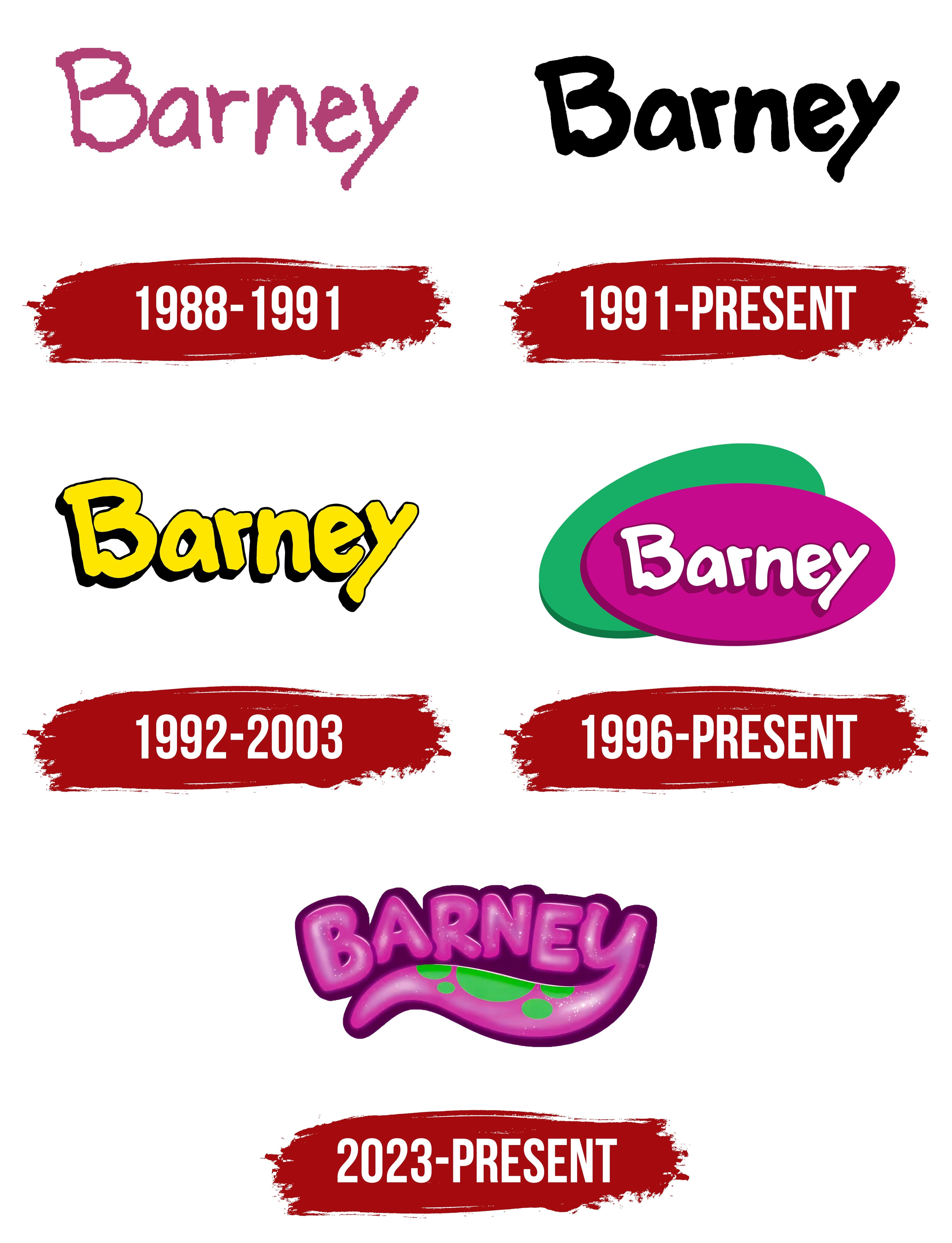
The animated toy has evolved into a whole franchise. Barney has been featured in videotapes and has launched a children’s TV show and a full-length film. A separate character logo has been created for each event. However, the common basis for most emblems was the first handwritten inscription conceived by the series’ creators. The inscription’s beginning and end have a multidirectional slope, evoking a sense of harmony and coziness that arises around the soft, plush hero. This approach was maintained in every rebranding, emphasizing the dinosaur’s individuality.
What is Barney?
Sheryl Leach’s franchise is about a toy dinosaur. A friend to small children, Barney teaches toddlers in an easy, playful, and musical way. For a long time, the character was voiced by Bob West. David Joyner performed in the hero’s costume. The show aired on PBS and was intended for children ages 2-5.
1988 – 1991

The Barney & the Backyard Gang video series began the character’s story. It ran from 1988 to 1991 in separate episodes, each with its own title. The character’s logo is verbal and fully reflects the dinosaur’s characteristics.
- The letters of the inscription seem to be made of soft plush with protruding fluff. The structure is reminiscent of the fabric from which the toy is sewn.
- The purple color indicates the revived cartoon hero’s coloring.
- The logo received the main character’s name, which Sheryl Leach invented while entertaining her son.
The tilt of the letters in different directions echoes the idea of swaying, movements, and songs in time with the music.
1991 – today

1991 marked a turning point in the history of the singing hero. After renting a video about Barney’s adventures, the head of public television saw the potential of the topic and suggested that the franchise creator air the dinosaur show on television.
The draft version of the logo is dark and completely repeats the first one in terms of letter shape and font. However, the symbols are bolder as the audience coverage increases. The glyphs have lost their roughness and appear clear on the screen.
The emblem is used periodically across different franchise products.
1992 – 2003

The character’s popularity led to the launch of the full-fledged long-term TV show Barney & Friends. A more childlike logo was developed for the singing dinosaur. Voluminous, clear yellow letters conveyed the idea of a revived toy that walks and sings. The shade reflected the mood of clips with games and laughter. The color also embodied the lightness of the content, learning in play.
1996 – today
The beloved hero franchise has changed owners. Lyons Group merged with Lyrick Company to form Lyrick Studios. The change led to the filming of a large movie about the dinosaur’s adventures: Barney’s Great Adventure. The hero’s logo also changed.
The new emblem consists of two intersecting ovals with the character’s name. The raspberry and green figures tell about Barney’s color palette. The purple-raspberry color is the main one in the character’s color scheme. The dinosaur has a green oval spot on its belly. An oval shape reflects a special, friendly children’s community filled with love, adventures, and music. The shape also points to an egg, around which the story revolves in the film adaptation.
2023 – today
The “Barney” logo is just as bright and cheerful as the popular children’s show it represents, perfectly capturing its essence. The logo’s visual style attracts children’s attention while conveying a sense of fun and carefree play.
The logo features the name “Barney” in bold, rounded letters, set in a vibrant, eye-catching pink with a gradient that adds depth and softness. This color symbolizes joy, friendship, and love, the key themes the show aims to convey to its young audience. The pink hue is closely associated with the main character, Barney, the friendly and playful purple dinosaur beloved by children worldwide.
The friendly typography reflects the character’s playful and affectionate personality. The font is smooth and rounded, with shiny elements that give it an almost “chewy” appearance. These shapes evoke associations with children’s toys and sweets, making the logo appealing and memorable for kids. The letters have a slightly raised, three-dimensional look, making the text stand out even more.
A wavy line extends from the foot of the last letter, “y,” decorated with round green spots. The line is reminiscent of Barney’s tail and symbolizes a connection to the main character. The green, combined with pink, contrasts with the show’s fun, lively nature.
The emblem reflects a time when “Barney & Friends” was at the height of its popularity, becoming a cultural phenomenon in the 1990s and early 2000s. The show rapidly expanded its audience and solidified its place among children’s programs during this period. With its vibrant colors and friendly design, the logo became an iconic symbol of childhood, embodying all the positive emotions children associate with the show.
Font and Colors
Purple, green, and white are the primary shades. Barney’s art director, Jamie Ruth Conner, selected them because they were popular when the character debuted.
- Purple is the color of self-awareness, soul, and emotions. In early childhood, children learn to identify themselves and form a perception of the world. Information is encrypted in the mind at an emotional level. Hence, the shade perfectly reflects the peculiarities of a child’s psyche.
- Green is the color of youth, growth, and development.
- White novelty. Each episode contains an important, bright message that should stick in children’s minds. Each episode means new adventures and discoveries.
The inscription’s font is unique and hand-drawn to convey the dinosaur’s individuality.