


![]() Barstool Sports Logo PNG
Barstool Sports Logo PNG
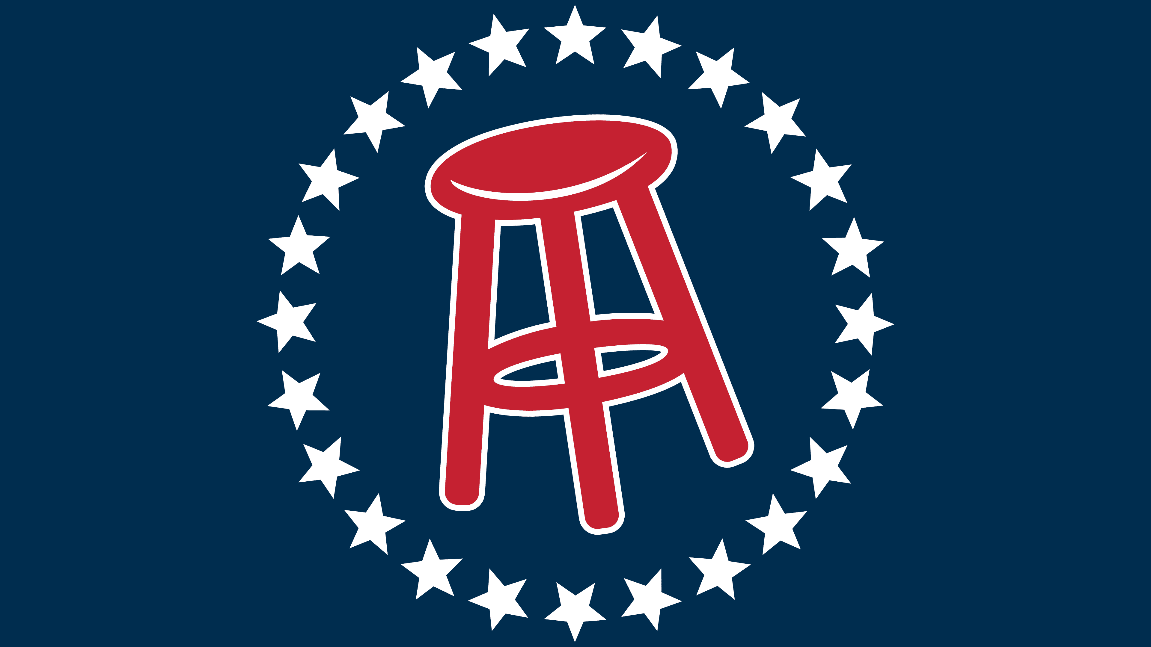
The brand’s feature is a red chair surrounded by stars. The explanation for this is quite prosaic: the web service is related to sports. But not directly; it is an entertainment channel with sports betting and predictions, so the Barstool Sports logo is exactly that.
Barstool Sports began in 2003, when David Portnoy left the IT research firm Yankee Group and launched a free four-page sports and betting paper in Milton, Massachusetts. He had grown frustrated with how major outlets such as ESPN covered gambling. Portnoy wrote the copy, sold ads to local bars and casinos, designed the pages, and handed out about 2,000 copies twice a week around Boston.
The early business was unstable. In 2004, Barstool filed for bankruptcy because its printing and distribution costs exceeded ad revenue. Portnoy kept it alive by cutting expenses and leaning into a blunt, barroom editorial tone aimed at young male readers. Friends wrote under fake names, while Portnoy used the persona El Presidente.
In 2007, Barstool moved online, and by 2010, social media helped the audience grow. Writers such as Kevin “KFC” Clancy and Dan “Big Cat” Katz joined in the 2010s. Against ESPN and Bleacher Report, Barstool built its voice around informal sports talk, bets, jokes, and personality-led content. Portnoy’s “One Bite” pizza reviews, launched around 2015, became a separate internet brand.
The Chernin Group bought a minority stake in 2016, valuing Barstool at roughly $10-$15 million and helping move the company to New York. Pardon My Take became a major podcast hit that same year. In 2020, Penn National Gaming bought 36% for $163 million at a $450 million valuation, then later took full control. The fit proved difficult. In August 2023, Penn Entertainment sold Barstool back to Portnoy for one dollar.
Meaning and History
Since its inception, Barstool Sports has evolved from a print publication distributed to gambling enthusiasts at offices and residential addresses in Central Boston to a powerful interactive resource. Taking a big leap forward in just four years, Barstool Sports went online and immediately gained national popularity, not just among male audiences. Live videos, podcasts, and blogs featuring top youth celebrities, humor, and the ease of presenting information have multiplied the reach of the target audience.
Today, everyone knows the core team of news anchors, entertainment programs, including the most popular El Pres, Big Cat, KFC, KMarko, and PFTCommenter. An army of bloggers is doing its part to raise the media resource’s popularity. Unique and original content presented 24 hours a day, 7 days a week, from Pardon My Take and KFC Radio hits to the daily Rundown video has made the resource consistently sought after by many Americans.
Given the company’s short history, it can’t “boast” about many changes to its logo. Today, the essence of Barstool Sports is symbolized by the object that bears its name: the barstool. And this is not done in vain. Exactly bars are among the most frequented by Americans, where they kill their free time, share news and gossip, socialize, and, of course, watch their favorite sports games and championships. Barstools are also a common feature in the interiors of bookmakers’ offices, where sports betting, betting, and payouts of winnings take place. Therefore, its use in the brand sign is not only a sign of courage but also the embodiment of the spirit and meaning of a media resource, which presents itself as a variant of a land bar and the same bookmaker’s office, but in an interactive version. At the same time, this approach demonstrates an attitude toward the presentation of information, with humor and lively communication, and no restrictions.
The image of the circle demonstrates the company’s desire for constant development, as it symbolizes dynamism, movement, and absolute content. The stars themselves are not just a tribute to the original design. This indicates that the company is always surrounded by stars – famous media personalities, sports stars, culture, advertising, art, and politics. And it has to do not only with the information presented to users but also with the direct involvement of many of them in Barstool Sports, which contributes to the content’s attractiveness and originality.
Font and Colors
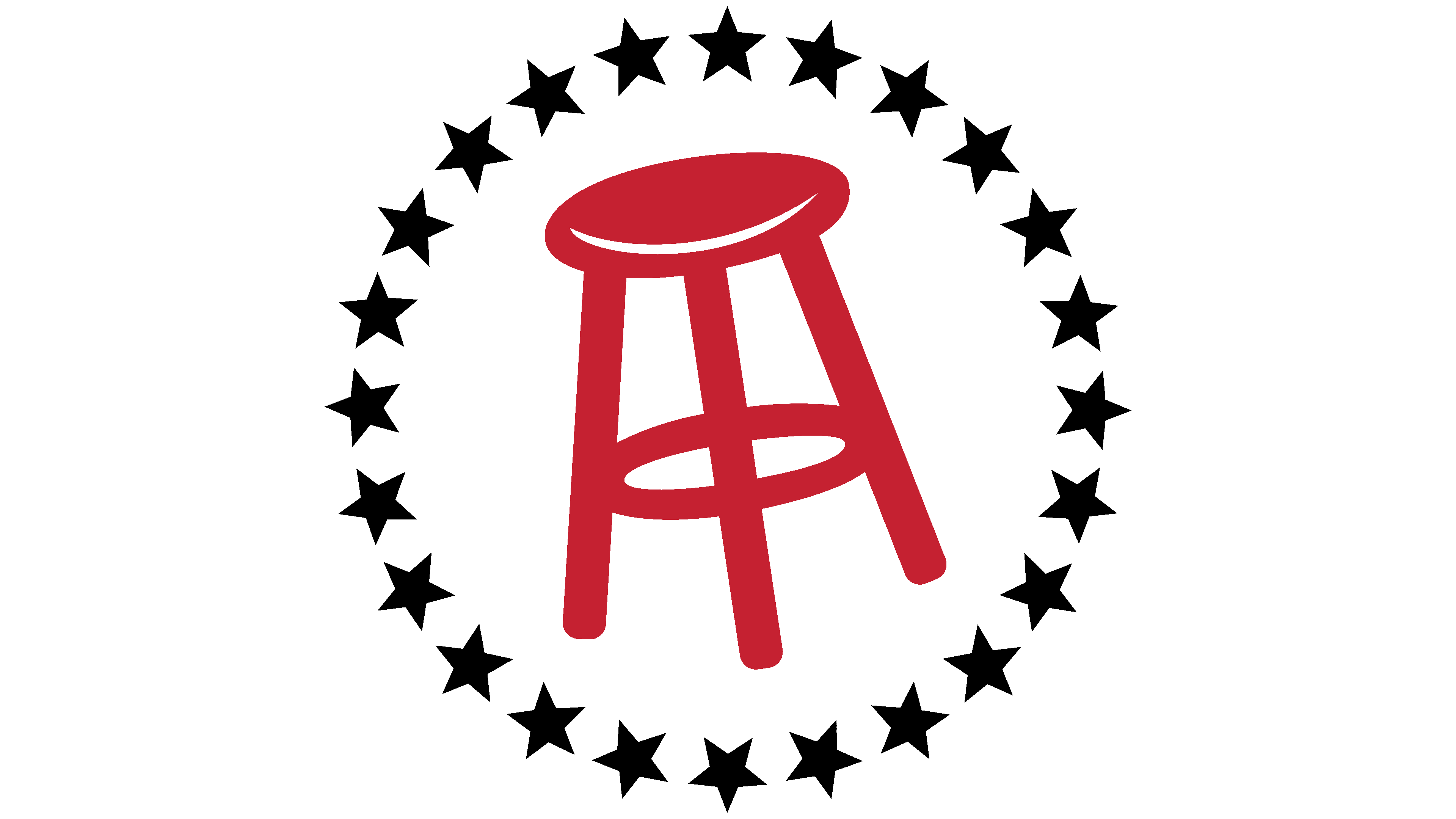
In detail, the stool symbol in the modern version is painted bright red. Against the black fill, it stands out sharply, immediately drawing the eye to this central sign of the logo’s composition. The chair is framed by a circle of identical black stars, evenly spaced. Do not load the emblem; move the elements of the emblem text, including the company name, to the right of the sign, with strict adherence to the image’s upper and lower limits. The letters of the text maintain a consistent style. They are made in black and stars, which signify the unity and commonality of the company’s goals and objectives with those of its guests, participants, and its team.