


![]() Bass Pro Shops Logo PNG
Bass Pro Shops Logo PNG
With bait and rods from the company’s stores, the fish will jump on the hook itself, the Bass Pro Shops logo promises. The emblem is highly thematic and accurately conveys the company’s direction. The sign is complemented by the pleasure of doing your favorite hobby.
Bass Pro Shops is a privately owned outdoor, fishing, and hunting store owned by Johnny Morris. It is represented by 200 sales pavilions in the U.S. and Canada, visited by up to 200 million customers a year. The stores feature distinctive designs in five styles, from outdoor nature with trees and waterfalls (Outdoor World) to outposts (Outpost), swamp and river motifs (Stick Marsh and White River Outpost), and sporty options (Sportsman’s Center). All of the stores have giant aquariums, the most famous of which, Wonders of Wildlife, is in Morris’ hometown. The outlets feature in-store merchandise from White River Marine Group (boats), Offshore Angler (fishing products), and RedHead (clothing and gear). The empire generates about $6.5 billion in revenue.
The giant’s story began with a small shelf of merchandise in the basement of his father’s liquor store. At the age of 21, it was a good deal for Johnny Morris, who was seriously into sport fishing. From every trip to competitions, he brought trollers and bait and sold them to local fishermen. The young businessman used his profits to open businesses that produced boats and equipment for tourist sites and nature preservation. Therefore, the first independent Bass Pro store did not appear until nine years later (1981). It gradually grew into a large business consisting of manufacturers, stores, cafes, and museums that teach Americans to admire, love, and cherish wildlife.
Meaning and History
![]()
As Wall Street Journal journalists accurately noted in the headline of one article, many who wear a Bass Pro Shops cap have never even held a fishing rod. And indeed, the image of a fish with an open mouth has become a cult symbol of America, especially famous in Missouri, where the company is based.
Both the retail chain of stores and their original logo are the brainchild of billionaire businessman John L. Morris. True, at the beginning of his career, he barely made ends meet: he had to open his first outlet in a small closet in his father’s liquor store (called Brown Derby) and borrow 10,000 dollars. The company’s founder created a logo for her in the early 1970s. Of course, a lot has changed since then: the fish has realistic shadows, and its base has a texture. But it’s essentially the same sign inspired by the largemouth bass.
Because Bass Pro Shops was historically associated with the Brown Derby, John L. Morris wanted a derby hat, also known as a bowler hat, to be worn on the fish’s head. In the course of evolution, this element disappeared. The application, filed with the United States Patent and Trademark Office, notes that the hatless, multicolor perch emblem came into use on at least July 31, 1997.
What is Bass Pro Shops?
American retailers owned by privately held BPS Direct, L. L. C., offer a range of outdoor, hunting, and fishing products in stylized pavilions. Today, there are about 200 outlets with 40,000 employees. The company’s revenue is $6.5 billion.
1971 – 1972
![]()
The first logo was devised for Morris’s retail “enterprise” in the basement of his father’s store, where he was assigned several shelves. The logo shows a perch, a fish that the businessman hunted professionally for five years. In America, perch is called bass. And it was bass fishing products that Morris originally sold. The prefix Pro indicated products for professional sport fishing.
Although the list of products later expanded greatly, the image of bass and the name of the stores remained the same.
The logo was notable for its simplicity and brevity. In the yellow circle of the emblem at the head, the owner’s name appeared in capital letters. In the center, below, was a picture of a curved, mouth-opening fish. It wore a brown Brown-Derby pot (named after Morris’s father’s liquor stores). On the sides of the cauldron was written the very name, Brown Derby. And at the bottom, in large red letters, is the name Bass Pro Shops. Below are small letters: Headquarters in Springfield.
The logo provided a complete picture of the firm’s merchandise, its location, and its owner. Well-designed accents were added to the perch and the outlet name. Overall, the logo resembled a fisherman’s medal. This association was reinforced by the brown trim and the fish image, which were consistent with those used by the Bass Anglers Sport Society.
1972 – 1977
![]()
Fishing and hunting items became more popular than my father’s wine and liquor merchandise. They were still sold in the backyard, but no longer needed my father’s store name on the emblem. So the logo was redesigned. A hint of Brown-Derby was removed from it.
Overall, the sign stretched out and took on an oval shape. The perch image was moved to the left, and the fish replaced the logo border with its own curve. Inside the medallion was the name “Bass Pro Shops,” already registered as a trademark, along with a special badge. Below is a small print that served as a reference for the Springfield location.
The emblem was black and white, which was closer to the name of the bass depicted on the logo, as it belongs to the black bass family (Micropterus salmoides). The store was still in the shadow of his father’s shop, as accurately reflected in the black-and-white scale.
1977 – 1984
![]()
The businessman was in no hurry to expand the retail chain. His efforts focused not just on selling other people’s goods but also on organizing his businesses. By 1978, the first shipyard to build Tracker Boats opened. In addition, Morris was preparing to open his first independent store. These ideas of promotion and active development were reflected in the emblem’s renewal. It changed to red with a light gray background. The reference to the headquarters location was removed from the logo since the boat manufacturer was located in another city.
The light grey and red created a nice contrast and conveyed energy and confidence.
1984 – today
![]()
In 1981, the first full store opened in Springfield. Once the outlet and businesses began generating income, Morris diverted the funds to his core mission of conservation. He bought land and developed the Big Cedar Lodge resort complex, which includes caves, a conservation museum, and a nature park. The idea of closeness to nature is reflected in the updated logo, which has acquired more natural colors.
The perch is reminiscent of one of the stuffed animals exhibited in the businessman’s stores. It was made in green, red, black, and white colors (in nature, the fish has a green tint to its scales and a darker pattern on the sides). The background of the logo went back to yellow, and the company name to red.
Yellow corresponds to the emblem of the U.S. Fish and Wildlife Service. Red is the color of blood and attention to wildlife issues.
2004 – 2010
![]()
The businessman continues to devote substantial funds to protecting nature, turning his stores into oases. He introduces visitors to the animal diversity and beauty of the wild world. The largest wildlife sanctuary was opened through his efforts, and he contributed to conservation organizations. The stores sell gear, but they also offer classes on how to stay in the wilderness.
As a result of his work, Morris received the Roosevelt Conservation Award in 1990. This recognition is reflected in the logo. It became even more natural. In its latest incarnation, the logo has become three-dimensional, and the fish’s coloring closely resembles that of a living fish. The letters of the name also cast shadows and seem three-dimensional. They and the black trim are stylized as scales. The lettering and the perch seem to rise above the yellow background. It demonstrates the grandeur of the company’s accomplishments.
In 2017, Morris absorbed its biggest competitor, Cabela’s. And today, it is the most unique and authentic fishing and hunting store. It continued its mission and was awarded the Audubon Medal in 2019.
2010 – today
![]()
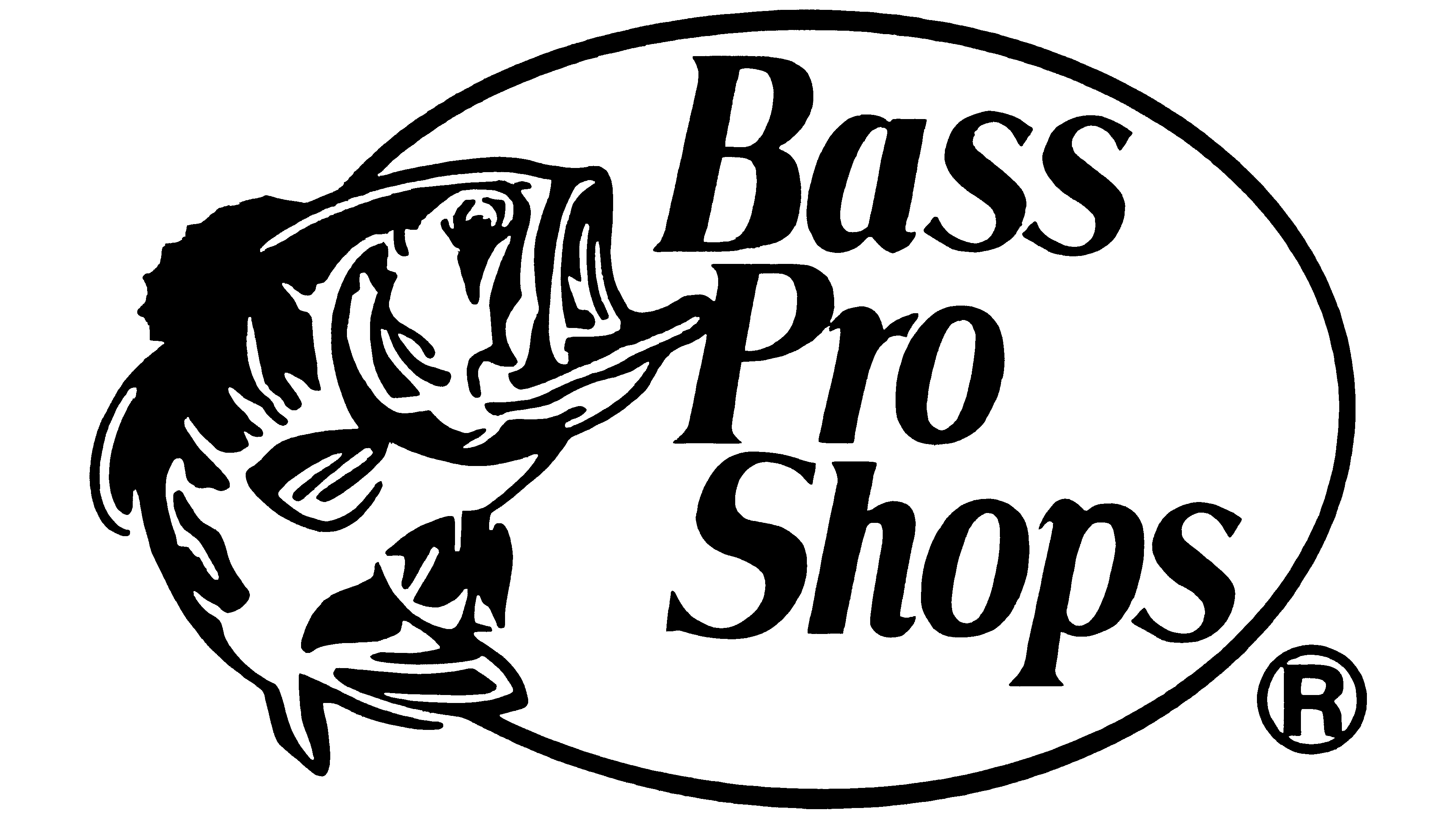
This is an improved version of the Bass Pro Shops logo, with more expressive shadows and a balanced arrangement of elements. The designers moved the inscription slightly lower so that it does not touch the dark frame and is centered within the orange oval. The letters have gotten smaller, but it’s hardly noticeable because the font hasn’t changed. The company has retained its iconic symbol, on which its recognition and popularity depend. A largemouth bass, a three-dimensional inscription, and the base’s wood grain suggest that the emblem is stylized as an old tavern sign. But this impression is misleading because the brand is not associated with the food industry.
Font and Colors
The primary colors of the emblem have long been yellow, red, and green.
- Yellow is associated with sunny days, good moods, and blooming nature. It suggests prosperity and profit.
- Red is the color of leadership (Tracker boat #1 in sales in America), blood, warning, caution, and care.
- Green is the color of nature, bodies of water, fish, and camouflage clothing.
The lettering font is a stylish serif, Accia Moderato Bold Italic.