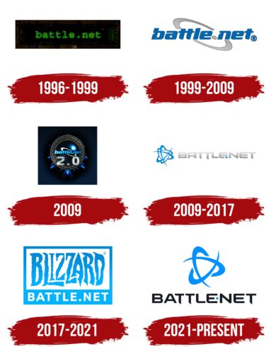
The Battle.net logo, with its simple yet distinctive design, encapsulates the platform’s core values and mission.
The logo consists of a symbol that visually combines a stylized “B” for Blizzard, the parent company, and the imagery of a ‘net,’ symbolizing the internet or network. This unique combination reflects Battle.net’s focus on online connectivity and multiplayer gaming, emphasizing the platform’s role as a hub for online gaming communities.
The circular design of the logo can also be interpreted as a global symbol, reflecting the worldwide reach of the Battle.net platform and its inclusive, international gaming community. The circular shape signifies unity, togetherness, and a sense of being part of a whole, which aligns with Battle.net’s commitment to fostering strong gaming communities.
The logo’s blue color has dual symbolism. Firstly, it is closely associated with the parent company, Blizzard Entertainment, maintaining brand consistency. Secondly, blue is often linked to trust, loyalty, and confidence, signaling Battle.net’s commitment to providing a reliable and quality service to its users.
In summary, the Battle.net emblem communicates the platform’s commitment to bringing people together through online gaming, offering a dependable and quality gaming experience while highlighting its affiliation with Blizzard Entertainment.
Battle.net: Brand overview
| Founded: | December 31, 1996 |
| Founder: | Blizzard Entertainment |
| Headquarters: | United States |
| Website: | blizzard.com |
In 1996, a new chapter in online gaming began to unfold. Battle.net, conceived by the creative minds at Blizzard Entertainment, sprang into existence. This online gaming platform, headquartered in the United States, set out on a mission to create a virtual gathering place for gamers worldwide.
From the get-go, the brand focused on providing a seamless and integrated gaming experience. It allowed players to connect, communicate, and engage in multiplayer games with ease. With popular Blizzard titles like Warcraft, Diablo, and StarCraft available, the platform quickly garnered a robust user base.
One of the platform’s significant innovations was its comprehensive approach to online gaming. It wasn’t just a platform to play games, connect with fellow gamers, engage in competitions, and even build entire communities. It became more than just a gaming platform – it was a social hub for gamers.
As digital technology evolved, so did the brand. Recognizing the changing needs of its users, it implemented various updates and features to enhance the gaming experience. From secure login systems to digital rights management, the brand stayed ahead of the curve, making sure its users had the best gaming experience possible.
Meaning and History
The brand identity of Battle.net revolves around community, connectivity, and high-quality gaming experiences. It stands as a testament to Blizzard’s commitment to creating shared gaming experiences, enabling players worldwide to connect, compete, and cooperate.
The Battle.net logo, featuring a stylized representation of a ‘B’ and a ‘net’ incorporated into a circular design, reflects this identity. The circular design can be interpreted as a symbol of unity and inclusiveness, embodying the platform’s global community of players. The stylized ‘B’ signifies the brand’s connection to Blizzard Entertainment, while the net imagery is indicative of the platform’s focus on internet-based gaming.
Moreover, the sleek, modern design of the logo aligns with Battle.net’s reputation for cutting-edge technology and innovative gaming experiences. The blue color palette, commonly associated with trust and dependability, speaks to Battle.net’s long-standing reputation in the gaming community.
With a foundation built on fostering community and delivering top-tier gaming experiences, Battle.net has remained at the forefront of the online gaming industry. Its brand identity celebrates the power of connectivity in gaming, showcasing its enduring dedication to its global community of players.
What is Battle.net?
Battle.net, launched by Blizzard Entertainment in 1996, is an iconic online gaming platform that has played a significant role in shaping the landscape of online multiplayer gaming. It serves as the central hub for Blizzard’s highly acclaimed games, including World of Warcraft, Diablo, Starcraft, and Overwatch, among others.
1996 – 1999
1999 – 2009
2009
2009 – 2017
2017 – 2021
2021 – today
Battle.net color codes
| Dodger Blue | Hex color: | #0290ff |
|---|---|---|
| RGB: | 2 144 255 | |
| CMYK: | 99 44 0 0 | |
| Pantone: | PMS 285 C |
| Eigengrau | Hex color: | #191c25 |
|---|---|---|
| RGB: | 25 28 37 | |
| CMYK: | 32 24 0 85 | |
| Pantone: | PMS Black 6 C |


