


![]() Bauer Media Group Logo PNG
Bauer Media Group Logo PNG
A serious media holding must show itself as a reliable and trustworthy organization. Therefore, the Bauer Media Group logo is made in the appropriate style. Strict geometry, clear lines, and balanced colors characterize the emblems.
Bauer Media began in 1875, when 23-year-old lithographer Johann Andreas Ludolph Bauer opened a small print shop in his Hamburg apartment near the Elbe bridges. The first work was modest, mainly business cards. He also published Rothenburgsorter Zeitung, a free advertising paper for nearby districts. By the early 20th century, the business had grown from one worker to 20.
In 1903, Bauer’s son Heinrich Friedrich Matthias Bauer joined the company. J. A. L. Bauer & Sons added a typesetting machine, a high-speed press, a stationery shop, and took over Rothenburgsorter Zeitung. In 1905, Heinrich launched the sports paper Extrablatt. In 1926, Rundfunk-Kritik, a magazine about radio broadcasting, was founded, and its weekly circulation soon surpassed 500,000.
Alfred Bauer, the third generation, entered the business in 1918 and later expanded through major acquisitions. In 1961, the company bought Neue Post. It then moved into television magazines with TV Hören und Sehen. In 1968, Bauer acquired BRAVO, a youth magazine that became one of Germany’s best-known titles. These purchases made the company a leading German magazine publisher.
Under Heinz Heinrich Bauer, the group expanded abroad. Woman’s World launched in the United States in 1981, Bella entered Britain in 1987, and Take a Break followed in 1990. In 2008, Bauer bought Emap for £1.14 billion, gaining KISS, Magic, and Kerrang!. Yvonne Bauer took over in 2010. Later deals included ACP Magazines in 2012, Absolute Radio in 2013, SBS in 2015, Communicorp in 2021, and Media Capital’s Portuguese stations in 2022. In early 2025, Bauer entered outdoor advertising through Clear Channel Europe-North.
Meaning and History
Initially, it was a family business that produced printed materials. It was a small printing house with few orders for a long time. The brand gained wide popularity much later when it began its global expansion. So, in 1981, he came to the USA and established a publication of Woman’s World magazine. Under his leadership, 13 magazines for different age groups were published in the United States. He also owns 16 thematic sites and five specialized publications in the American media space.
In 1987, the Bauer Media Group made its presence felt in the UK by launching Bella magazine. Now, it is among the top three largest English publishers. Gradually, the conglomerate expanded in this country, including Emap Radio and Emap Consumer Media in 2008. Each new acquisition is passed under the corporate logo and grouped by direction.
What is Bauer Media Group?
Bauer Media Group is a diversified company specializing in publishing, broadcasting, television, analytical comparison, and small- and medium-sized business management support. It was founded by Johann Bauer in 1875 and is now active in 17 countries. Its head office is located in Hamburg (Germany).
Currently, the German brand Bauer is widely known and has a presence in 17 countries. It has 11,000 employees, and its departments include marketing, distribution, postal, printing, television, and radio broadcasting. The international company owns 50 stations, 400 digital products, and 600 magazines. And their number is constantly growing, receiving the same blue and white markings. The trademark logo is minimalistic, so it is clear at first sight: a single space under one name, uniting several directions.
The Bauer Media Group’s visual identity combines graphics and text into a unified design that accurately represents the multimedia conglomerate. The first thing that catches your eye is a strict, deep-blue square close to a cobalt hue. It occupies the main area of the emblem and serves as a background for the first word of the company’s name, “Bauer.” The inscription is large and bold. All the letters in it are in capitals and painted white.
At the top right is a white triangle standing on a point. The right side of the geometric figure is separated from the square’s edge by a wide blue stripe. The same line is available at the top. Below is a residual fragment of the name – “Media Group.” It is typed in thin black characters, with a greater distance between them than in the first word.
Font and Colors
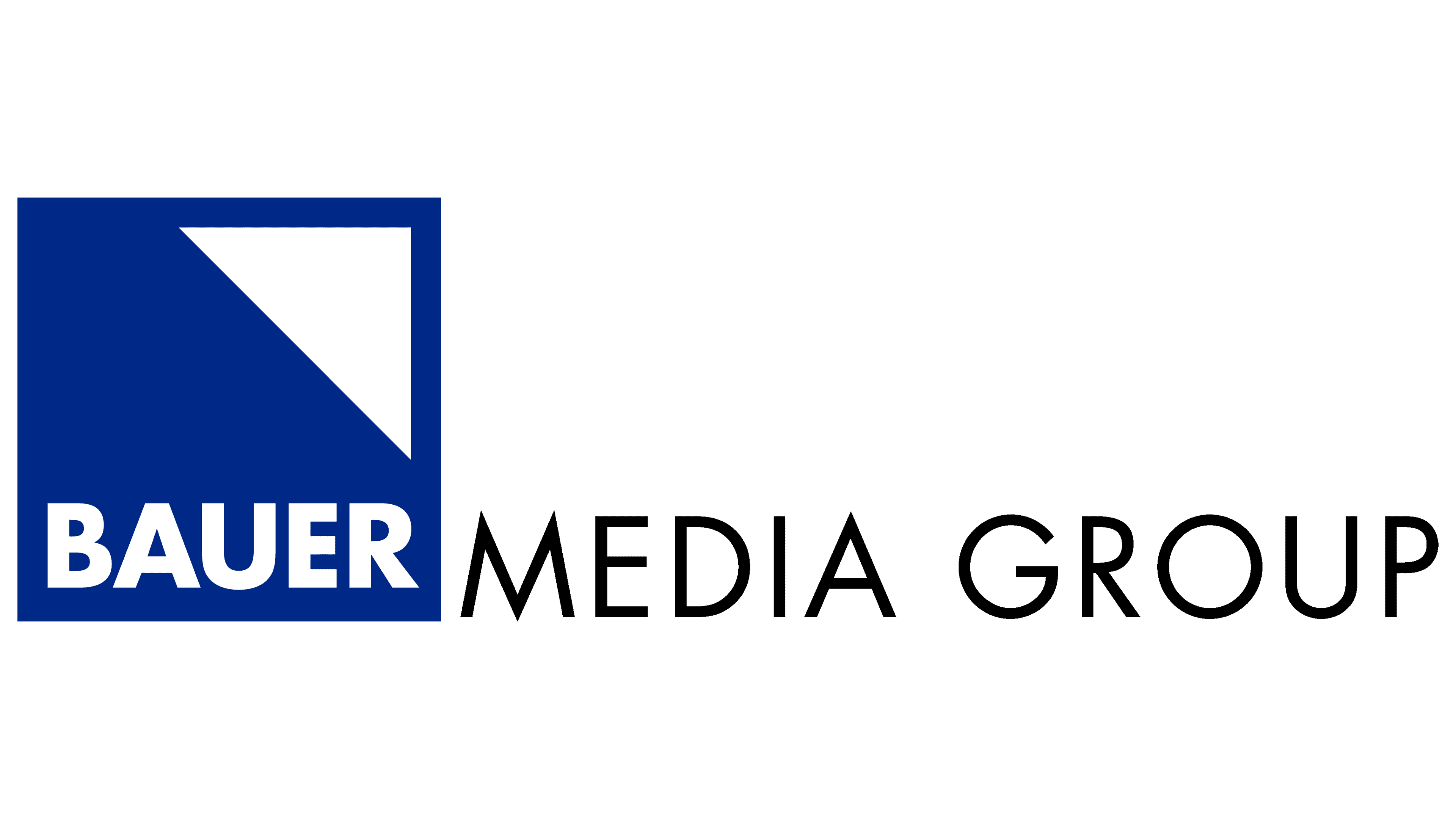
For its logo, Bauer Media Group chose two types of typefaces. The inscription in the square is made in a font identical to Limerick Serial Xbold, created by the graphic studio SoftMaker, a bold grotesque with a harmonious combination of angles and smooth curves. The text below uses a different style: a thin, elegant Limerick Serial Regular typeface from the same developer.
The corporate palette consists of cobalt (dark blue) and white (neutral background). In combination, they create a unique atmosphere of calm and confidence. The logo is also black: it is the bottom line of the German media company’s name.