 Bausch + Lomb Logo PNG
Eye care involves contact lenses, solutions, and other ophthalmic products used every day. Such products require precise manufacturing and compliance with medical standards. The Bausch + Lomb logo represents a company that manufactures contact lenses, eye care products, and ophthalmic solutions for vision treatment and correction.
Bausch + Lomb was founded in 1853 in Rochester by entrepreneurs John Jacob Bausch and Henry Lomb. The company began as a small workshop producing eyeglasses. Soon, it gained a position in the growing American optics market. During the Civil War in the 1860s, when supplies from Europe were cut off, the company expanded its production. During this period, it began manufacturing lenses, microscopes, and binoculars.
In 1876, the company introduced vulcanite frames. This made eyeglasses lighter and more affordable. By the end of the 19th century, Bausch + Lomb had become the largest optical goods manufacturer in the United States and began exporting products abroad.
During World War I (1914 to 1918), the company produced optical instruments for the army. In 1937, in cooperation with the U.S. Air Force, it created Ray-Ban Aviator sunglasses. In 1952, the Wayfarer model appeared, bringing the company commercial success.
In 1971, the company released soft contact lenses called SofLens. They were developed using Czech technology and represented an important step in the industry’s progress. In the 1980s, the company attempted to diversify its business. Later, it returned to its main field, optics.
In 1999, the Italian company Luxottica bought the Ray-Ban brand for $640 million. In 2007, the Warburg Pincus fund acquired Bausch + Lomb for $ 4.5 billion. After that, the company began restructuring and focused on ophthalmology.
In 2013, Valeant Pharmaceuticals acquired Bausch + Lomb. In 2018, the parent company changed its name to Bausch Health Companies. In 2022, Bausch + Lomb conducted an initial public offering on the New York and Toronto stock exchanges, raising about $ 630 million.
The company remains one of the largest global manufacturers of ophthalmic products. It supplies lenses, solutions, and surgical equipment to more than one hundred countries worldwide.
Meaning and History
What is Bausch + Lomb?
An international ophthalmic company headquartered in the United States, a global leader in the production of contact lenses, eye care products, ophthalmic medications, and surgical equipment. The business is divided into three segments: VisionCare (lenses PureVision, Biotrue ONEday, Ultra), Pharmaceutical (products for glaucoma and dry eye treatment), and Surgical (equipment for laser vision correction and intraocular lenses Crystalens, SofPort, Akreos). The company is known for innovation and a wide range of vision correction solutions.
1965 – 1978

The ampersand in the Bausch & Lomb name originated in an agreement between the 2 founders. In 1853, German immigrant John Jacob Bausch opened an optical goods store in Rochester, New York. He borrowed $60 from his acquaintance Henry Lomb to expand the business. The loan agreement required Lomb to become a partner if the company succeeded. The Bausch and Lomb surnames formed the company name, while the ampersand “&” represented their business partnership.
Early documents used the names J. J. Bausch, Bausch & Lomb Optical Company, and Bausch & Lomb Incorporated. Its legal forms changed as the business grew, while the founders’ surnames remained central to the name. The ampersand remained part of the logos and corporate name until the 2010 update.
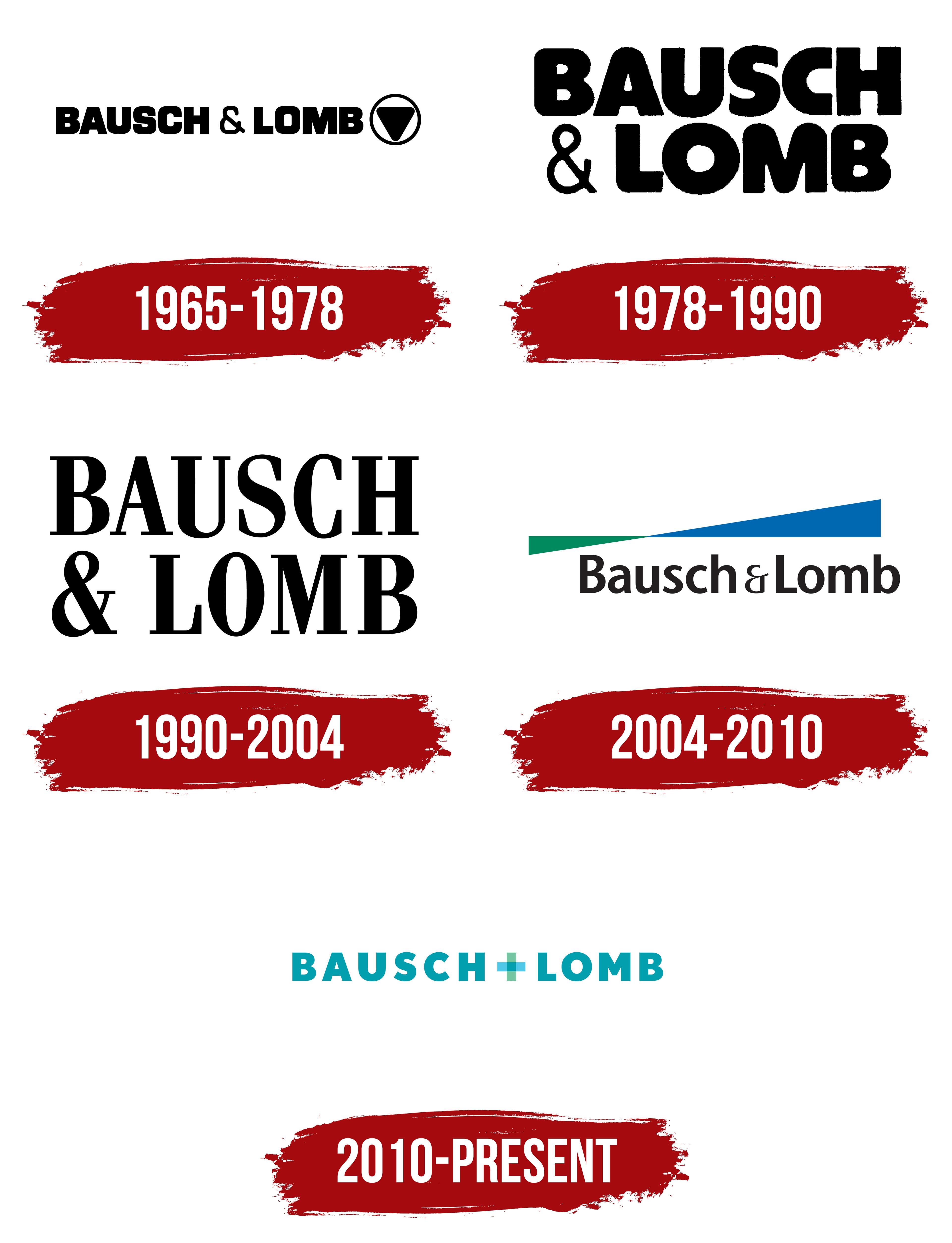
Bausch & Lomb introduced a logo on November 15, 1965, that remained in use until 1978. It consisted of the large words BAUSCH & LOMB and a circular emblem on the right. All components were black. The horizontal composition paired the company’s full name with a separate geometric figure, separated from the lettering by open space.
The name appeared in uppercase sans-serif letters. The wordmark used Eurostile, while the heavy strokes and condensed spacing gave it similarities to Impact and Compacta Extra Bold. The letters had even lines, elongated proportions, and narrow spacing. The dense type allowed the lengthy BAUSCH & LOMB name to occupy most of the logo.
The ampersand differed from the other characters. Its strokes were thinner, and its curves had a calligraphic quality. The contrasting style separated the conjunction from the surnames and recalled the partnership between Bausch and Lomb. The ampersand created a pause at the center of the wordmark and divided the 2 names despite the tight spacing.
A black circle containing an inverted triangle appeared on the right. Its point faced downward, and its 3 corners were rounded. Softened edges made the figure resemble a teardrop-shaped arrow. The triangle occupied most of the circle, leaving a narrow light band around it. The black wordmark, circle, and interior figure unified the logo into a single-color composition.
1978 – 1990
By October 1978, Bausch & Lomb had established a strong position in the contact lens market. The introduction of SofLens in 1971 supported the business’s growth. It became the first soft contact lens produced on a mass-market scale in the United States. The company’s expansion led to a logo update for packaging, instruments, and advertising.
The company name replaced the circular emblem. BAUSCH occupied the upper line, while LOMB appeared below. A large ampersand was placed before the lower word, filling the left side of the second line. The 2-line arrangement condensed the long name into an almost square block with similar height and width.
The wordmark used the Harry typeface. All letters were uppercase, with heavy strokes and rounded edges. Its dense proportions and soft contours resembled Cooper Black. Tight spacing connected the 2 lines, while their similar widths supported the compact form. The name occupied nearly the entire logo.
The ampersand used thinner lines than the surrounding letters. Its height matched the LOMB characters and maintained the lower line’s structure. The lighter weight separated the partnership symbol from the founders’ surnames while preserving its historical role in the Bausch & Lomb name. Its large size balanced the short LOMB word against the longer BAUSCH line.
The entire composition appeared in black. The 2-line layout suited contact lens boxes, optical instrument housings, and narrow advertising formats. In those applications, the nearly square block required less horizontal space than the 1965 version.
1990 – 2004
Bausch & Lomb introduced a logo developed by Lippincott & Margulies on March 1, 1990. The family name remained arranged across 2 lines. The heavy rounded letters from the 1978 version gave way to the tall Fenice serif typeface with thin cross strokes and heavy verticals. The separate emblem disappeared, leaving the wordmark to fill the entire logo area.
BAUSCH occupied the upper line, with & LOMB below. A large ampersand opened the lower line and nearly matched the letters in height. The 2 lines formed a compact, elongated block in which both surnames carried equal weight. The arrangement helped fit the lengthy name on packaging, instrument housings, and printed materials.
Fenice featured tall, narrow characters, thin horizontal strokes, and heavy verticals. The thickness variation resembled Bodoni and Didot. Fine serifs and elongated proportions gave the wordmark a slender appearance. Compared with the heavy 1978 version, the letters became lighter while retaining the established word order.
The ampersand was enlarged to nearly the height of LOMB. It occupied the open area beneath the beginning of BAUSCH and balanced the 2 lines. Its thinner strokes separated it from the large letters and preserved its historical role in the company name. The ampersand joined the 2 surnames within the shared block.
The entire wordmark appeared in black. The logo was used on contact lens packaging, eyeglasses, sunglasses, ophthalmic medications, and medical instruments. The unified family name worked across Bausch & Lomb’s consumer optics, medical products, and equipment.
2004 – 2010
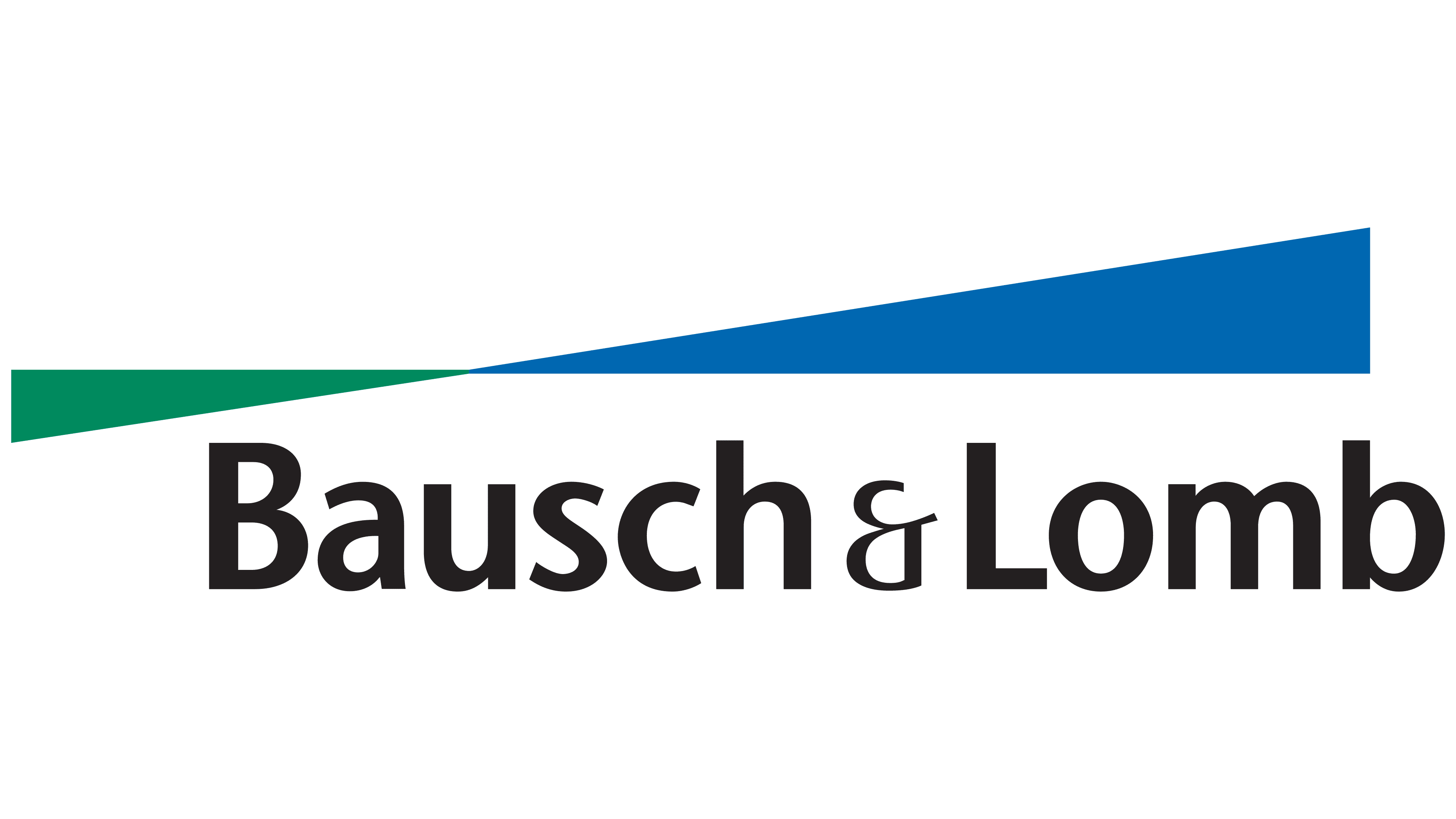
Bausch & Lomb introduced a new symbol called Pathways on July 20, 2004. FutureBrand developed the identity. A horizontal wordmark with a colored figure above it replaced the family name’s 2-line arrangement. The update connected the brand’s image with optics, contact lenses, and light refraction.
Pathways consisted of 2 elongated triangular planes joined at the center. A green form extended to the left, with its outer corner lower than the other points. A larger blue section extended to the right and ended in a raised outer point. The inner edges met along one horizontal line, creating a shared contact boundary. The different edge heights formed an elongated angular contour above the name.
The connection between the green and blue sections created a smooth color transition and united the geometric forms. The outline resembled a lens, a beam of light, or a perspective drawing. Pentagram later associated Pathways with the scientific principles behind contact lenses and the angles of light refraction. The abstract geometry communicated Bausch & Lomb’s field without directly depicting an eye or lens.
Bausch & Lomb appeared beneath the symbol. The surnames began with uppercase letters, while the remaining characters were lowercase. The name used Stone Sans Semibold, a sans-serif typeface with humanist proportions and similarities to Optima and Humanist Sans. A thin-stroke ampersand separated the 2 surnames within the line.
The name appeared in dark gray close to black. The restrained tone kept the full name legible while emphasizing the green-and-blue figure. The horizontal format replaced the nearly square layout with BAUSCH and LOMB on separate levels. In the new version, Pathways carried the brand image, while the family name identified the company. The green-and-blue combination continued into later Bausch & Lomb branding.
2010 – today
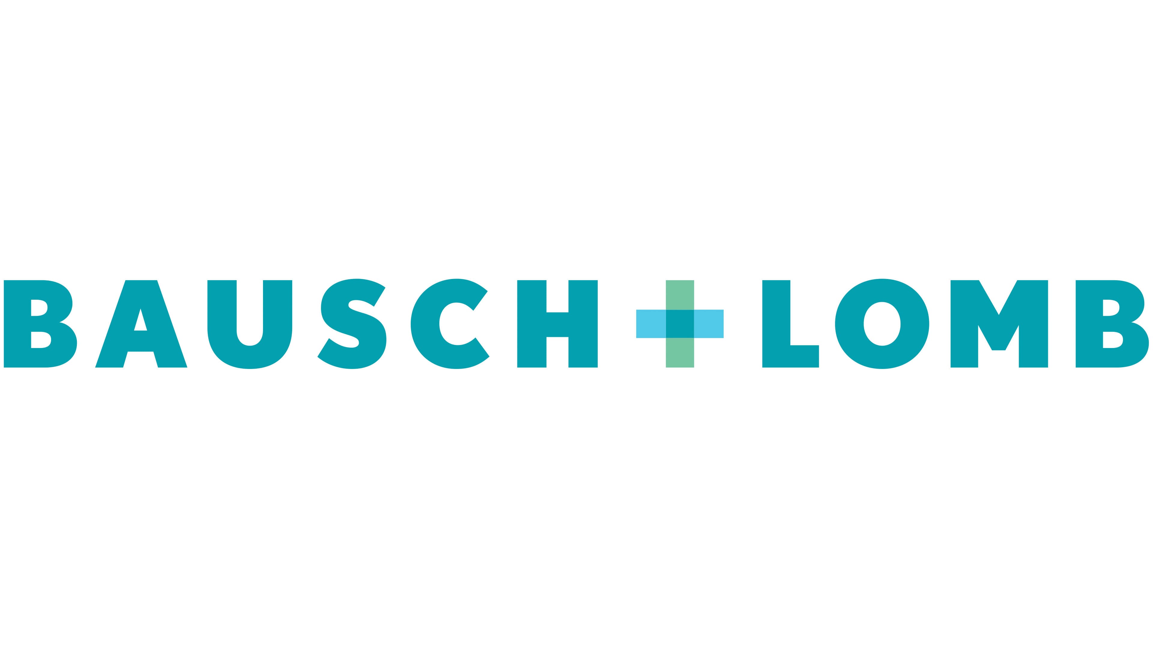
On January 6, 2010, a plus sign replaced the ampersand between the Bausch and Lomb surnames. Pentagram’s New York team, led by Paula Scher, developed the project. The BAUSCH + LOMB form retained the connection with the partnership between John Jacob Bausch and Henry Lomb. At the same time, the plus sign introduced a medical meaning. The composition featured the 2 surnames and a colored symbol, without illustrations or the heraldic details found in earlier versions.
The update accompanied Bausch + Lomb’s expansion in eye health. The company produced contact lenses and care products while developing ophthalmic medications and surgical systems. The new image presented Bausch + Lomb as a medical company with several operations in vision care. The Pathways emblem remained in use during a transition period lasting up to 24 months.
The primary logo placed BAUSCH on the left, the plus sign in the center, and LOMB on the right. All letters were uppercase and used a blue-turquoise color. Wide spacing separated the characters, while broad, even strokes kept the thickness consistent. The horizontal arrangement worked across packaging, medical products, and corporate materials.
Pentagram created the custom Nobel BL typeface from Nobel. Its sans-serif letters had dense forms and geometric contours. Their proportions resembled Gotham Bold and Avenir Heavy while retaining individual features from the original Nobel. The custom typography provided consistent spelling of the surnames and reliable reproduction at different sizes.
The translucent plus sign consisted of 2 intersecting bars. The horizontal bar was light blue, while the vertical bar was light green. Their intersection created a richer shade, showing how the colored planes interacted. The design drew inspiration from pharmacy crosses commonly used in France.
The medical plus sign represented Bausch + Lomb’s collaboration with professional communities and the company’s expanding role in eye health. Its translucent intersection represented vision and the liquid solutions in the product lines. Blue and green recalled water and moisture, maintaining a connection with contact lenses, care products, and ophthalmic medications.
Pentagram created a B+L monogram for compact applications. The initials appeared with the same plus sign in small areas where the full name required too much space. The shortened version was used for embossing on packaging. Its colors, typeface, and medical symbol maintained a connection with the primary logo.
Bausch + Lomb returned to the public market in 2022 and continued using the 2010 logo. The legal name Bausch + Lomb Corporation coexists with the historical form Bausch & Lomb Incorporated, while trademarks include both spellings. The plus sign appears in the primary brand name. At the same time, the ampersand remains in legal names, copyright notices, and older registrations.