![]() Zyrtec Logo PNG
Zyrtec Logo PNG
The Zyrtec logo is associated with medicine and the fast-acting nature of the allergy medication. It reflects the product’s primary effect: quickly alleviating symptoms such as itching and sneezing, making life more comfortable during allergy season.
The history of Zyrtec dates back to the early 1980s when it was developed in the laboratories of the Belgian pharmaceutical company UCB. The company’s scientists developed an antihistamine substance called cetirizine, which was patented in 1983. The medication quickly proved effective in combating allergies, causing minimal drowsiness compared to first-generation antihistamines. In 1987, Zyrtec officially entered the market as a prescription drug.
During the 1990s, UCB began promoting the drug internationally, signing a sales agreement with Pfizer for the United States. In 1995, the FDA officially approved Zyrtec for use in the US. By the end of the decade, the drug had become one of the most popular antihistamines worldwide. In 2006, Johnson & Johnson acquired the rights to an over-the-counter version of Zyrtec, and in 2007, the FDA officially categorized it as a non-prescription drug.
With its transition to over-the-counter status, new forms emerged, including syrups, chewable tablets, and combined medications like Zyrtec-D. Today, Zyrtec remains one of the most popular antihistamine products globally.
Meaning and History
![]()
What is Zyrtec?
A second-generation medication used to relieve allergy symptoms. Available as tablets, drops, and syrup. It treats seasonal and perennial rhinitis, hives, and allergic conjunctivitis. Effects begin within an hour and last about 24 hours. Available by prescription or over the counter, depending on the country.
2008 – 2025
![]()
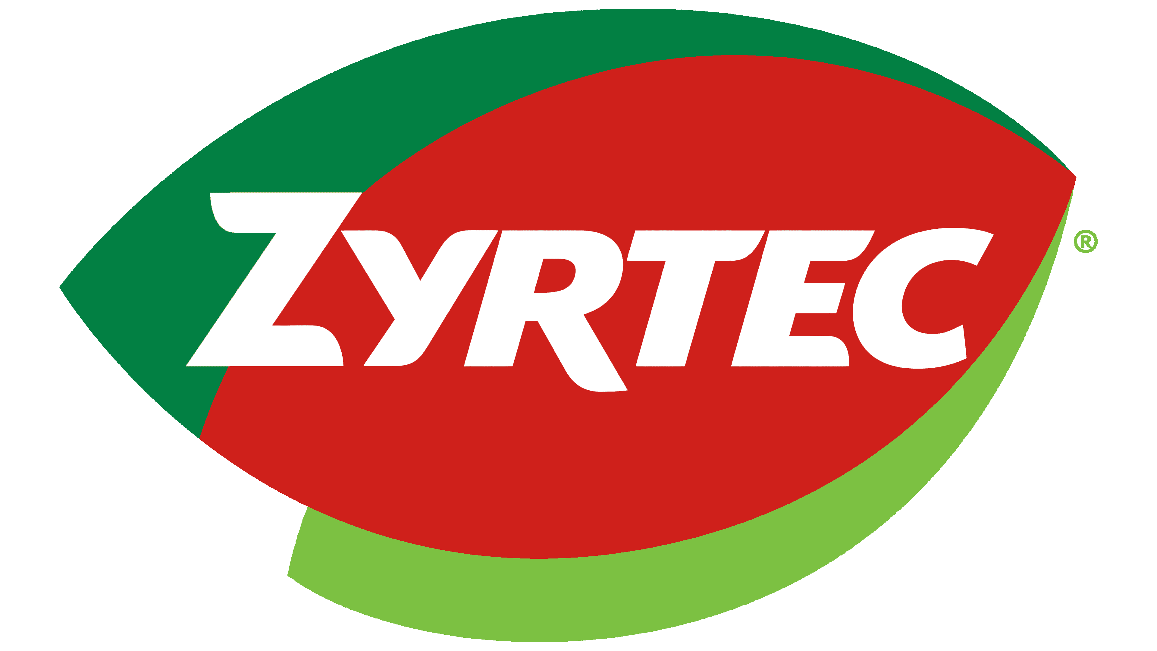
The Zyrtec logo was developed by Interbrand, a renowned agency known for its vibrant branding projects. The decision to use vivid green and red shades relates directly to the product’s core purpose: combating allergies. Green symbolizes plant-based allergens such as pollen and grass, while red indicates the medication’s fast-acting nature.
The brand’s name is set in a custom sans-serif typeface, similar to a slightly modified Bold Italic style with angled letters. Notable characteristics include the slanted lines and angular details that create a dynamic and energetic effect.
The main visual element consists of stylized leaves merged into a dynamic shape. Each leaf represents common allergens: green for pollen and plants, red indicating acute reactions, and yellow symbolizing household allergens. The overlapping forms suggest motion, emphasizing the product’s rapid effectiveness.
White text, neatly outlined, enhances readability against the colorful background, ensuring easy brand recognition and highlighting its pharmaceutical nature.
Overall, the logo effectively reflects pharmaceutical specificity and consumer perception, appearing friendly yet persuasive regarding its purpose, and is designed to stand out on pharmacy shelves.
2025 – today
![]()
The new visual identity for Zyrtec was introduced in the spring of 2025. As before, the logo combines the brand name with a vibrant emblem in a blended green-and-orange palette, resembling both a drop and a leaf, thereby establishing a connection to nature and health.
The brand symbol features a three-dimensional shape with smooth, flowing contours. The colors have been updated, with green and orange shades harmoniously blending into one another, creating a dynamic gradient that emphasizes the product’s energy, effectiveness, and natural origins. The shape of the symbol conveys a powerful visual metaphor: the orange hue symbolizes activity and the medication’s effectiveness, while green represents freshness, naturalness, and safe usage.
The font chosen for the word “ZYRTEC” is a custom-made, bold sans-serif typeface. It combines gently rounded elements with sharply defined geometric lines, projecting confidence and technological sophistication. The letters have distinctive proportions, ensuring easy readability even from a distance. The text is presented in pure white, chosen to contrast vividly with the richly colored background and to symbolize purity, clarity, and consumer trust.
Developing the logo and new packaging took over four years, involving more than 50 structural concepts and over 100 visual layouts. The primary focus during this process was improving readability, visual simplicity, and environmental friendliness. The new packaging is entirely paper-based, completely avoiding plastics. Its front panel features a flat design with vibrant, contrasting colors (orange, green, and accent red), making the product highly visible on pharmacy and store shelves.