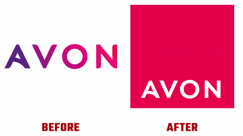
The iconic beauty brand Avon has decided to hit the reset button on its brand identity, unfurling a comprehensive revamp that transcends mere aesthetics to embrace a renewed mission of female empowerment. Orchestrated by London-based design agency Free The Birds and supported by Wunderman Thompson’s strategic insights, the overhaul also brings a new Avon logo into the spotlight.
Historically known for its commitment to women, Avon found its brand had been diluted and inconsistent over time. Responding to this, Free The Birds conducted an exhaustive brand audit that laid the groundwork for Avon’s reinvigorated image. The result is a harmonious blend of several creative elements—from color palettes and fonts to advertising layouts—that merge to redefine Avon’s brand experience.
The Avon logo, the cornerstone of this large-scale transformation, channels the company’s rejuvenated mission to empower women. Collaboratively developed with Dalton Maag, an independent font foundry, the new typography maintains the legacy of the Avon brand while catapulting it into the modern era.
What’s more, the brand has taken a bold stance with its use of the color pink. Far from a mere aesthetic flourish, this vibrant hue emulates Avon’s ongoing philanthropic engagement with breast cancer charities. Accented by a palette of complementary colors, this strategic use of pink is a vivid reminder of Avon’s commitment to social causes.
But it’s not just about a fresh coat of paint. Avon’s rebranding is designed to accentuate its unique business model of community-centric beauty solutions tailored to different local markets’ specific needs and preferences. Amid rapid changes in the global beauty industry, this is seen as a strategic move to help Avon maintain its cutting-edge relevance.
Already in the implementation phase, these sweeping changes are coming across diverse international markets—from Europe and the Middle East to the Americas and Asia-Pacific. The goal is twofold: to establish a cohesive global brand identity and continue honoring women’s individuality and power worldwide.
This strategic makeover comes at an inflection point in Avon’s nearly 140-year history, serving as a deliberate pivot toward future readiness. With these expansive changes—spanning logo, packaging, website, and even its social media persona—Avon aims to achieve a balanced and compelling brand narrative that aligns perfectly with its new brand positioning, “Embrace Your Power.”
By reengineering its visual and experiential elements, Avon pays homage to its rich history and prepares for a future where it continues to be a torchbearer for women’s empowerment and beauty innovation worldwide.


