The Avon logo is bright and shimmering. It represents the beauty industry and decorative cosmetics. The symbol emphasizes the personality of the company. Shows the work for the female audience.
Avon: Brand overview
| Founded: | 1886 |
| Founder: | David H. McConnell |
| Headquarters: | London, United Kingdom |
| Website: | avonworldwide.com |
Avon is an American company founded by David H. McConnell in 1886, which supports the pursuit of beauty, earnings, and health. The company’s first representative, Mrs. Albee, a senator’s wife, developed and organized the current direct sales system. Today, the company creates and sells through its representatives with catalogs in 100 countries cosmetics, perfumes, jewelry, watches, baby products, souvenirs, and chemicals.
Meaning and History
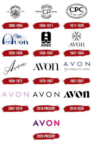
Most of the visual identity choices for Avon were illogical. Places and inscriptions not related to the company itself and the city of its appearance were used for images. The choices were based on emotions associated with a particular place or word. This emphasizes the special female orientation of the brand. It shows that the company works for women and thanks to women. Hence the emphasis on emotions, pink shades, mother-of-pearl, and floral motifs.
What is Avon?
Founded in America, Avon is a health and beauty products company that sells from hand to hand through 6.5 million female representatives. Sales in 100 Americas, Africa, and Eurasia countries amount to more than $9 billion a year.
1886 – 1904
The company’s first logo is in the form of a beautiful coat of arms. The whole identity is tied to the state of California, although the company itself has nothing to do with it. It is all about the association of McConnell’s partner, who admired the abundant flowering of plants in that area. That’s why the company was named California Perfume Company.
In the upper scrolls of the coat of arms are the first letters of the company name: C, R, Co. In the center is placed the seal of the state of California, slightly modified. The image depicts the ancient goddess Minerva, who patronizes artisans. In her hands is a spear and shield of the goddess of war. In the distance are mountains and the rising sun, absent in the original.
In the logo, Minerva represents a beautiful woman ready to conquer the world and stand up for herself to show her talents. It is for such ladies that Avon was created. The sun shows the flowering, the growth of the company.
Archimedes’ exclamation at the bottom of the image is “eureca,” from the seal California. In the emblem, the word spoke of a unique idea, a discovery concerning the sale of cosmetics through personal sales.
1904 – 1911
The number of sales representatives reached 10,000. Success is celebrated by renewing the logo. This time, the emphasis is shifted from California and its identity to the company itself.
The general image of the emblem is preserved, and so are the signatures at the top and bottom, but instead of the central image, two capital letters are placed on the coat of arms: C and R.
1911 – 1929
With his partner Alexander D. Henderson, McConnell signed the founding of the California Perfume Company in New Jersey, although it was not located there.
The emblem for the occasion is transformed again. Its oval is formed of individual squares representing beads. Inside each is a letter of the name California Perfume Co. In the center is a monogram of the company’s name and the inscription: “a mark of quality.” When distributing the goods to individuals, it was important to show that the products were very high quality, better than in the store. That is why such an accent was made.
The idea of the beads represents sales representatives. Working together, the members form a company.
1930 – 1936
In 1929, the first Avon logo appeared on its cosmetics line’s packaging; in 1939, the whole company was renamed Avon Products Inc.
Anne Hathaway’s thatched cottage was chosen for the logo. The cottage was built in 1463 and is known for the fact that Shakespeare’s wife and then widow were born and lived here. According to legend, the future writer married for love to a simple girl from the village. The house has been turned into a museum, with a matrimonial bed on display and a beautiful garden planted. The cottage in the logo was a model of style, love, and beauty.
The name Avon came from the Celtic language and means “flowing water.” It is the name of a river in England. The name conveys the spread of cosmetics from person to person, like a stream.
The English sentiment in the name and emblem is related to a visit of the founder’s son, David McConnell, to his fellow man in Great Britain. Seeing the beauty of the city of Stratford-upon-Avon, he transferred the emotions into the company’s visual identity.
1936 – 1947
The company reached an unprecedented scale. Its income is approaching 4 million dollars, and its sellers are already more than 20 thousand. Therefore, it was decided to advertise nationally in the popular magazine Home Hearth.
To show the growth and distribution of Avon, chose a new logo representing the letter A in the form of a fountain, pouring out two waterfalls, which are the legs of the letter. They demonstrate the flow of sales and many customers. A lotus flower is placed at the base of the A as a symbol of beauty and femininity.
1947 – 1954
After the founder’s and his son’s death, the board passed to John A. Ewald. Thanks to his management, the company’s products are displayed in perfume stores. The move helped boost sales to $17 million.
The period logo is a unique flower of exquisite curls. The four petals are formed by the letters A, made ornate and exquisite. Each petal resembles a lily bud and contains the symbol of infinity.
The composition indicates the spread of Avon to all corners of the world, development, and high income.
1954 – 1972
The emblem becomes simpler and is reduced to the name. The word is written in elegant lettering going upwards. This is how the firm demonstrated its desire for growth. The connection between the letters represents the constant contact between representatives and customers.
1970 – 1997
The new logo is full of impressiveness and power but with the added smoothness and refinement seen in the serifs and different thicknesses of the glyphs. The lettering represents the femininity and power of the company, which already employs 450,000 representatives.
1997 – 2007
Avon seeks to conquer the world by actively opening offices in Africa and Europe and launching an internet site. The logo reflects this in the widely spaced letters of the name and the elegant underlining of the first A, alluding to the circle of the planet.
For the first time, the logo uses an orientation message toward women.
2007 – 2019
Avon launches “Together Against Breast Cancer” to support cancer victims. The initiative is recognized as one of the best in philanthropy.
The company’s new logo reflects the pink ribbon that connects the fight against breast cancer worldwide. All of the letters are written in a thin pink font spaced apart. Each one is like a separate ribbon in support of women.
Pink is also the recognized color of femininity and points to the company’s female ambassadors.
2019 – 2020
In 2019, Avon Products, Inc merged with Brazilian Natura Cosmeticos, which gets a 76% stake. The result is the fourth-largest perfume company in the world. This globality can be seen in the massive letters of the emblem.
2019 – today
2016, the company split into New Avon LLC and Avon Products, Inc. The former contracted to sell itself to South Korea’s LG Household & Health Care in 2019. The logo became simple and subtle after the split, showing that the firm was on a journey of self-determination, finding its face and place.
2020 – today
After all the reorganizations, the firm creates a new visual mark full of color, life, and great cheer. The logo draws attention to the company and women’s issues. It shows the variety of cosmetics, tones, and pigments the industry giant offers.
2023 – today
Font and Colors
The main colors of the logo are purple, lilac, and pink. All of them indicate emotions. Purple is creativity, lilac is self-knowledge, and pink is femininity. Avon allows you to express your femininity.
The font of the name is unique. The semi-circular glyphs represent the word in a smooth, growing way. The unusual “A” line represents a star, telling of a brand that rose to the sky and each customer as a star.
Avon color codes
| Maximum Purple | Hex color: | #65247f |
|---|---|---|
| RGB: | 101 36 127 | |
| CMYK: | 20 72 0 50 | |
| Pantone: | PMS 2603 C |
| Red Purple | Hex color: | #dc0676 |
|---|---|---|
| RGB: | 220 6 118 | |
| CMYK: | 0 97 46 14 | |
| Pantone: | PMS 213 C |
| Red | Hex color: | #e80a44 |
|---|---|---|
| RGB: | 232 10 68 | |
| CMYK: | 0 96 71 9 | |
| Pantone: | PMS 1788 C |

