


![]() Colgate Logo PNG
Colgate Logo PNG
The American oral hygiene brand Colgate-Palmolive was first sold in 1873. The Colgate logo reflects the brand’s history and identity, closely linking it to the parent company’s past and paying tribute to its founder.
The history of Colgate began in 1806, when William Colgate opened a small factory in New York to produce soap, candles, and starch. By 1817, the company placed its first advertisement, and in 1820, it expanded with a starch plant in Jersey City. By the mid-19th century, it offered around 100 soap products.
In 1857, Samuel Colgate took over and formed Colgate & Company, shifting its focus to personal care. In 1872, the Cashmere Bouquet brand was introduced. In 1873, Colgate launched toothpaste in glass jars, a new oral hygiene product.
In 1896, Colgate Ribbon Dental Cream appeared in a collapsible tube, based on a design by Washington Sheffield. This packaging improved hygiene and convenience, reshaping the market.
By 1906, the company produced over 800 items. In 1914, it entered Canada, followed by expansion into Europe, Latin America, Asia, and Africa.
A parallel business was founded in 1864, when B. J. Johnson established a soap company in Milwaukee. In 1898, it introduced Palmolive soap and later merged with Peet Brothers in 1917 to form Palmolive-Peet.
On July 1, 1928, Colgate merged with Palmolive-Peet, creating Colgate-Palmolive-Peet Company. In 1953, the name was changed to Colgate-Palmolive.
In the 1940s, the company launched Fab and Ajax, competing with Procter & Gamble. In 1960, it reformulated toothpaste with fluoride following Crest’s ADA approval. Total followed in 1968.
From 1976, Colgate expanded through acquisitions, including Hill’s Pet Products in 1991 and Kolynos in 1995, strengthening its global presence.
Meaning and History
![]()
The visual style of the world’s most famous toothpaste has always remained unchanged: red and white. Appearing in the late 19th century, it never switched to another palette: only the style or font changed, but not the color. Initially, jars were used for packaging, but after Washington Sheffield suggested using tubes, the paste began to be dispensed into them. The first logo appeared a year after the line’s launch and has been updated eight times since 1897.
What is Colgate?
This global leader in oral hygiene is transforming tooth brushing into a comprehensive approach to dental health. The brand includes innovative toothbrushes, mouthwashes, professional dental tools, and iconic toothpaste formulated for sensitivity, whitening, and cavity prevention. In collaboration with dentists worldwide, the brand has developed solutions for all aspects of oral care, including plaque control, breath freshening, and gum health maintenance.
1897 – 1948
![]()
The debut emblem featured a white inscription on a red background, set in simple letters. The brand name was two-tiered: on top was the large word “Colgate’s,” and below, in small font, “Ribbon Dental Cream.”
The emblem was immediately placed on a cardboard box containing the tube. It was placed on all sides, which was very convenient: when the product was put on a shelf, the inscription remained visible. The white name stood out clearly against the red background, evoking a sense of cleanliness, freshness, and radiance.
1949 – 1963
![]()
The original version lasted about 40 years, receiving an update only in 1940. Designers changed the font, making it clearer and more modern, in line with the toothpaste’s new name: Dental Cream with Gardol. Naturally, the “Colgate” inscription remained. The text was written in capital letters, except for the preposition “with,” which was in lowercase. In this version, the words are geometrically balanced, with clear, straight angles, conveying a sense of confidence and safety.
1963 – 1980
![]()
In 1963, the company changed its logo to a new style. In this version, the brand name starts with a capital letter, and all other characters are lowercase, with smooth, elegant lines. The designers also placed a geometric blue-white element, “MFU,” on the packaging. It was located on the left side. The updated logo looked minimalistic yet recognizable. Moreover, this format became the basis for the current symbolism.
1980 – 2001
![]()
The 1980 changes affected only the font. It was a smooth sans-serif italic, and the word was written in the same style as before, although the font was replaced with Magistral Bold Italic, with a rounded “C” and pointed angles on the “g” and “a.” The letter “t” had half of its horizontal stroke removed.
2001 – 2004
![]()
In 2001, the logo was updated again. The inscription became more complex, with letters featuring smooth transitions and subtle bends. In this interpretation, the font already resembled Sanstone Heavy Italic, though with some truncated lines. The color palette remained unchanged.
2004 – 2009
![]()
During this period, the company added volume and dynamism to the emblem, resulting in a burgundy shadow on the white letters. This technique made the inscription embossed, massive, and bright. The font was also slightly changed, maintaining the corporate style.
2009 – today
![]()
In 2017, the manufacturer decided to add a bit of freshness to the logo, so it changed the writing to “Colgate.” It elongated and curved the letter “g,” creating a semblance of a smile. Although the experiment was not entirely successful, the designers supported the idea.
2017 – 2018
![]()
In 2017, the manufacturer decided to add some freshness to the logo and changed the spelling of “Colgate.” He lengthened and arched the tail of the letter “g,” creating a semblance of a smile. Although the experiment was not entirely successful, the designers supported the idea.
2018 – today
![]()
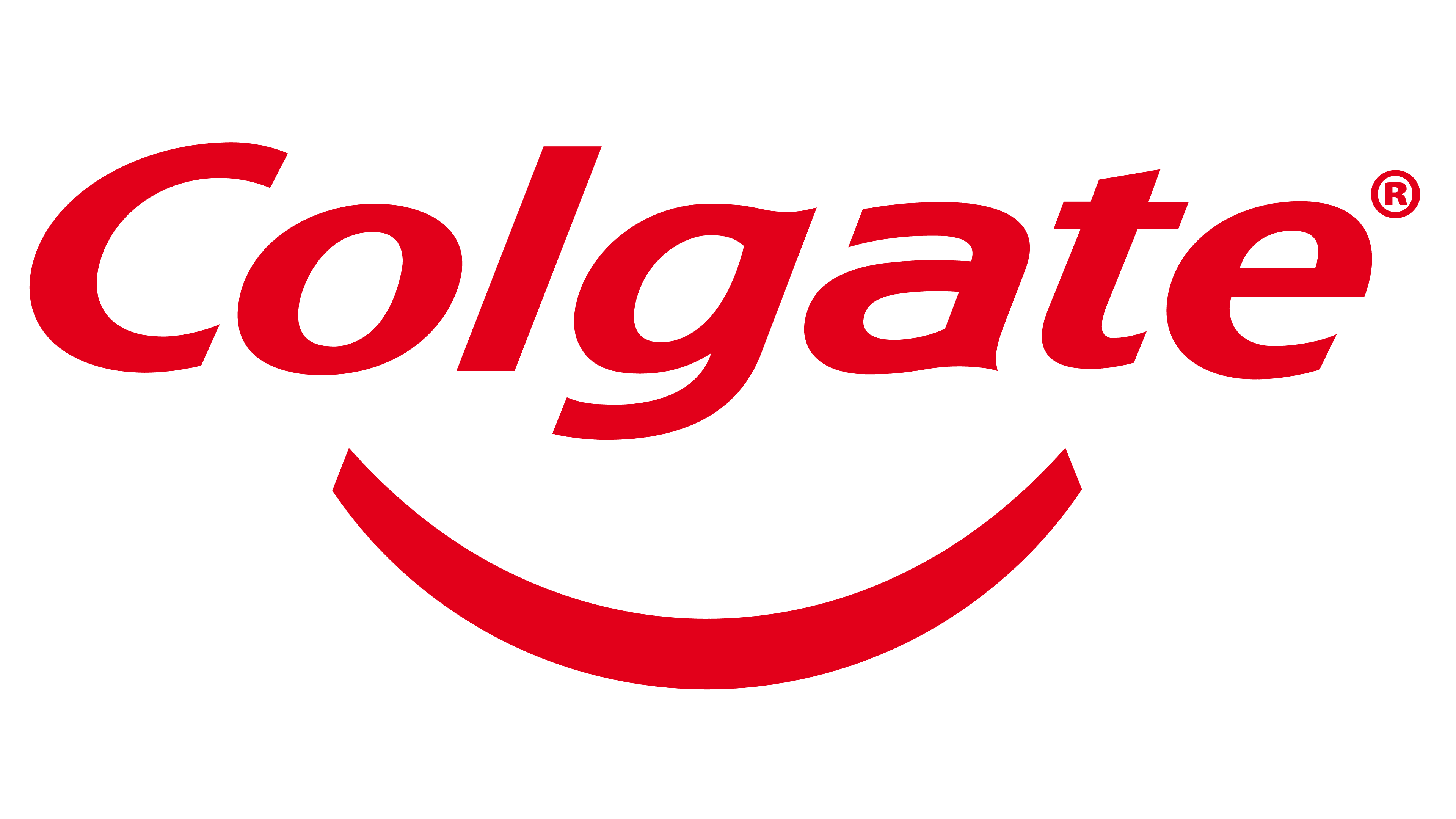
The current logo combines the emblems from 2009 and 2017, with a white smile beneath the word “Colgate.” Such a version looks friendly and accurately reflects the brand’s mission. The font is part of the FreeSet studio and was developed in 1992 by Manvel Shmavonyan and Tagir Safaev.
Font and Colors
The Colgate brand immediately settled on a logo featuring the toothpaste’s name. The reason is the need for a colorful and informative label on the product itself. Over the years of the brand’s existence, the logo had several design variations: in each, the name, red background, and white letters dominated. Starting in 2017, the developers noticed the similarity of the curved tail of the letter “g” to a white-toothed smile and brought this idea to life. Later, they separated the graphic from the text.
The font used in the Colgate logo is similar to several other types of fonts. It is most similar to FreeSet Demi Bold Oblique and Vera Sans Bold Italic, developed by Jim Lyles and published by Bitstream. The inscription’s palette consists of white and red.
FAQ
What is the Colgate logo?
The Colgate logo is the brand name in bold italicized white. Below the inscription is an arc symbolizing a smile. The base is a red quadrilateral. Its color symbolizes vitality and health. White color represents purity and freshness.
What is the Colgate slogan?
Each Colgate product has its slogan. The company’s general advertising slogan is “Oral Health Protection.”
When did Colgate change its logo?
The modern Colgate logo appeared in 2018 when a smile arc was added to the inscription.
Which company owns the Colgate brand?
Colgate is a brand of the transnational company Colgate-Palmolive Company.