“Oriflame branded cosmetics are a great choice,” proclaims the emblem. A balanced composition Oriflame logo will gently emphasize the dignity of the buyer’s skin and help make the features more expressive and memorable.
Oriflame: Brand overview
| Founded: | 1967 |
| Founder: | Jonas af Jochnick, Robert af Jochnick, Bengt Hellsten |
| Headquarters: | Stockholm, Sweden |
| Website: | oriflame.com |
Meaning and History
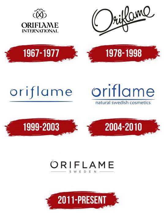
During its long existence, the Oriflame Holding AG visual identification mark has gone through five stages of change. They are mainly concerned with the styling of the word “Oriflame.” Now the minimalistic version is used.
What is Oriflame?
Oriflame is a holding company from Sweden specializing in multi-level marketing. It sells decorative and care cosmetics, perfumes, and fashion accessories. It was founded in 1967 by Bengt Hellsten, Robert, and Jonas Jochnick. One office is located in Stockholm, and another is in Schaffhausen.
1967 – 1977
The Swedish cosmetics brand started with a logo that featured both text and graphics. The inscription consisted of not one but two parts: at the top was the word “Oriflame,” below it – “International.” This meant that the company was initially focused on international sales. The letters were printed, with the original serifs pointing to the left. At the top, the designers have placed a monogram – a vignette made up of three symbols. It featured two mirrored “Fs” made by hand and one “O” that served as their background.
1978 – 1998
For several decades, the company used the italic logo – simple, as if written in careless handwriting. The name was rapidly going up the diagonal. The cursory handwriting testified to a high emotional outburst because the symbols did not have clear outlines, but were coherent, merged into an inseparable whole. Beneath the caption was a bold line in the same black color as the word “Oriflame.”
1999 – 2003
In 1999, the cosmetic brand switched to printed signs. The designers have converted them to lower case but retained the same features. The letter “o” was left with an open circle with overlapping lines, “f” looked like a smooth vertical bend, the top rounding “a” did not converge to the end, and the point above “i” was located higher than usual. The subscript is also preserved: it has become one long line with a bulge in the center. Instead of black, a deep blue appeared.
2004 – 2010
The main focus was on typography, so some symbols were changed. So, the developers have removed the lower tail from “f,” making it more classic. The sharp edges at the ends disappeared, and a marketing clarification appeared below the line: “natural swedish cosmetics.” It was done in lowercase letters. The only thing that has survived is the trademark “o” in the form of an open ring.
2011 – today
The current logo is rigorous itself. It consists of a title typed in a classic capital sans serif. It has an original design emphasizing the letter “O.” The sign is made in the form of an open circle as if it were a massage movement along the contour of the face. In this way, the manufacturer emphasized the connection with cosmetic products. There is a wide space between the letters, so the inscription looks airy and light despite the bold lines and black color. All symbols are straight, geometric, with even corners. The designers divided the long line into two thin stripes and raised them to the word “Sweden.” They also returned the emblem to black.
Oriflame: Interesting Facts
Oriflame, started in Sweden in 1967 by Jonas af Jochnick and Robert af Jochnick, has become a big name in beauty and skincare. Known for its direct sales and focus on natural ingredients and sustainability, Oriflame sells products in over 60 countries.
- Swedish Roots: Oriflame’s approach to beauty is deeply influenced by its Swedish origins. It is known for natural beauty, environmental care, and innovative design, focusing on simple, pure, and functional products.
- Direct Sales: The company uses a direct sales model, where independent consultants sell products directly to customers. This creates business opportunities globally and ensures personalized customer service.
- Diverse Products: Starting with skincare, Oriflame now offers makeup, fragrances, hair care, and wellness products, meeting a wide range of beauty and health needs.
- Natural and Sustainable: Oriflame uses natural ingredients and is dedicated to reducing its environmental impact with eco-friendly packaging, sourcing, and production practices.
- Oriflame Foundation: The company’s foundation supports social causes, focusing on empowering women and children through education, scholarships, and charity partnerships.
- Research and Innovation: Oriflame invests in research and development to find new ingredients, formulations, and technologies, operating advanced science centers for product enhancement.
- Global Presence: With operations across Europe, Asia, Africa, and Latin America, Oriflame adapts its products and strategies to various customer needs and preferences worldwide.
- Beauty with a Purpose: Oriflame aims to make a positive societal and environmental impact, integrating social and environmental efforts into its business philosophy.
- Awards: The company’s products have won awards for quality, innovation, and effectiveness, highlighting Oriflame’s commitment to excellence.
- Digital Engagement: Oriflame uses digital technology and social media to connect with customers and consultants, offering beauty tips, product information, and business tools online while keeping up with consumer trends.
Oriflame’s story is one of growth from a small Swedish business to a global beauty brand, driven by innovation, quality commitment, and social responsibility in the competitive cosmetics and skincare industry.
Font and Colors
The emblem uses two types of typefaces. The first letter in the word “Oriflame” is made in the printed font of the same name, the rest – symbols from the Sans Serif category. Moreover, “O” plays the role of an individual sign. The letter-spacing in both inscriptions is wide. The corporate palette is monochrome and represents the classic combination of black (letters) and white (background). There is also a dark gray used for the word “SWEDEN” and its surrounding strokes.
Oriflame color codes
| Black | Hex color: | #000000 |
|---|---|---|
| RGB: | 0 0 0 | |
| CMYK: | 0 0 0 100 | |
| Pantone: | PMS Process Black C |
