


![]() Lakme Logo PNG
Lakme Logo PNG
The emblem’s image is natural, as if fresh grass were growing next to the symbols. At the same time, the Lakme logo features stylistic elements that indicate the high quality of the company’s cosmetics and their suitability for professional care.
Lakmé emerged in the early 1950s amid India’s foreign currency shortage. Prime Minister Jawaharlal Nehru was concerned that affluent women were spending scarce resources on imported Western cosmetics. With no domestic alternatives, he turned to Jehangir Ratanji Dadabhoy Tata.
Around 1950, Tata launched the brand under the Tata Oil Mills Company, originally founded in 1920 in Cochin. In 1952, Lakmé began operations from rented premises on Pedder Road in Bombay.
Early product development relied on technical agreements with French firms Robert Piguet and Renoir. They shared expertise without equity stakes. The name “Lakmé” was inspired by the French form of Lakshmi and by the 1883 opera of the Same Name by Léo Delibes.
The initial range covered skincare and color cosmetics adapted to Indian skin and climate. Demand grew quickly, and by 1960, production moved to a larger TOMCO factory in Sewri.
In 1961, Simone Tata became managing director, and in 1982, chair. She shaped brand positioning and reframed public attitudes toward makeup, which had carried a social stigma. Early campaigns featured model Shyamoli Varma, followed by figures like Rekha, Aishwarya Rai, and Kareena Kapoor.
After India’s economic liberalization in 1991, competitors such as Maybelline, Revlon, and L’Oréal entered the market. In 1993, TOMCO merged with Hindustan Unilever. A 50:50 joint venture, Lakmé Unilever Limited, followed in 1996. By 1998, the Tata group exited, transferring the brand to Hindustan Unilever for 200 crore rupees. In 2017–2018, Lakmé crossed the 1,000-crore-rupee mark in annual revenue.
Meaning and History
![]()
The brand is named after the eponymous French opera, and its name is reflected in the logo, which is elegant and refined. Over its history, the brand has changed its logo several times. However, the logo count began in 1996, when the Lakme brand was sold to Lever HUL and began to establish itself internationally. Then, in 2011, a radical reboot began, expanding the range and entering new markets.
What is Lakme?
Lakme is an Indian cosmetic company with a global name. It was founded in 1952 by Tata Oil Mills and was a subsidiary of that company. Later, it was spun off and became an independent brand. J.R. Tata and Simone Tata did this. In 1998, the company was acquired by the cosmetic giant Hindustan Unilever.
1996 – 2011
![]()
The personalized sign of that time was incredibly concise: it consisted of the brand name, set in a wide-spaced typeface. The symbols were simple and slender, executed in a classic style. The logo predominantly featured dark purple.
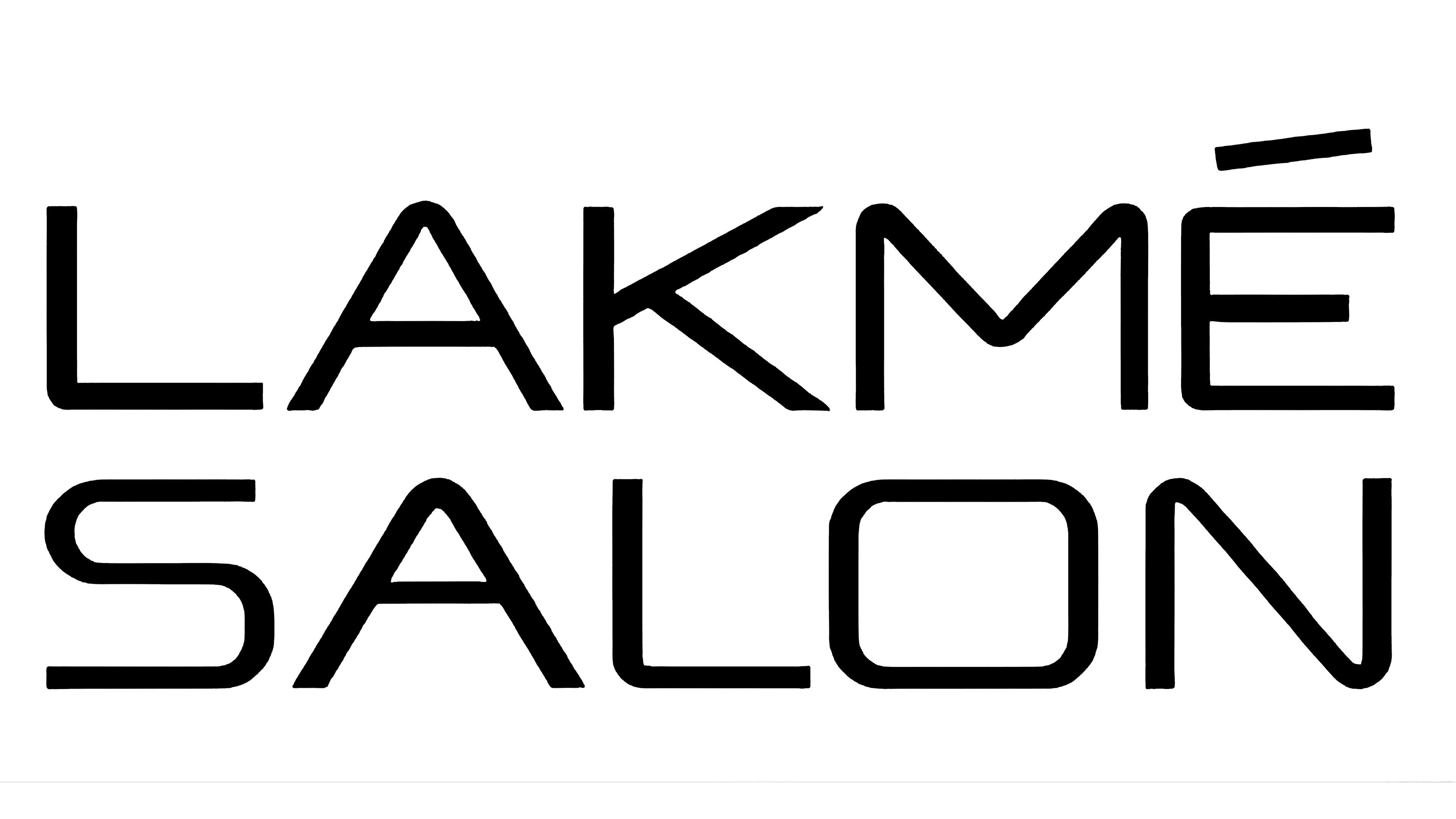
2011 – 2019
![]()
The main logo is a modified repetition of the previous version. The letters are compressed in width, with minimal spacing between them. On the outside, all corners are softened and rounded; on the inside, they are sharp.
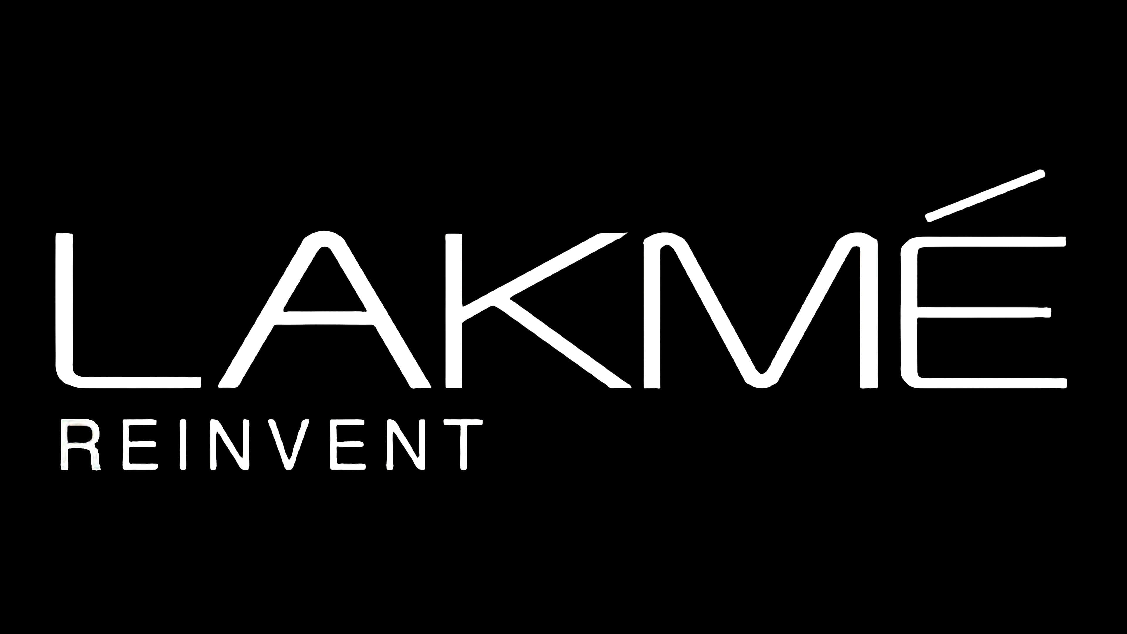
2019 – today
![]()
Now, the logo looks like a stylish inscription with decorative elements. In particular, the letter “A” has an individual design: instead of a central bar, a pointed stroke is used. It is positioned diagonally, dividing the letter into two parts. According to the cosmetic company’s concept, the term “hair” indicates the purpose of its products. All signs have uneven thickness: they harmoniously combine narrow and wide segments. Under the brand name, the motto “Inspired Haircare” appeared. The phrase is written in thin black characters in the same style as the text above.
Font and Colors
The trademark’s personal symbolism is concise: it contains the company’s name. There is also a graphic image, which can be presented separately. It is a circle with a stylized letter “L” the size of the background.
For the inscription, a sans-serif font was chosen – grotesque, smooth, without serifs. On the outside, the signs are thin and slightly rounded at the corners. They are executed in uppercase. The color palette is simple, consisting of black and white, though a dark purple was used in the early version.