


![]() Maybelline Logo PNG
Maybelline Logo PNG
Maybelline is a well-known cosmetic brand established in 1915. It was founded by 20-year-old entrepreneur Thomas Lyle Williams, who invented the original mascara recipe. In 1967, the brand changed hands when it was acquired by the French company L’Oréal.
Maybelline began in 1915 in Chicago after a household accident. Mabel Williams burned her eyelashes and brows, then mixed ash, coal dust, and petroleum jelly to mask the damage. Her brother, Tom Lyle Williams, saw commercial potential and started refining the formula.
Early attempts failed, so he turned to Parke-Davis, which helped prepare a market-ready product. The first version, Lash-Brow-Ine, was sold by mail through newspaper ads. In 1917, a new product called Maybelline appeared, combining Mabel’s name with Vaseline.
In the 1920s, growth relied on advertising. Silent film actresses such as Phyllis Haver, Ethel Clayton, Viola Dana, and Ruth Roland promoted the brand. The range expanded with the introduction of waterproof mascara in 1925 and eye products in 1929.
Sales held even after the 1929 crash, supported by low pricing and press promotion. While Revlon, founded in 1932, focused on higher-priced segments, Maybelline retained a broad audience.
After World War II, Williams and partner Emery Shaver moved to Hollywood. Shaver handled advertising deals and brought film stars into campaigns. By the mid-20th century, the company controlled about 75 percent of the U.S. mascara market.
In the 1960s, Ultra Lash introduced a tube with a brush, replacing earlier formats. After Shaver died in 1965, Williams sold the company to Plow Inc. in 1967 for $136 million, declining offers from Revlon.
Ownership changed again in 1990 when Schering-Plough sold Maybelline to Wasserstein Perella. In 1996, L’Oréal acquired the brand for $660 million, moved its headquarters to New York, and rebranded it as Maybelline New York.
Meaning and History
![]()
The recognizable Maybelline logo, with its strict black letters, once looked completely different. Company owners frequently updated it to align with fashion trends.
The brand’s first graphic sign appeared in a commercial advertising Lash-Brow-Ine. It was the inscription “Maybell Labs,” done in an old-fashioned font. The company’s name is derived from Mabel, the younger sister of Thomas Lyle Williams.
In 1930, the company’s owner introduced a new emblem with the word “Maybelline” in red. It was handwritten in a neat calligraphic script. The capital ‘M’ was separated from the lowercase letters. The font remained script-like, but the size and shape of the characters changed: now slightly tilted to the right, with the lower ends of the ‘M’ elegantly curved. Overall, the words became more legible and harmonious.
In the 1960s, another version of the logo appeared, with the brand name handwritten. The style changed slightly: it no longer looked as strict as before. The color remained red. The letters became straight, without the usual tilt.
The next redesign coincided with the launch of the first series of lip cosmetics. The brand’s products were adorned with the strict inscription “Maybelline,” set in a sans-serif typeface. The spacing between the characters was very narrow; the printed signs touched and even overlapped. Another update reflected in the palette: the traditional red color receded into the past, giving way to dark blue.
What is Maybelline?
Maybelline New York is a brand that offers a wide range of makeup products, including eyeliners, blushes, eyeshadows, mascaras, foundations, and more. The brand was founded in 1914 and first entered the market with the product Lash-Brow-Ine. It is now owned by the French cosmetics company L’Oréal and continues to evolve in line with the latest beauty industry trends.
1920 – 1956
![]()
Italics characterized the cosmetic brand’s debut logo. Yet, it had its own specific double letters. The left half of each character was colored black, and the right was dark green. This design made the emblem unique and quickly recognizable. The text was handwritten and expressive, with neatly drawn symbols. The style was semi-cursive, as the first letter was set apart from the rest. The ‘M’ was framed with calligraphic flourishes and had a slight rightward deviation, with its tips slightly curved.
1956 – 1979
![]()
The emblem of these years was the complete opposite of the first logo. It was thin, not bold, slanted left, not right, and the “M” was turned away from the rest of the part, not towards it. The carved signs looked as if they had been hastily written on paper; they reminded one of something to remember. In this case, the name is the cosmetic brand Maybelline. Black letters were on a white background.
1979 – 1992
![]()
In 1979, the company adopted a new logo with the same name. No icon appeared in it. The cosmetics manufacturer decided to focus on simplicity. Moreover, labeling products regardless of shape and volume is much more convenient. The letters were printed large, with miniature protrusions at the ends, reminiscent of small serifs. The main feature of the text was the very tight placement of the characters. They stood so close that they merged. Only the letters “l” and “i” were isolated.
1992 – 1996
![]()
In 1990, the brand was acquired by Wasserstein Perella, a New York investment company. Soon after, Maybelline adopted a new logo with wide sans-serif type and a narrow underline. It was used in a video commercial featuring Marcus van der Loo and Christy Nicole Turlington.
1996 – 2002
![]()
In 1996, the brand became part of the French conglomerate L’Oréal. Designers updated the logo’s style, making the font smaller and the letters bolder. And to the word “Maybelline,” they added the name of the city of New York, where the headquarters were moved.
2002 – 2019
![]()
At the beginning of the third millennium, the developers returned to the 1990s logo. They modernized the previous version, removing the long horizontal line and placing the phrase “New York” in the lower-right corner beneath the inscription “Maybelline.”
2019 – today
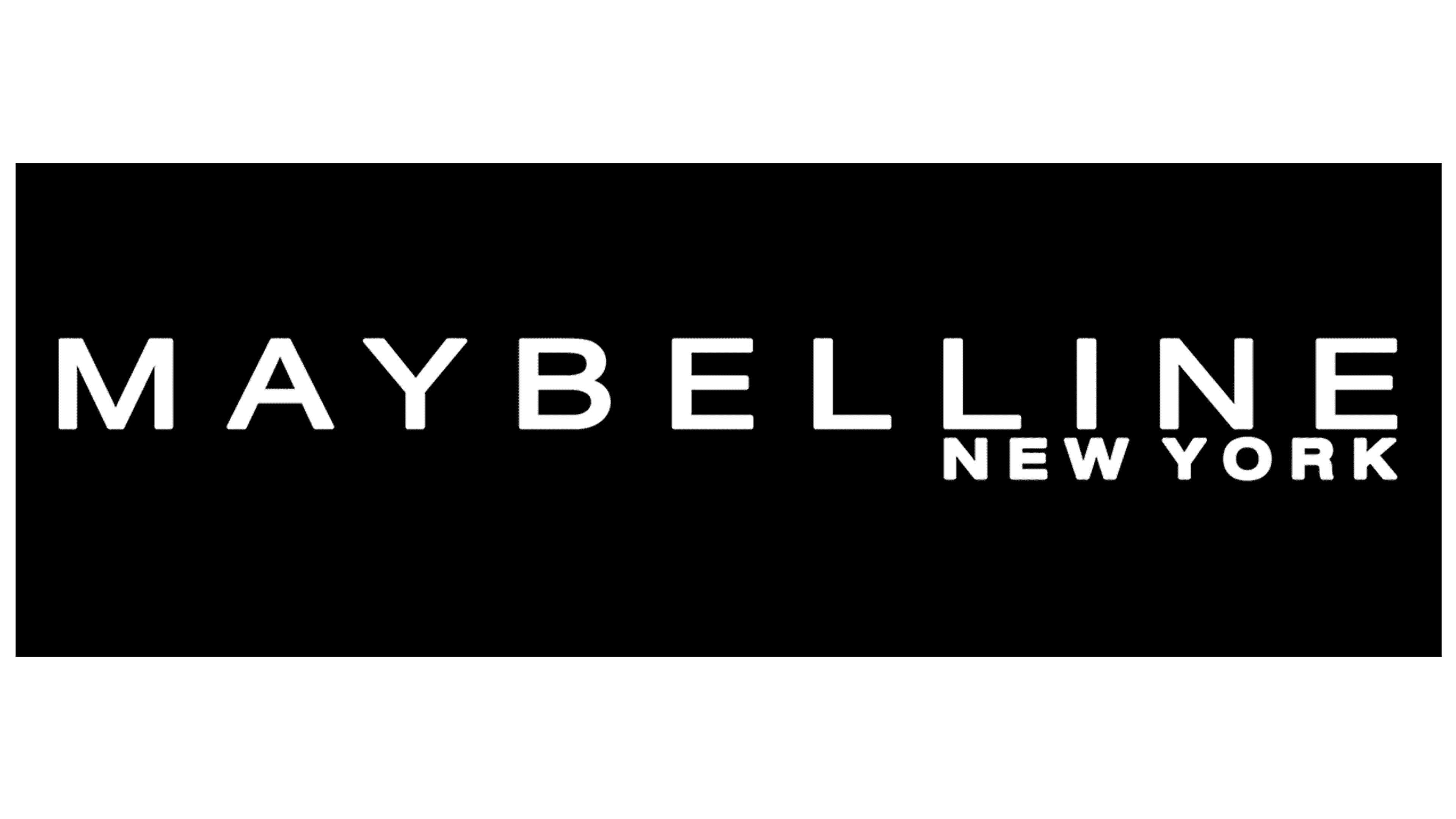
![]()
After several experiments with the font, letter spacing, and sign size, the designers arrived at the optimal ratio. Now, the size of the characters is quite comparable to the distance between the letters and the width of the feet. The city name the brand originates from is in the lower-right corner. The word “New York” is written in small capital letters and occupies a place under the “LINE” sign.
Font and Colors
Since 1915, the American cosmetic brand’s logo has experimented with inscription styles. Its evolution was uneven, with spurts when thick letters alternated with thin ones. Here’s how the epochs and design have changed: the debut version uses wider characters, while the 2002-2019 version uses narrower ones. Currently, a bold version is used. It is characterized by clarity, optimal font, and good legibility.
The developers settled on the font Sanzettica 3 Regular Expanded. It fits perfectly into the concept that the company’s leadership wanted to emphasize. Thus, the emblem is easily perceived, looks presentable, and is easy to read. As for color, the brand adheres to the classic black-and-white canon. Accordingly, its logos always use dark letters on a light background.