


![]() Sunsilk Logo PNG
Sunsilk Logo PNG
Shine and purity are visible on the emblem. The components of the products work together to heal the hair and scalp. As the Sunsilk logo shows, the effect is made possible by the high concentration of beneficial components.
In 1954, Sunsilk was introduced in the UK by Unilever through D & W Gibbs. Its liquid formula enabled effective cleansing in one wash, replacing the two-step routine common at the time.
In 1955, the brand entered television advertising, focusing on specific hair issues. In 1956, a cream version for dry hair appeared. By 1959, Sunsilk operated in 18 countries, expanding across Europe, Brazil, and Asia, with local names such as Elidor, Seda, and Sedal.
In 1962, the product line shifted toward segmentation by hair type. In 1964, hairspray was added. In 1966, an olive oil shampoo appeared, competing with brands such as Procter & Gamble and Pantene. In 1968, packaging changed to larger PVC bottles without a price increase.
In 1969, the brand promoted Sunsilk Herb through radio campaigns featuring Derek Nimmo. In 1971, conditioners were introduced in three variants, reflecting growing demand for multi-step hair care. In 1973, an aerosol styling lotion followed. By 1975, weekly sales reached one million units.
In 1980, the range was relaunched with updated formulas and packaging. In 1985, styling foam was introduced in response to changing trends. In 1993, new products were developed with the Elida Hair Institute based on consumer research.
In 2001, Sunsilk entered the hair color segment in Asian markets. In 2008, the global campaign “Life Can’t Wait” launched. In 2009, the brand was relaunched as Sunsilk Co-Creations, developed with international stylists.
Meaning and History
![]()
The British manufacturer’s progressive approach helped it gain popularity quickly. He managed to enter the international market for five years of work and gain fame in 18 countries. Over the brand’s existence, the number of its emblems has increased to several dozen. The main ones are six modifications.
What is Sunsilk?
This is a major Unilever haircare brand, particularly popular in Asia, Latin America, and the Middle East. Each product in the range is developed in collaboration with hair specialists and offers targeted solutions for different hair types and needs, from volumizing formulas to products that ensure smoothness and manageability. The brand is distinguished by its deep understanding of the diverse haircare needs of people across cultures and climates. It creates products that address specific concerns such as damage repair, humidity resistance, and maintaining the natural hair condition.
1954 – 1956
![]()
In 1954, the hair care brand was introduced, and its first logo featured black “Sunsilk” lettering in a typeface similar to SoftMaker’s Thames Serial Bold. The first letter was capitalized, and all the rest were in lowercase. Long serifs and great contrast between the main and additional strokes created a sense of dynamics.
1956 – 1963
![]()
In 1956, the brand name was split into two parts: “Sun” and “silk.” They were in different lines, aligned in the center. The inscription, as before, was black, but a bold custom font was used.
1963 – 1968
![]()
In this version, there is not only text but also a graphic part. The designers simplified the characters a bit by removing a few serifs and adding a vertical oval shaped like a yellow “S.” It divides the space into two halves: the upper side is white with a miniature brand name, the lower one is blue in the form of a drop.
1968 – 1974
![]()
After the redesign, all letters became lowercase. The typeface, with long, thin serifs, was roughly similar to DSType’s Prumo Deck Extra Bold; only the “k” at the bottom had a graceful spiral with a dot at the end.
1974 – 1977
![]()
The first “S” in “Sunsilk” has been changed to uppercase. At the same time, all letters were elongated vertically, and their strokes widened, causing them to merge.
1977 – 1982
![]()
In the second half of the 1970s, the logo changed again. The inscription remained black, but the designers completely redesigned the font. This version’s brand name was written in jagged glyphs with custom styling. The word was located diagonally, with a slight rise to the right.
1982 – 1983
![]()
In the early 1980s, the inscription was aligned. Both “S” acquired long diagonal serifs, while all other letters had short, triangular, and horizontal serifs.
1983 – 1984
![]()
After the redesign, the serifs disappeared, and the letters became thin and slanted. An individual set of glyphs was used for the logo, but in a new design.
1984 – 1989
![]()
The wordmark has become a handwritten inscription set at a high angle. The letters were not connected; only two “S” accidentally touched the next “u” and “i” because of their curved shapes.
1989 – 1991
![]()
In 1989, the developers of the Sunsilk logo realigned the inscription. Both the capital and lowercase “S” were twisted and disproportionate. At the same time, “u” and “n” looked like mirror images of each other.
1991 – 1992
![]()
In the early 1990s, the designers used a handwritten font for the brand name and placed it vertically at a large angle. A black stripe was drawn under the word, and a round element was at the top.
1992 – 2001
![]()
Until 2001, the Sunsilk logo used a bold, contrasting sans-serif similar to FontSite Inc.’s Regalis ExtraBold. The lettering was black and aligned horizontally.
2001 – 2008
![]()
In 2001, the letters became thinner and took on an unusual shape. For example, the “L” had a sharp, claw-like curve at the end, and both “S”s looked like vertical waves or upside-down tildes. The inscription was repainted in dark purple. In the lower-right corner was a wavy line of light purple hue.
2008 – 2009
![]()
The logo uses a long, wavy stroke, positioned vertically. There is a large dot under it. Visually, this modification resembles an exclamation mark. It is a stylized letter “S.” At the very bottom, the company name was added with the same “u” and “n.”
2009 – 2011
![]()
In 2009, the brand was relaunched as Sunsilk Co-Creations, which was reflected in its symbolism. The management retained the undulating element and approved two modifications: advertising and labels.
![]()
2011 – 2016
![]()
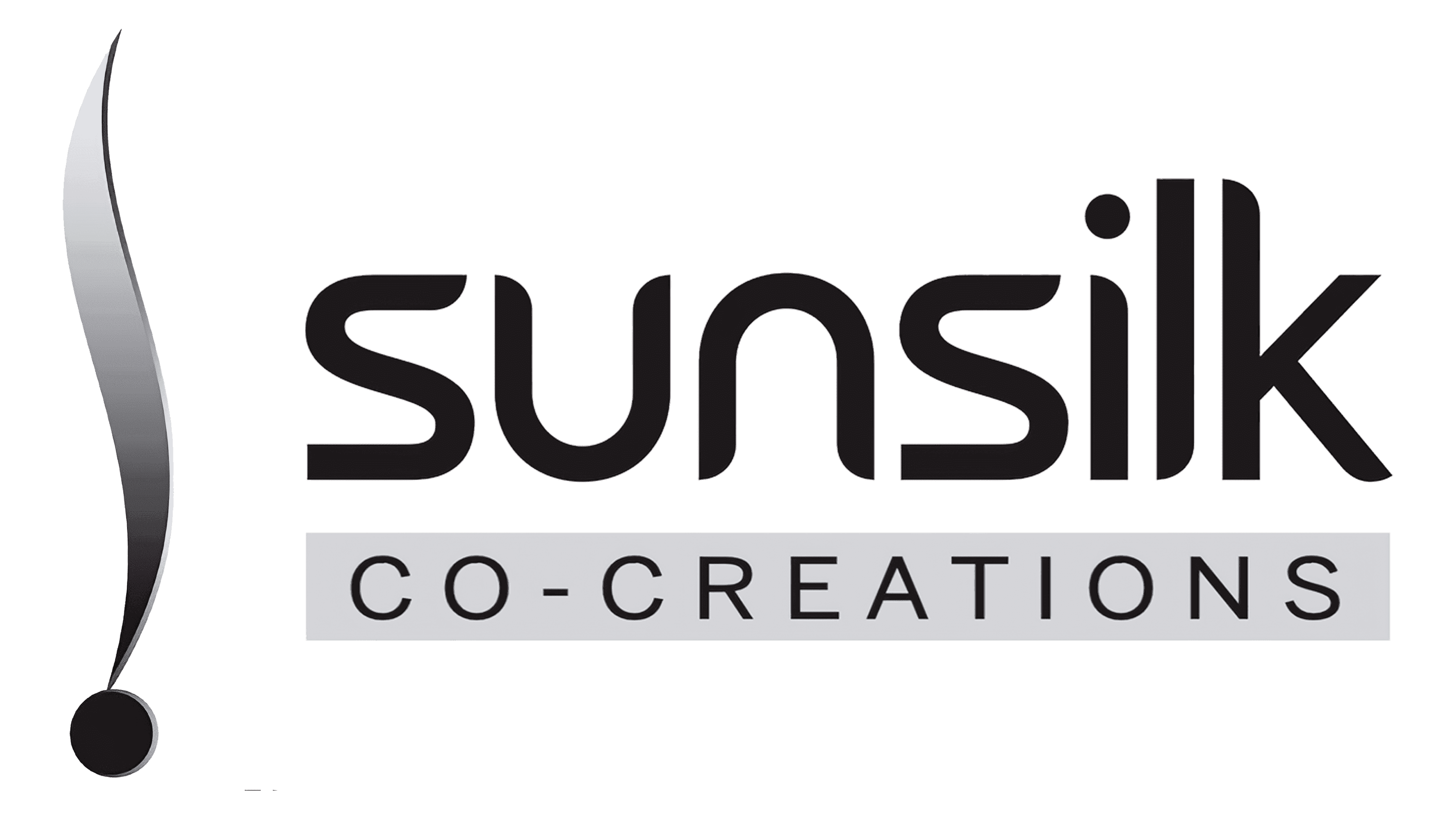
The developers made the vertical wave, symbolizing a lock of hair, thin and elongated. The point was left large. An updated inscription appeared under it in two lines: at the top, the single word “Sunsilk”, at the bottom, “Co-Creations” in a gray rectangle.
2016 – 2022
![]()
In 2016, the company name was inside a fuchsia circle with a dark gradient and gray-to-black shadows. The word “Sunsilk” was the largest and was at the top. But it consisted only of lowercase letters, in contrast to the inscription “CO-CREATIONS,” made in small capital glyphs. The font remains the same as in the previous version.
2022 – today
![]()
The current Sunsilk logo differs from the previous one in that it lacks gray shading along the edges of the circle and the letters. The purple has darkened, and the gradient has taken on a pronounced linear shape. The bottom lettering has been removed, allowing the designers to enlarge the word “Sunsilk.” Moreover, it is now so large that the first “s” and the last “k” go beyond the round base.
Font and Colors
In 2022, the Sunsilk logo’s font changed slightly, although the brand name still uses bold geometric sans serifs. The letters have taken on a more round shape, while many corners have been cut off and smoothed. The left-hand cuts at the tops of the vertical strokes “i,” “l,” and “k” look symmetrical.
The color scheme has also been modified. Now it is dominated by purple, ranging from dark to light pink, with a gradient. The white inscription is visible against such a background.
Despite the abundance of versions, Sunsilk’s symbols are associated with its name, which is present in all versions. Since 1963, a graphic designation in the form of a vertical oval has appeared in the logo, evolving from the letter “S” into an elongated curl.
The emblem contains several types of typefaces. The first versions were serif; the rest were not. The current logo uses a sleek, grotesque font. The color palette also ranged from black-and-white classics to a bright purple neon spectrum.
FAQ
What does the Sunsilk logo mean?
The logo has a clear, significant meaning that aligns with the brand’s uniqueness and its consumers. The fuchsia-and-white palette represents femininity, style, and beauty. Fuchsia, a bright and bold color, reflects the brand’s passion, energy, and dedication to providing effective hair-care solutions. This color choice conveys luxury and care, suggesting that using the brand’s products leads to a pampering, indulgent experience.
The white elements in the logo add simplicity and purity, enhancing feelings of trust and reliability. This color mix makes the logo visually appealing and strengthens the brand’s image as a beauty and hair care leader.
The logo’s design appeals to its target audience, primarily women, by resonating with their desire for stylish, high-quality hair care products.
Is Sunsilk an Israeli brand?
The brand is not Israeli. It is a British hair care brand produced by Unilever. The brand was introduced in the UK and is available in most countries worldwide. Unilever is a multinational company that owns the brand and oversees its production and distribution.
The company started in the UK and has grown in popularity globally. It offers a wide range of hair care products, including shampoos, conditioners, and styling treatments for different hair types and needs.
The brand’s global presence and extensive product line have made it a trusted name in hair care. The company continues to innovate, creating new formulations to meet the changing needs of its diverse customer base.
What is the vision of Sunsilk?
Sunsilk’s vision is to empower and equip girls with the support, skills, and confidence they need to explore their possibilities. The brand aims to expand what girls believe they can achieve and become. The company inspires young women to pursue their dreams and reach their full potential by focusing on empowerment.
The brand’s products and marketing efforts align with this vision. The company provides high-quality hair care products and fosters an environment where young women feel empowered and supported.
What is the logo of Sunsilk?
The logo is a purple-pink circle with the brand name and the word “CO-CREATIONS” written in white letters. This design showcases the brand’s vibrant, modern identity. The purple-pink color represents energy, passion, and a youthful spirit, matching the brand’s focus on providing high-quality hair care solutions.
The white letters for the brand name and “CO-CREATIONS” ensure clear readability and a clean look. “CO-CREATIONS” highlights the brand’s collaborative approach with hair care experts and stylists to develop products and effective hair care tailored to various needs.
This simple yet impactful design makes the logo recognizable and memorable, strengthening the brand’s presence in the competitive hair care market.
Do they still make Sunsilk?
Although the brand is no longer made or sold in the United States, it is still available in many other countries, including Canada. It remains popular in regions like Europe, Asia, and Latin America.
Unilever, the company behind Sunsilk, continues to support the brand and innovate with new products to meet the needs of its global customers. The brand’s product line includes shampoos, conditioners, and styling treatments for different hair types and concerns.
Which company owns Sunsilk?
Sunsilk is owned by the British multinational company Unilever. The brand is part of Unilever’s portfolio, which includes other well-known names like Dove, Axe, and Tresemmé.
Unilever’s ownership benefits the brand with vast resources and expertise in research, development, and marketing. This helps the brand innovate and introduce new products to meet consumers’ needs worldwide.
Through Unilever’s efforts, the brand continues to thrive and expand its offerings, reinforcing its commitment to effective and reliable hair care solutions.