The kinetic energy is encrypted in the logo of Head & Shoulders shampoos. The Head & Shoulders logo states that using Head & Shoulders products cleanses hair, removes dandruff and dirt, and restores elasticity and strength to the curls.
Head & Shoulders: Brand overview
Head & Shoulders is an anti-dandruff shampoo line introduced in 1961 by Procter & Gamble. To date, it has expanded to an incredibly wide range while maintaining its visual identity.
Meaning and History
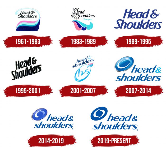
The brand’s emblem is its trademark, so its appearance dates back to the same time as the product itself. Over the years, the Head & Shoulders line has had six logo variants.
What is Head & Shoulders?
It’s an American brand with a long history. It offers anti-dandruff shampoos, hair conditioners, and shower gels. Its primary market segment is the market.
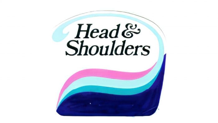
1961 – 1983
The emblem features a wavy design in both the image and inscription. The color palette is rich, consisting of pink, blue, aquamarine, and dark blue.
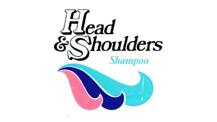
1983 – 1989
Developers changed the layout of the elements, placing the name at the top and waves at the bottom. The word “Shampoo” was added in between.
1989 – 1995
All drawn details disappeared from the logo – only text remained.
1995 – 2001
Designers placed the name diagonally and changed the color of the letters.
2001 – 2007
For the first time, the abbreviation H&S appeared on the logo.
2007 – 2014
In 2007, the “swirl” logo period began – an oval with several multicolored strokes inside. Next to it is the brand’s full name.
2014 – 2019
This period relates to the emblem with a simplified version of the “swirl.” It has a clear structure and clear division into two central elements, reminiscent of the classic Yin and Yang combination. The diagonal oval contains two curved stripes – blue and white. A gray stripe with metallic reflections borders its edges. The ampersand (&) changed color from dark blue to light blue.
2019 – today
Designers left the structure of the logo unchanged: a graphic icon on the left and the extended brand name on the right. Changes only affected details, which did not alter the overall design of the components. Developers removed the gray frame, highlights, and gradient from the oval, making it look strict and practical. Compared to the previous version, the icon became slightly larger due to the combination of space with one color. Blue is now used instead of blue and silver.
The semi-circular hook-shaped lines in the center of the icon are narrowed on one side and widened on the other. Previously, they were different colors, but now they are both white. The inscription on the right remains the same – lowercase, semi-lettering, with a slight tilt to the right.
Head & Shoulders: Interesting Facts
Head & Shoulders is a famous shampoo brand that’s been around since 1961. It was made to help people get rid of dandruff, and it works because it has a special ingredient called pyrithione zinc (ZPT). This ingredient fights the fungus that causes dandruff.
- Starting Out: Head & Shoulders began in 1961 as one of the first brands to fight dandruff. They did extensive research to make a shampoo that works.
- The Magic Ingredient: The shampoo contains ZPT, which stops dandruff by fighting a specific fungus.
- Always Learning: The company has a special Scalp Health Institute where they study how to keep scalps healthy and hair looking good.
- Around the World: Head & Shoulders is available in over 140 countries. They make different kinds of shampoo for different hair needs.
- So Many Choices: They’ve made shampoos and conditioners for sensitive scalps, oily hair, and dry scalps.
- Caring for the Planet: In 2017, Head & Shoulders made a shampoo bottle out of recycled beach plastic, showing they care about the environment.
- Famous Fans: Many athletes and celebrities have said they use Head & Shoulders, which helps people trust the brand.
- Breaking Records: In 2019, they set a world record for the most people washing their hair simultaneously.
- Teaching Us: They also help teach people about dandruff and how to care for their scalp and hair.
- Smart Packaging: The packaging is easy to use and good for the planet because it uses less plastic and more sustainable materials.
Head & Shoulders is more than just a shampoo. It’s been a big part of making hair care better for everyone, with lots of research, global reach, and care for the environment.
Font and Colors
After five stages of evolution, the personal symbol became simpler. Now, it consists of an extended name and an oval on the left.
The inscription is in italics. All letters in the words are lowercase. The modern color palette is reduced to a combination of blue (letters, signs) and white (background, internal strokes).
Head & Shoulders color codes
| USAFA Blue | Hex color: | #0154a4 |
|---|---|---|
| RGB: | 1 84 164 | |
| CMYK: | 99 49 0 36 | |
| Pantone: | PMS 2945 C |
FAQ
Which company manufactures Head and Shoulders?
All Heads & Shoulders products are manufactured by Procter & Gamble, which specializes in consumer goods production.
Why are Heads and Shoulders products harmful?
Head and shoulder products contain substances that cause itching (SLES, SLS) and nerve damage (methylisothiazolinone). Hair loss may also occur due to preservatives, stabilizers, fragrances, dyes, and other additives.
Is Head and Shoulders an Indian brand?
Head & Shoulders is an American brand that sells only anti-dandruff shampoos in India.
Is Head and Shoulders a good brand?
Head & Shoulders shampoo effectively combats dandruff thanks to active ingredients such as selenium sulfide and pyrithione zinc. Other ingredients can be potentially harmful to the health of your hair and scalp.
