Although the Olay logo contains only the brand name, it embodies a deep meaning. The minimalist form of the letters conveys the perfectly balanced formulas that are fundamental to skin care. The rounded corners are associated with softness, harmony, and elegance, while the long line at the bottom symbolizes smooth skin.
Olay: Brand overview
| Founded: | 1952 |
| Founder: | Procter & Gamble |
| Headquarters: | United States |
| Website: | olay.com |
Meaning and History
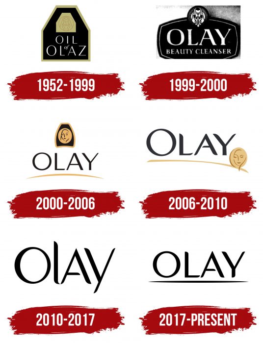
The brand has changed several names, which is reflected in its logos. Initially, it was called Oil of Olay, then Ulay, Ulan, and Olaz. There are eight versions of the logo in the brand’s history: three are related to the renaming and five to the design changes.
What is Olay?
It is a skincare cosmetics brand. Its first products were produced in South Africa and contained lanolin. It is owned by the American corporation Procter & Gamble, and Olay’s product formulas are based on vitamins and peptides.
1952 – 1999
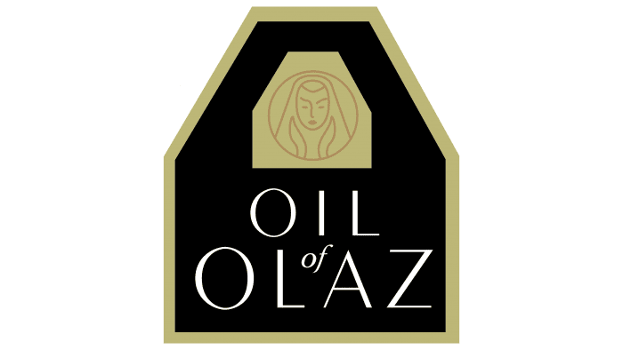
The debut period includes three emblems resembling a shield. At the top, in the narrow part, there was a circle with a girl’s face, and at the bottom – the brand name. All elements were outlined with a thin, light line.
1999 – 2000
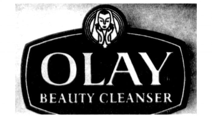
Before the start of the new millennium, the company changed its logo, choosing a different shape and shortening the name. The version of that time looked like an oval with a circle, where a contour portrait of a woman was depicted.
2000 – 2006
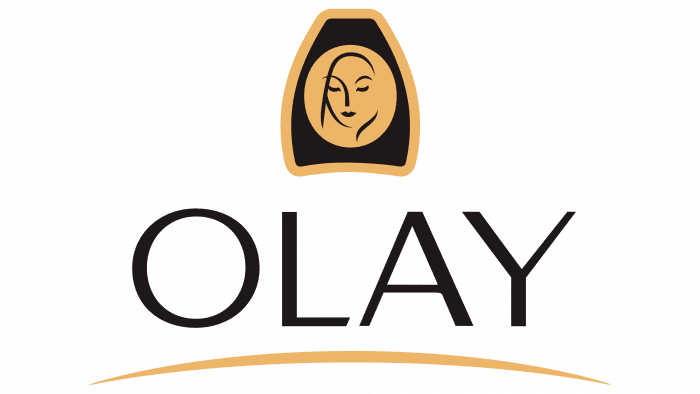
Developers removed the dark background from the letters and highlighted the female face as a separate element. The writing of the name changed.
2006 – 2010
In this period, the underlining of the letters disappeared. The top sign moved down to the right side. The letter “O” was enlarged.
2010 – 2017
The female face received another design in two versions and became an independent icon. The emblem was simplified to a single word, “Olay.”
2017 – today
The current version consists of the brand name with an underline.
Olay: Interesting Facts
Olay is a big name in skincare that started with a simple idea. It’s been around since the 1950s when a chemist named Graham Wulff in South Africa wanted to make a skincare product that was better than the thick creams available at the time. He created a light, easy-to-absorb formula that his wife loved, and that’s how Olay began.
- How It Started: Olay was first made to help Wulff’s wife, who didn’t like the heavy creams of the day. He worked to make something lighter so that the skin could absorb better.
- Marketing Magic: In the beginning, Olay was a bit of a mystery. It was sold in a fancy glass bottle without clear instructions, using the tagline, “Share the secret of a younger looking you,” to make people curious.
- Name Changes: The brand’s name changed a few times depending on the country, like “Oil of Ulay” or “Oil of Olaz,” but eventually, they settled on “Olay” to bring everything under one name worldwide.
- Science and Innovation: Olay is known for using science to make better skincare. They were among the first to use Vitamin B3 in their products because it’s good for the skin in many ways.
- Affordable Anti-Aging: The Olay Regenerist line, which came out in the early 2000s, made a big splash. It offered anti-aging products at prices that more people could afford, making Olay a go-to brand for many.
- Pro-X Range: In 2008, Olay stepped up its game with the Pro-X range, which was made with dermatologists’ help to target the root causes of aging skin.
- Empowering Women: More recently, Olay’s #FaceAnything campaign celebrated women’s uniqueness and encouraged them to face the world confidently.
- Going Green: Olay is working on being more eco-friendly, such as using refillable pods for some of its products to reduce plastic waste.
- Joining P&G: In 1985, Olay became part of Procter & Gamble, which helped It grow even more and reach people worldwide.
Olay’s journey from a single product to a global skincare leader shows how innovation, smart marketing, and a commitment to quality can make a brand loved by many. Olay continues to focus on making products that help people feel good about their skin while also trying to be kinder to the planet.
Font and Colors
Regardless of the version, the trademark logo has always been associated with its name. Until 2010, it contained a miniature image of a woman’s face, drawn in contour technique. But then, the graphic sign was separated and gained the status of an independent symbol.
The brand name is made in an individual font. It is a mixture of several fonts, so it contains elements of Optima, Bergman, and Peignot. The colors of the emblem are standard beige, black, and white.
Olay color codes
| Black | Hex color: | #000000 |
|---|---|---|
| RGB: | 0 0 0 | |
| CMYK: | 0 0 0 100 | |
| Pantone: | PMS Process Black C |
FAQ
What does the Olay logo represent?
The cosmetic brand’s logo contains its name: the word “OLAY,” written in a custom font with serifs.
Has Olay changed its logo?
The latest update of the Olay logo was aimed at simplifying the inscription. Designers changed the shape of the letters and added an underline so that the word “OLAY” could be easily reproduced in print.
Is Olay a Philippine brand?
The Olay brand is American, and in the Philippines, it sells only cosmetics, as in other countries.
Is Olay a Japanese brand?
Although Olay produces the Olay Regenerist Cellscience line of cosmetics in Japan, it is not considered Japanese – it is still an American brand.
What is the significance of the Olay logo?
The Olay logo reflects the name of the skincare line. The drawn underline below indicates the importance and completeness of the corporate concept. The font chosen by the designers indicates the uniqueness of the cosmetics and a modern approach to its production.
What does the Olay Logo symbolize?
The Olay logo symbolizes the leadership and leading role of the brand, as it contains only its name. The inscription is made with unconventional glyphs, embodying Olay as an innovator and experimenter striving to find high-tech solutions.
Why is the brand called Oil of Olay?
The Olay brand was formerly known as Oil of Olay because its cosmetics contained lanolin. In addition, the product was released not in the form of cream but as a liquid, that is, oil, which was reflected in the name and logo. The phrase “Oil of Olay” was chosen by chemist Graham Wulff, who developed the product.
What was Olay called before?
In the past, Olay was called differently: Oil of Ulay, Oil of Ulan, Oil of Olaz, and Oil of Olay. The choice of name depended on the country where the cosmetics were sold and, accordingly, was reflected in the logo. In 1999, the company decided to unify all its products under the global brand Olay, although this was not possible everywhere due to the linguistic peculiarities of the regions. For example, it is still known as Olaz in Belgium and the Netherlands.
Is Olay the same as Oil of Olay?
Yes, the names Olay and Oil of Olay represent the same cosmetic brand. The only caveat is that they were used at different times. The company officially became Olay in 1999 and adopted a new logo to reflect these changes.
