


![]() Old Spice Logo PNG
Old Spice Logo PNG
The Old Spice logo featuring a sailing ship refers to the era of sea voyages and long-distance trade routes, when spices were brought from exotic lands. It preserves the brand’s connection to its origins, traditionally associated with masculine fragrances and a spirit of adventure.
In 1934, William Lightfoot Schultz founded Shulton Inc. in New Jersey, producing soap and toiletries with minimal resources. Early sales reached $165,000. A turning point came in 1937, following a suggestion from Bullock’s buyer, Harry Schwimmer, who saw potential in colonial-themed products inspired by Colonial Williamsburg.
That year, Early American Old Spice launched as a women’s fragrance line with soap, powder, and bath salts. Packaging referenced 18th-century glass, while the name drew on maritime trade and personal associations. Despite a limited Christmas release, sales reached $77,000, and stock sold out quickly.
In 1938, Shulton introduced a men’s line with shaving soap and aftershave. Nautical imagery, including ships like Grand Turk and Friendship, became a core motif. The men’s segment soon overtook the original female line and defined the brand’s direction.
World War II accelerated growth as Old Spice products were included in military kits. Returning soldiers sustained demand from the 1940s through the 1960s. In 1970, Shulton was acquired by American Cyanamid, expanding the range.
In June 1990, Procter & Gamble purchased Old Spice for $300 million. At that time, the brand struggled with an aging image, while Unilever promoted Axe toward younger consumers. P&G updated its packaging and added deodorants, body wash, and hair products, including High Endurance, which are distributed in schools.
In 2010, Wieden+Kennedy launched “The Man Your Man Could Smell Like” with Isaiah Mustafa. The campaign targeted female buyers and drove rapid growth. By May, Red Zone Body Wash sales rose 60%, reaching 125% by July. The ad later received the Grand Prix at Cannes and a Primetime Emmy.
Meaning and History
![]()
In its early years, Shulton Inc. produced women’s perfumes inspired by a potpourri of scents used by the founder’s mother. The company named its product Early American Old Spice. Then, building on its success, it released a male counterpart to the same fragrance. The line also featured aftershave lotion and shaving soap.
For these, the company first used a nautical theme, depicting a sailing ship on the label, which subsequently became the prototype for all other emblems. Initially, the ships “Friendship” and “Grand Turk” were featured; the list was later expanded. Many famous long-distance ships have graced the emblem, including Hamilton, United States, Sooloo, Maria Teresa, John Wesley, Java, Recovery, Birmingham, Constitution, Propontis, Salem, Star of the West, and others.
The sailing ships perfectly fit into the men’s cosmetic line and resonate well with its name. In the past, spices were transported by ship from distant countries, and sailors were considered the most masculine because they had to overcome many challenges. Thus, the maritime theme, inspired by aromatic spices, became the basis for the logos of the Old Spice collection. Because only the very wealthy could afford spices, the line was considered luxurious.
What is Old Spice?
This brand from Procter & Gamble evolved from a traditional men’s fragrance into a major player in men’s grooming, known for its bold scents and vibrant style. The range includes body washes, shampoos, styling products, and signature deodorants and antiperspirants, each with a unique fragrance from the classic Original to the distinctive Bearglove and Wolfthorn. The brand’s uniqueness is combining memorable marketing with effective personal care products. It appeals to young consumers who prefer daring scents and those who appreciate the brand’s iconic fragrances.
1938 – 1947
![]()
1947 – 1955
![]()
1955 – 1996
![]()
1996 – 2004
![]()
2004 – 2010
![]()
2010 – today
![]()
Font and Colors
The logo contains an image of a sailing ship used to deliver spices from exotic countries. It has three tall masts and a thin fluttering flag. Below is the phrase “Old Spice.” The ratio of their sizes has changed over time. Sometimes, the ship was tiny, and the name was large. The ship is located at the junction of the two words and is positioned over the “d” and “S.” The inscription is done in an old style and complemented by neat roundings.
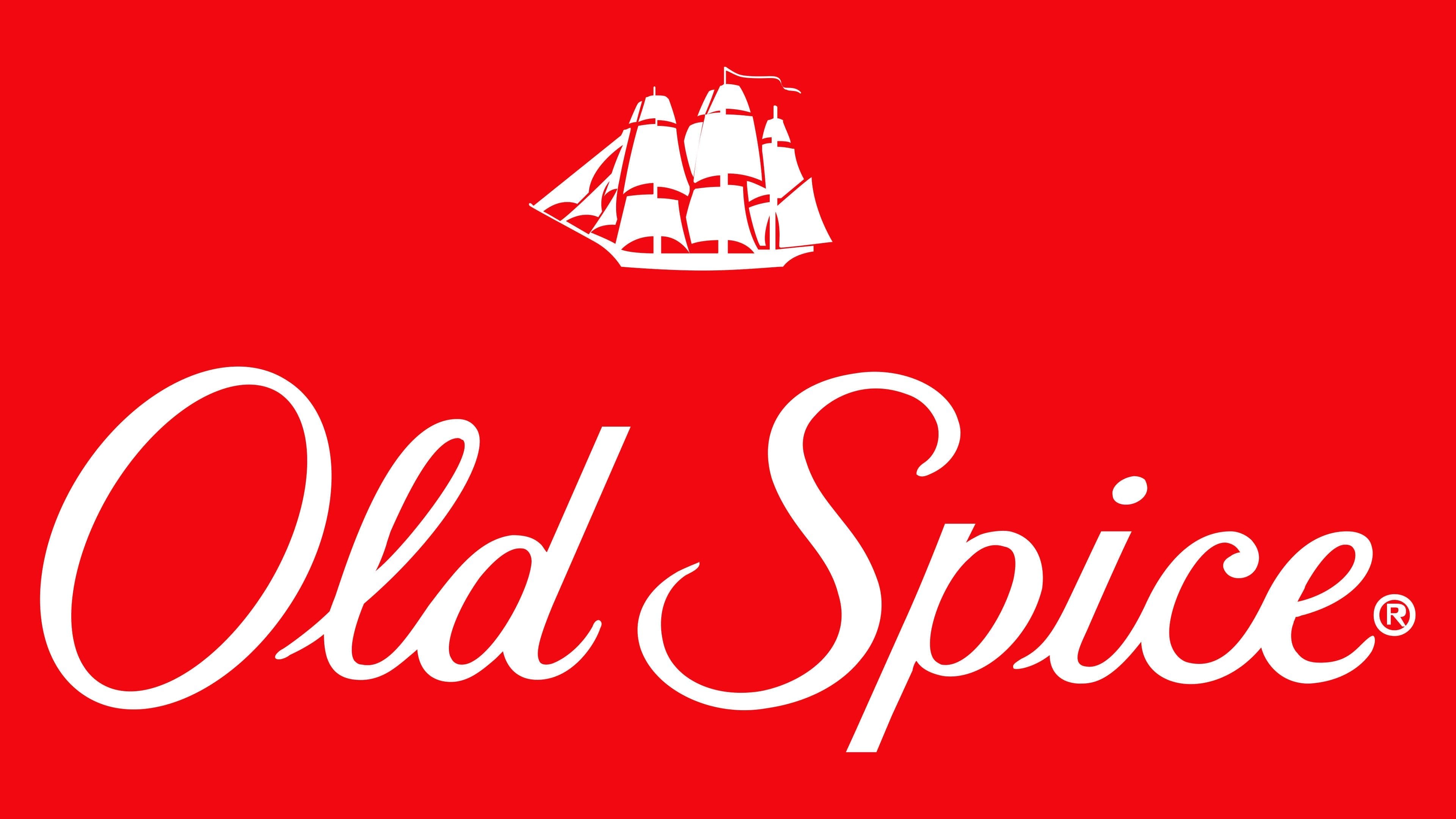
The name on the emblem imitates calligraphic handwriting. It is executed in an italic, semi-closed handwritten font. The letters have a streamlined, elegant shape. The modern corporate palette consists of dark red and white; the old one, of blue and white.