


![]() Dove Logo PNG
Dove Logo PNG
The Dove logo symbolizes the lightness and softness of the brand’s cosmetics. The brand’s products are reminiscent of gentle silk. This care is evident in the emblem’s symbols. Ingredients used in production gently cleanse, nourish, and moisturize the skin.
The history of Dove began during World War II, when research on burn treatment led to a mild, pH-neutral cleansing formula. After the war, Lever Brothers continued development. In 1952, Unilever acquired a French patent for a synthetic cleanser containing added moisturizing cream, linked to chemist Vincent Lamberti.
In 1957, Dove Beauty Bar launched in the US with the claim that it contained one-quarter moisturizing cream. Ogilvy & Mather’s advertising positioned it as a “beauty bar,” contrasting it with traditional Procter & Gamble soaps, including Ivory.
For decades, Dove held about three percent of the market. In 1969, campaigns began featuring real users. A 1979 relaunch emphasized dermatologist recommendations, and by 1986 Dove became the top-selling soap brand in the US.
In 1989, the brand entered Europe, starting with Italy. Between 1991 and 1994, it expanded into 55 countries, including Brazil, the UK, India, China, and South Africa. By 1991, its growth helped Unilever surpass Procter & Gamble in the US soap market.
In 1995, the range expanded to include body wash, lotions, and deodorants. By 2001, Dove had exceeded 1 billion dollars in annual revenue and had become a key Unilever brand. Research that year showed that only two percent of women described themselves as beautiful.
In 2004, Dove launched Campaign for Real Beauty, sparking public debate. The Dove Self-Esteem Project followed, and in 2013, the Real Beauty Sketches video reached over 163 million views. In 2010, Dove Men+Care expanded into male grooming.
Meaning and History
![]()
The toiletries brand’s logo has always been distinguished by refined elegance. It consists of two parts: graphic and textual. The first is the name in italics, and the second is an image of an elongated dove from the Columbidae family. The main elements of the logo were developed when the company was founded and have remained almost unchanged since. They have retained the style, color scheme, personal sign, and original idea. The logo has undergone three minor redesigns over the years.
The blue-white-gold palette symbolizes the gentleness and luxury that the brand carefully conveys to consumers. The image of the dove also speaks of this – an embodiment of peace, loyalty, and love. The logo was created by artist Ian Brignell, a renowned designer specializing in fonts, branding, and lettering. He has worked on logos for companies such as Budweiser, Smirnoff, Coors Banquet, and many others.
What is Dove?
Dove is one of the many brands of Unilever PLC. It was founded in 1957 in the USA. Its range primarily includes toiletries such as skin care cosmetics, detergents, and deodorants. The products are intended for adults and children of both genders.
1955 – 1969
![]()
The debut Dove logo appeared in 1955. It features a balanced blue background with the name in white italics. The top half is colored gold, and in the right corner of the field is a stylized dove. The bird looks to the left and is drawn as if flapping its wings at that moment. This version was used for 15 years and served as the basis for the current emblem, which has become globally recognizable.
1969 – 2004
![]()
In 1969, the brand’s design changed. The developers retained the mood, style, and elegance. They also retained the color scheme, simply adjusting the shades: the word “Dove” was set in blue, and the dove was set in gold. The letters were replaced with wider ones, and the loop connector of the lowercase “v” was removed.
The background was replaced with a minimalist white to make the elements stand out sharply and brightly. Additionally, the artists drew the bird more elegantly and radically turned it to the right. The font remained the same, with slight design adjustments, as the main focus is now on color richness. This logo variant lasted 35 years.
2004 – 2012
![]()
The next logo change occurred in 2004, before the brand’s milestone anniversary. The design change was undertaken to show that the brand is constantly evolving, renewing, and improving. For this, the representatives retained the previous color scheme but adjusted the tones. As a result, the dove appeared in a gradient version with a tonal transition, creating a three-dimensional effect. Additionally, white was added to the gold, increasing the drawing’s brightness and dynamism.
The bird’s position also changed: it is now below the name, not above it, exactly in the center. The inscription also underwent a slight transformation. The word “Dove” is written in a thin lowercase font, except for the first letter, which is capitalized according to grammar rules. The lines became smooth, with neat, uniform contours. The designers modernized the letter “v”: added a smoothed angle and completely removed the upper connecting loop.
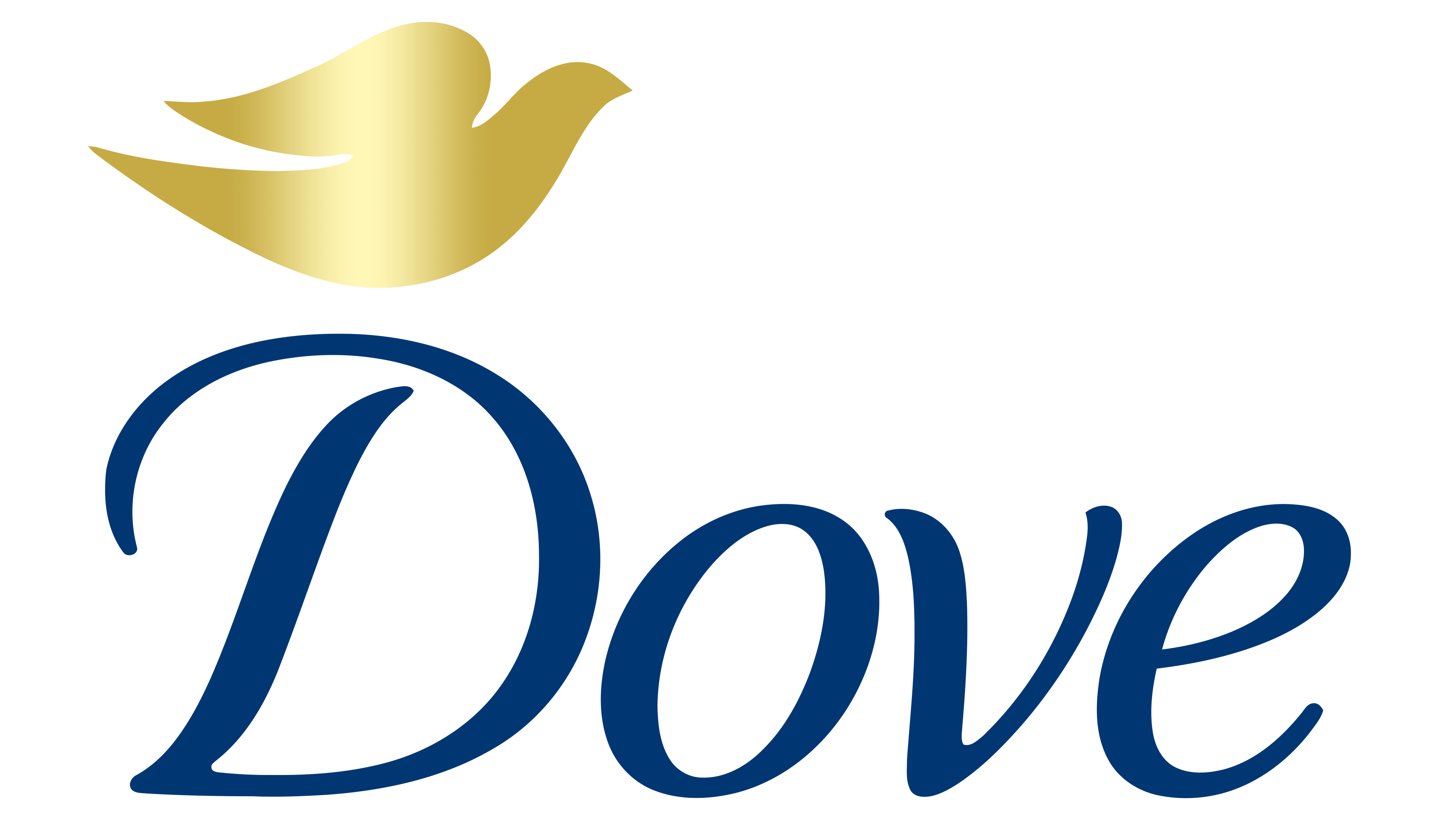
2012 – today
![]()
The current logo of the cosmetic brand appeared in 2012. It was created from the previous version, so the changes were minimal. The developers slightly elongated the letter “D,” making the name look more refined, and making the letter “E” smoother. The dove’s color was altered to remove the excessive steel shine, making the gold appear several shades darker.
Font and Colors
The main element of the logo is the dove. It perfectly aligns with the brand’s concept, embodying purity, beauty, and lightness. But if it was initially a rather heavy bird, it has now become weightless. Along with it, the color evolved from standard white to beige-gold with bright highlights. Each variant also contains the brand name.
Despite the word “Dove” appearing identical, different fonts are used in the emblems. The capital letter “D” resembles Rigaer Tango, and “ove” Atlantic Sans Italic. However, the inscription most closely resembles Civita Light Italic, a font developed by Dieter Hofrichter. The closest free variant is TribunADFStd-Italic. The color palette consists of ocean blue (for the letters), beige-gold (for the bird), and white (for the background).