![]() Neutrogena Logo PNG
Neutrogena Logo PNG
The seemingly simple Neutrogena logo is actually not that simple. Designers used the world’s most common font, Times New Roman, and a minimalist black color to show that behind a dull sign, a riot of colors can hide an entire universe of bright cosmetics.
Neutrogena traces back to 1930 in Los Angeles, where Emanuel Stolaroff launched Natone as a small cosmetics business serving Hollywood studios and on-set salons. In the 1940s, the company expanded into retail distribution, moving beyond a narrow professional client base.
A turning point came in 1954 during a European trip, when Stolaroff encountered Belgian chemist Edmond Fromont and his patented soap. Marketed as Neutrogena, it rinsed clean without residue and quickly restored skin pH. Stolaroff secured U.S. distribution rights and introduced it through pharmacies and department stores.
By 1957, Lloyd Cotsen joined the business after marrying Stolaroff’s daughter. He repositioned the soap as a clinically credible product, using dermatologists and luxury hotels as key channels. In 1962, Natone was renamed Neutrogena Corporation. By 1967, with Cotsen as president, annual sales reached about $3 million.
Rather than compete directly with Procter & Gamble, the company focused on dermatologist-backed skincare. In 1973, Neutrogena went public on NASDAQ. The 1980s brought expansion into shampoos, with rapid growth and diversification beyond its core soap.
In 1991, Cotsen moved to the chairman role, and Allan Kurtzman, formerly of Max Factor, became CEO. By 1993, the company introduced a full skincare line. A year later, Johnson & Johnson acquired Neutrogena for $924 million, enabling global expansion.
In 2023, Neutrogena became part of Kenvue following a corporate spin-off, alongside Aveeno, Tylenol, Listerine, and Band-Aid. In 2025, Kimberly-Clark announced plans to acquire Kenvue in a $48.7 billion deal expected to close in 2026.
Meaning and History
![]()
In its early years, the cosmetic company supplied its products to specialized stores serving Hollywood stars. These were prestigious goods. But their distribution history did not start simply. The founder expanded the business, gradually turning it into a profitable company with its own stores. In 1945, he met Belgian chemist Edmond Fromont, married his daughter, and gained full rights to the patented formula for a new, soft, transparent, non-drying soap. In 1994, the Neutrogena trademark became the property of Johnson & Johnson. In 2021, it was involved in a benzene-related scandal and recalled several products from the market.
What is Neutrogena?
Neutrogena is the trade name of Neutrogena Corporation, which has been owned by Johnson & Johnson since 1994. It is used on the logo, where only one word is presented, executed in a serif font. The company produces a variety of cosmetics, hair, and skin care products.
1951 – 1974
![]()
The presented logo consists of a horizontal, elongated rectangle adorned with lined-up stripes. They are thin, intersect, and form numerous diamonds. Against their background is the cosmetic brand’s name. The inscription is clear and includes a combination of lowercase and uppercase letters, following grammatical rules. But the first letter, “N,” is somewhat separated from the rest, as it is placed upright, while the second part of the word is tilted to the right.
1974 – 1978
![]()
After several modifications, the emblem transformed and became much more correct due to the tilt of the first letter “N.” Moreover, designers added boldness to the symbols while preserving the original font. They colored the base in black so that the name would not be lost against the background of small elements, and made the rectangle narrower.
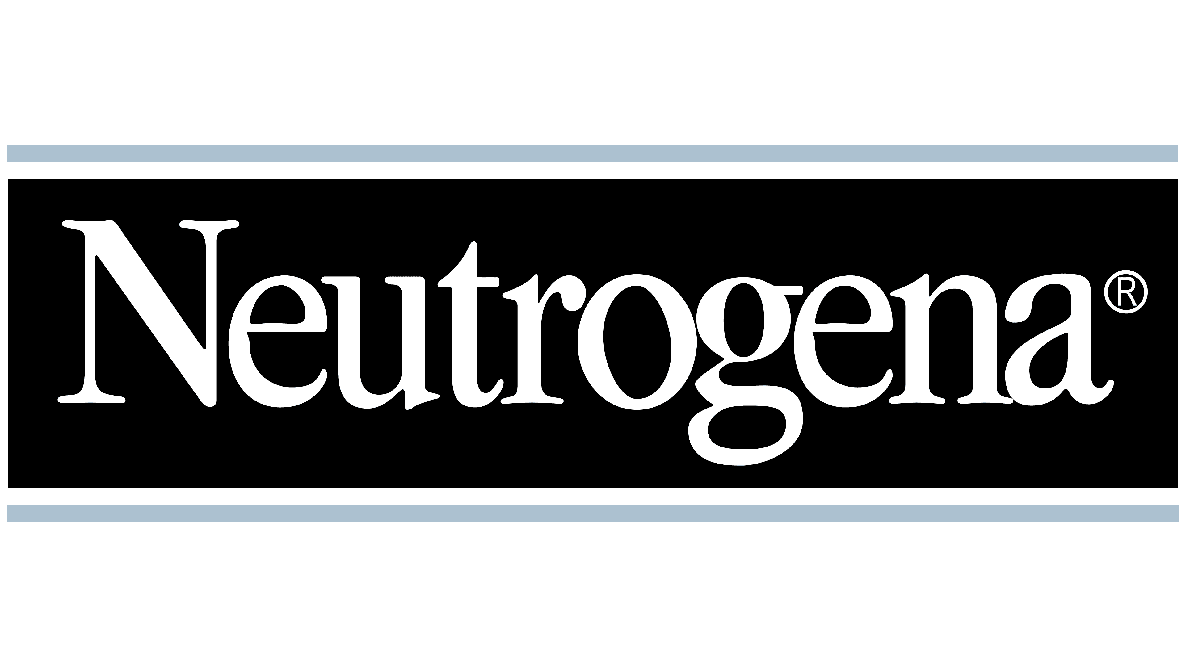
1978 – today
![]()
The individual trademark only features the name. There are no other identifying elements. The word “Neutrogena” occupies the entire space on the logo and is tightly spaced.
Font and Colors
The inscription used the classic font, Times New Roman, the most widely used in the world. This boosted the emblem’s popularity and brand recognition, as the font is easy to read. The logo’s color palette is monochrome, consisting of black and white. The current version also includes dark gray.