


![]() Unilever Logo PNG
Unilever Logo PNG
The emblem conveys the brand’s originality and uniqueness through the unusual ornament. The style of service and the stores’ decor distinguish the network from other retailers. The Unilever logo is an example of a successful combination of various products in one place.
Unilever’s history began with two separate family businesses in Europe. In 1884, William and James Lever bought a small soap factory in Warrington, England. William Lever turned Sunlight Soap into a packaged, branded product for mass buyers at a time when soap was usually sold by weight. By the late 1920s, Lever Brothers controlled 60% of British soap production. They operated in South Africa, Europe, Canada, Australia, and the United States.
In the Netherlands, the Jurgens and Van den Bergh families built competing margarine businesses after Hippolyte Mège-Mouriès patented margarine in 1869. Their rivalry lasted for decades, then ended in 1927 with the creation of Margarine Unie, formed with other European fats and oils producers.
By the late 1920s, Lever Brothers and Margarine Unie faced the same problem: both needed palm oil and animal fats. Talks over supplies turned into merger talks. On September 2, 1929, the companies signed the agreement, and on January 1, 1930, Unilever officially began. The Economist described it as one of Europe’s largest industrial mergers. By 1930, Unilever had 250,000 employees, while Procter & Gamble entered the British market as a major rival.
Unilever expanded through acquisitions and brands: United Africa Company; T.J. Lipton in 1943; Sunsilk in 1954; Dove in 1957; National Starch in 1978; Brooke Bond in 1984; Breyers from Kraft in 1993; Best Foods in 2000; and Hellmann’s and Knorr. In 2017, it rejected Kraft Heinz’s $143 billion takeover bid and sold its spreads business to KKR. In 2020, Unilever ended its dual Anglo-Dutch structure and became a single British company based in London.
Meaning and History
![]()
In 1929, the soap company Lever Brothers (UK) merged with the margarine company Margarine Unie (Holland). As a result, all of their brands became part of Unilever’s single entity. Over time, the number of assets grew to 1,600, which was not profitable for marketing. The managers decided to keep only the most profitable and promising brands, reducing their number to 900. This happened in 2001, after the adoption of a new development strategy. And now there are half as many.
Until 1967, Unilever did not have its logo. Individual graphic signs belonged to separate brands under which consumer goods were produced. Then the company ensured that a single symbol represented the various business units. The design changed once, in 2004, to mark the multinational corporation’s 75th anniversary.
1967 – 2004
![]()
Unilever appeared in 1929, but for the first 38 years, there was virtually no corporate identity. In 1967, the staff of the Design Research Unit created a logo that reflected the company’s Dutch and British origins, the two pillars on which the whole structure rests. To this end, they used an allegorical symbol that depicted the balance of the two vertical lines of the letter “U.” According to the concept, it reflected the manufacturer’s stability and seriousness. As the archival documents show, until 1989, this element was the only one; then the word “Unilever” was added to it. The color was also changed from gray to blue.
The upward-pointing parts of the “U” were doubled and pointed. Because of their distinctive shape, they resembled the fountain-heads of ink-writing pens. But most often, they were compared to the twin towers of the World Trade Center complex.
2004 – today
![]()
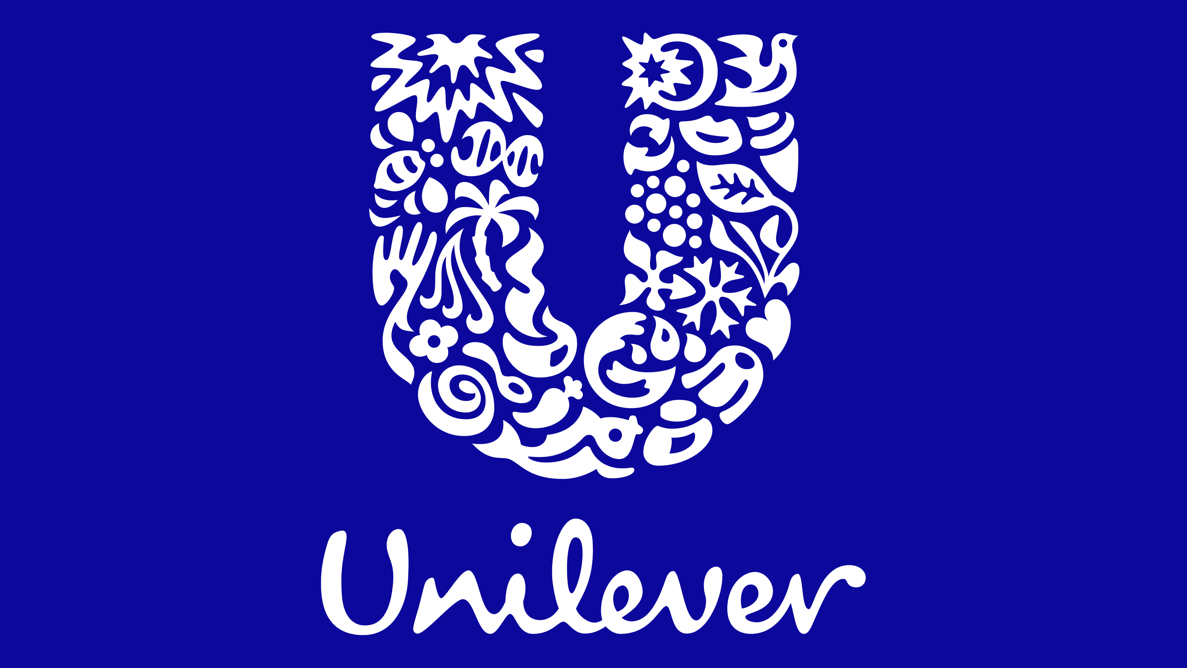
After the September 11, 2001, terrorist attack, the association with the twin towers took on a negative aspect, so Unilever needed a different logo. As part of the rebranding, the company turned to Wolff Olins to create something conceptually new. The creative director of the multinational corporation, Lee Coomber, was the ideological mastermind, while artist Miles Newlyn was responsible for the graphic part. He used negative space and reflected 25 characters in the letter “U,” best seen when zoomed in. The icons represent key market segments and manufacturer values. They form a U-shaped figure without serifs. At the bottom is the company name, handwritten.
The global identity was completed in 2004, just in time for the 75th anniversary. Unlike the previous one, the current logo appeared on all Unilever products. It appears in advertising and is inextricably linked to the brands that make up the company.
The 25 symbols have a wide range of connotations. For example, a palm tree can stand for paradise or oil, a bee is associated with sweets and agricultural products, and a bird reflects the world and Dove products. In addition, the icons are grouped by meaning. Flowers, plants, lips, and hair are associated with beauty; bubbles, water, and sunlight are associated with purity; fish, chili peppers, and ice cream are associated with food; trees, birds, fish, and insects are associated with nature.
According to Unilever’s website, each element reflects a particular aspect of the company. Among them are two arrows (a recycling symbol), a heart (a symbol of love), DNA (literally the brand’s DNA), and many others.
It is believed that the multinational corporation’s emblem imitates the logo that Pharmacia & Upjohn used from 1995 to 2000 during the merger. It depicted a star, a bird, and a hand, with their impressionistic design closely resembling that of Unilever icons.
Font and Colors
Lee Coomber and Miles Newlyn created a unique wordmark using custom glyphs. There are remotely similar fonts: Olivier and Desyrel Font. They mimic sloppy handwriting in a semi-connected style, with only some letters connected.
Since 1990, the company’s primary color has been blue. After the 2004 rebranding, the logo became darker, making it clearer. The chosen shade is close to #06069B.