


![]() Behance Logo PNG
Behance Logo PNG
The limited resource area has everything you need for communication and development. The Behance logo represents the solidarity of users around creative ideas, the opportunity to express their opinions, and the ability to exhibit work for the community to evaluate.
Scott Belsky graduated from Cornell University in 2002 and later earned an MBA from Harvard Business School. While working in leadership development at Goldman Sachs, he noticed a gap in the creative field: designers, illustrators, and photographers lacked a central platform to showcase their work. Many still relied on PDF portfolios, personal websites, and scattered online profiles.
In November 2005, Belsky founded Behance in New York with graphic designer Matias Corea. The name combined “be” and “enhance,” reflecting the platform’s aim to give creative professionals wider visibility and more control over public portfolios. For six years, the company operated without outside investment.
Early revenue came from Action Book notebooks, built around the Action Method, formally introduced in 2008. The method organized projects through tasks and references, helping users move from ideas to execution. Notebook sales helped fund development and kept Behance close to its target audience. At the same time, it grew between Dribbble, focused on polished design shots, and LinkedIn, built as a broad professional network.
In 2010, Behance launched ProSite, a portfolio site tool for users’ own domains, priced at $11 per month. From 2009 to 2019, it ran the 99U conference in New York. In May 2012, Behance raised $6.5 million from investors including Dave McClure and Bezos Expeditions. In December 2012, Adobe Systems bought Behance for about $150 million. At the time, it had 2.3 million public projects from 170 countries and 33.6 million appreciations. By October 2020, the platform had more than 24 million members.
Meaning and History
![]()
After its launch, the site’s activity depended on sales. At first, the sales objects were job postings and banners, and then tickets for its annual conference 99U, held in New York.
Then the authors improved the functionality of the creative site by introducing the option to rate and comment on other users’ work (projects). Now, both registered and unregistered visitors can do this. Community participants can subscribe to profiles that interest them, and anyone can open them.
According to the founders of the web-based design service, they have developed an online portfolio that presents projects as a structured art showcase, which distinguishes it from similar platforms like DeviantArt and Saatchi Art. In the spring of 2012, it received its first batch of external funding, and in the winter of that year, Adobe took a closer look and acquired it for $150 million.
A logo redesign accompanied each new stage in the work on the site. In total, there are three. The key elements of Behance’s identity are its full and abbreviated names. The first version is textual; the second and subsequent are graphic. Although the verbal designation is still used, it does not complement the icon, which also acts as an independent component of the visual identity.
What is Behance?
Behance is a creative web platform with a personal portfolio and design community function. It is for communicating and publishing your work, and for other users to comment on and rate it. The online platform was launched in 2005 by Scott Belsky and Matias Corea. At this time, the service is owned by Adobe Systems.
2005 – today
![]()
This is the earliest emblem registered on the website’s inception date. It is placed in the top left corner of the site’s header, retaining its original appearance in both shape and color. This gives the service instant recognition. The logo consists of a name made in strict grotesque with perfect readability. It has no graphic part, which makes it universal and virtually impersonal.
This design has repeatedly faced criticism from users who believe that the Internet design community should have a more professional logo. But there is nothing on it except the bold Helvetica font. To increase originality, the developers drew the word “Behance” with a macron, a diacritical mark in the form of a straight, wide strip. They placed it above the first “e.”
2012 – 2020
![]()
In 2012, the design community became part of Adobe Systems. The new owner kept the verbal identity but supplemented it with a graphic icon, a square with the first syllable of the website name. It is two bright blue letters on a black background, which adds a sharp contrast to the icon. And a border the same eye-catching color as “Be” made it look like a magic box. Curiously, the characters’ font differs from the lettering in the main box: the signs are slightly flattened on the right. This shortening allowed the developers to fit the letters harmoniously into the square.
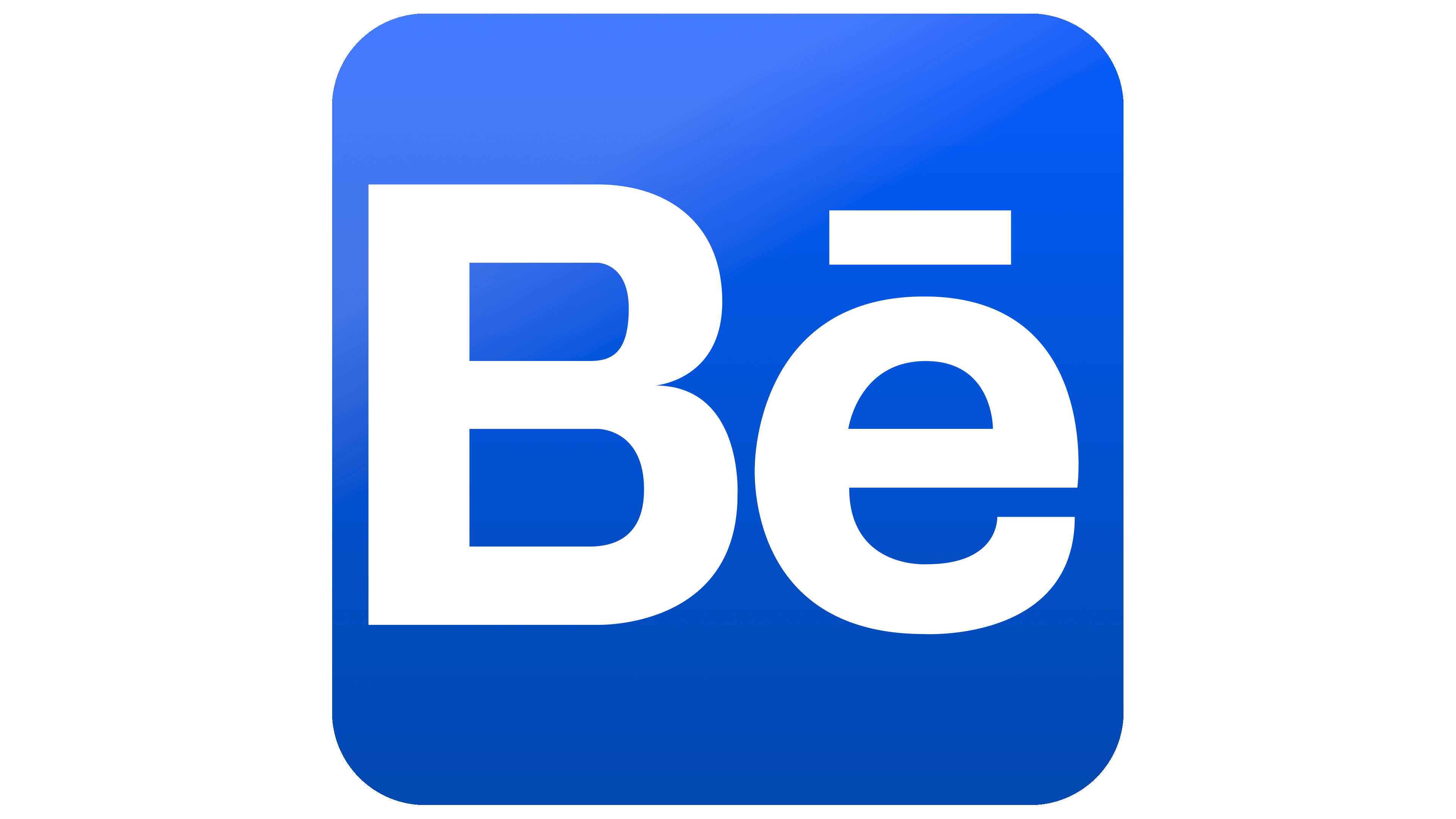
2020 – today
![]()
The modern logo is smoother: the corners have been removed, and the remaining edge is rounded. The frame is now gone, as is the blue paint it was painted in. The designers also redesigned the font: instead of a narrowed version, they offered wide letters, as in the name of the web resource. All of this made the logo simple and clear. But the sharp contrast between white lettering and the charcoal-black background lends a certain aggression.
Font and Colors

The company that bought Behance didn’t change its identity because it was consistent with its style. Adobe Systems limited itself to adding an icon to identify the resource across different media. In doing so, the new owner of the Behance design community chose an icon in a familiar style: a pair of letters at the center of a square framed by a border. Later, he refined it a bit, making it individual and concise.
The main logo (with the website’s name) uses one of the most common typefaces, Helvetica Bold. This font family has been around since 1957, when it was developed by the designer Max Miedinger in collaboration with Eduard Hoffmann. Linotype first released it. The broad characters are sans serif and in lower case, except the “B.” Above the lowercase “e” is a diacritical marker, the so-called macron. It makes the inscription unique.
The logo’s color palette is restrained, consisting of only white and black in the later version, and of blue and black in the earlier version (which had an anthracite hue).