![]() Bellarmine University Logo PNG
Bellarmine University Logo PNG
The Bellarmine University logo represents an institution where education extends beyond lecture halls, transforming into a dynamic process of knowledge exchange and idea sharing. It is a space where students discover new horizons, develop their thinking, and find like-minded individuals while the university continually expands opportunities for learning and research.
Bellarmine University was founded in Louisville, Kentucky, in 1950, following Archbishop John A. Floersch’s invitation to Franciscan monks to establish a Catholic men’s college. Named after the Catholic theologian Cardinal Robert Bellarmine, it opened with 115 students. In 1953, Bellarmine relocated to its current campus in Louisville’s Newburg district, constructing Pasteur Hall and expanding its academic offerings.
The 1960s brought major milestones. In 1963, Bellarmine gained regional accreditation, and by 1968, it had become coeducational, a move that significantly boosted enrollment and curricular diversity. Throughout the 1970s, the campus continued to expand, adding dormitories and athletic facilities and increasing program offerings, particularly in business administration and the natural sciences.
In the 1980s, Bellarmine introduced its first master’s degree in business and expanded its academic infrastructure with library expansions and the establishment of new research institutes. By 1995, its 45th anniversary, enrollment had surpassed 2,000 students, and new healthcare-related degrees in nursing and physical therapy were launched.
In 2000, Bellarmine College officially transitioned to Bellarmine University, marking a broader expansion of its educational scope. The ambitious “Vision 2020” strategic plan was launched in 2005, resulting in the construction of new residence halls, academic facilities, and sports complexes.
By 2010, Bellarmine had become a prominent private Catholic institution in the region, introducing doctoral programs and forming international academic collaborations. Its 65th anniversary in 2015–2016 marked further modernization and campus improvements, with enrollment exceeding 3,500.
From 2016 to 2020, Bellarmine expanded its academic offerings, focusing on programs in healthcare, business, and the arts, reaffirming the traditions established at its founding in 1950.
The Bellarmine Knights are the university’s athletic teams. They compete in NCAA Division I events, representing the institution in sports such as basketball, baseball, track and field, swimming, and others.
Meaning and History
![]()
What is Bellarmine University?
This private Catholic university in Louisville, Kentucky, offers undergraduate, graduate, and doctoral programs. Its academic fields include business, healthcare, education, and the arts. Classes are held in small groups, providing individualized attention to each student. The campus is situated in a scenic area, blending Gothic-style architecture with modern amenities. The university’s sports teams compete in NCAA Division I events.
1950 – today
![]()
The modern version of the Bellarmine University logo was established in the 2000s, when the college officially gained university status. The agency Zehno then developed a unified identification system that included text, a seal, and additional elements. The goal was to give the brand institutional rigor and legal solidity while maintaining a connection to its historical origins.
The composition is organized as a two-line structure aligned along the central axis. The proportions form an elongated rectangle perceived as an emblematic mark.
The typographic foundation goes back to the classics of Roman epigraphy and is genetically connected to the Trajan family of typefaces. All letters are executed in capital style. Large serifs emphasize solemnity, strokes have moderate contrast, verticals are elongated relative to horizontals, and terminals have a wedge-shaped form. The letter spacing is calculated to evenly fill the text field.
The color system is built around Cardinal Red (PMS 202). The burgundy shade is fixed as the primary one, transmitting academic tradition and emphasizing solemnity.
The symbolic meaning of the text is tied to continuity. The capital forms relate to stone inscriptions, thereby giving the identity a sense of durability and authority.
The Seal
![]()
1950 – today
![]()
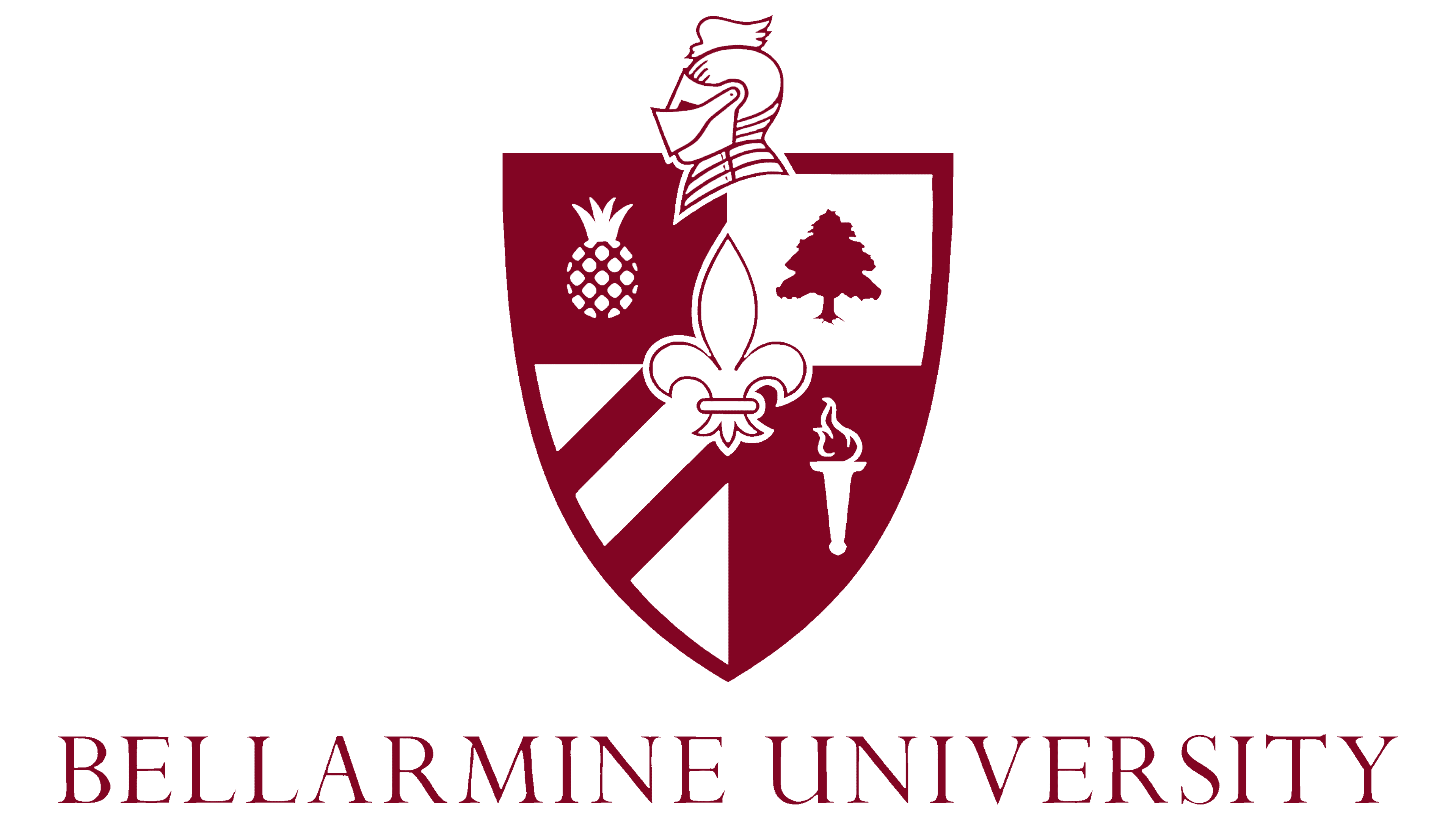
The Bellarmine University seal was formed as an instrument of official status and ceremonial representation. Clergy and academic representatives worked on its content, and it was approved under the first president of the university, Alfred Hughes, C.S.B. The mark is fixed for legal and ceremonial documents, and the shield, given its composition, is permitted for independent use as a shortened symbol of the university.
A double ring forms the frame, within which are indicated the name of the university, Louisville, Kentucky, and the date 1950. Inside is a shield with heraldic elements. Above the shield is a knight’s helmet in profile, and below it is the Latin formula In Veritatis Amore (“In love of truth”).
The shield is divided into four sectors with an additional fleur-de-lis in the center. In the upper left field is a pineapple as a sign of hospitality and regional tradition, in the upper right is a tree as an image of growth and the natural foundation of knowledge, in the lower left a diagonal stripe connected with ecclesiastical heraldry, and in the lower right a torch representing the allegory of enlightenment. The central fleur-de-lis links the coat of arms to Catholic heritage and the figure of the founder, ensuring a sense of religious continuity.
The typography around the outer circle is in a serif style. All letters are uppercase, the strokes have moderate contrast, and the serifs are wedge-shaped.
The color system is based on Cardinal Red (PMS 202). Burgundy is fixed as the primary shade, transmitting tradition and academic seriousness. White space is used to highlight forms and maintain legibility.
The seal serves as a mark of institutional continuity. Its composition reflects European heraldic practices and aligns with modern requirements for identification in the academic environment.