The Benfica logo contains many events related to the history of the club. The emblem shows that the players are always ready to go on a journey to demonstrate their ability to control the ball and the right to be called champions.
Benfica: Brand overview
| Founded: | 28 February 1904 |
| Headquarters: | Lisbon, Portugal |
| Website: | slbenfica.pt |
Sport Lisboa e Benfica, better known as Benfica, was founded in 1904. Its successes are legendary, although failures also do not go unnoticed. For example, the myth of the “curse of Béla Guttman” has been around the world for a long time.
It all started in 1962 when the club owners refused to raise the salary of the famous coach Béla Guttman. The outraged man left and announced that Benfica would lose all European Championships for over a hundred years. So far, the prediction is coming true: since then, the club has not managed to win a single Eurocup, although it does well in other competitions.
Meaning and History
Benfica is deservedly considered the most titled club in Portugal. Perhaps an old talisman, the eagle Vitória, whose nickname translates as “Victory,” leads him to victory. This bird is depicted on almost all the team’s emblems: it closely observes what is happening from the heraldic shield. But it seems that the “curse of Béla Guttman” is too tough for her.
What is Benfica?
Benfica is the abbreviated name for the Portuguese football team Sport Lisboa e Benfica. They participate in the Primeira Liga and are part of the Big Three, along with Sporting CP and FC Porto. The club was founded in 1904 and is based in Lisbon.
1904 – 1908
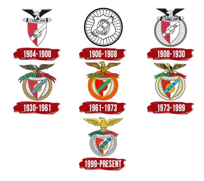
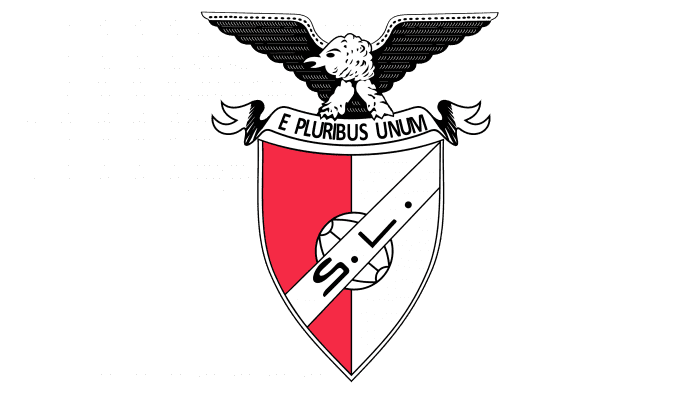
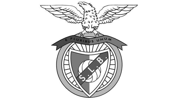
In 1904 Sport Lisboa was created – the main predecessor of Benfica. At the same time, his first logo appeared, which consisted of a coat of arms, a ribbon with an inscription, and an eagle, which spread its wings wide. The shield was divided into two parts – white and blue. A diagonal stripe partially covered it with the club’s initials: S. L. “. There was a round ball in the center.
The tape contained the Latin motto “E pluribus unum,” which means “One of many.” This phrase became the popular slogan of the United States and, in its meaning, perfectly suited the football team.
1906 – 1908
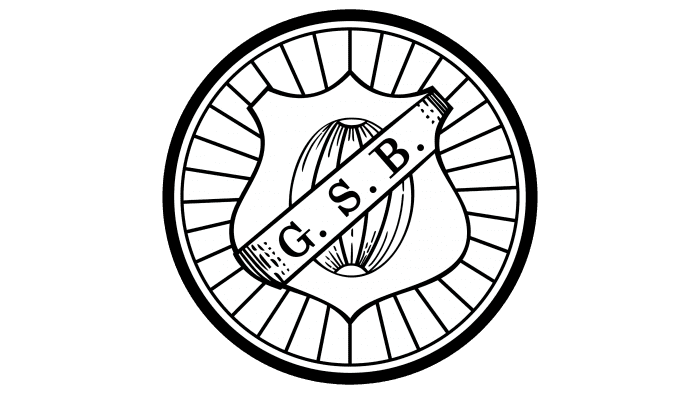
In 1906, the second predecessor of the modern Benfica, the Grupo Sport Benfica, emerged. But if Sport Lisboa had football in the first place, then at Grupo Sport Benfica, they were primarily engaged in cycling. Even the then logo of the club, which has the shape of a bicycle wheel, testifies this. In the middle, at the junction of the spokes, there was a figured shield, on which the artists depicted an oval ball and a ribbon with the letters “G. S. B.”
1908 – 1930
In 1908, one of the most important events in Benfica’s history took place: the two ancestor clubs merged, giving rise to Sport Lisboa e Benfica. Their emblems were also merged, with the result that the Sport Lisboa graphic appeared inside the Grupo Sport Benfica bicycle wheel. The lettering on the center stripe has changed because the initials have changed after the rebranding.
1930 – 1961
In the early 1930s, another version of the logo was introduced – this time more colorful. The designers have added new colors to the existing palette, taken from the Portuguese flag: blue and green. Also, they made the shield triangular and enlarged the gray ring representing the bicycle tire.
The ribbon’s shape has also been changed: its ends do not curl but hang down along the edges. Another innovation concerns the design of the eagle: if before the bird bent its head, now it looks up proudly.
1961 – 1973
The brown color used for the ball, eagle, initials, and outlines has been removed. The ball became as red as the left half of the backboard – only thin yellow lines separate them. The outline of the rest of the elements, the bird, and all the inscriptions are yellow, in some places – with the addition of black – the band with the abbreviation “S. L. B. “blue-green and orange outer ring. The eagle is not depicted as detailed as before: the artists chose a very simple drawing style.
1973 – 1999
Once again, experimenting with the palette, the designers made the ball yellow, the diagonal stripe on the shield was repainted in blue, and the wheel was used white. The shades are much paler. The proportions of the elements have also changed slightly. The eagle looks much the same as the 1930-1961 emblem except for the new color scheme.
1999 – today
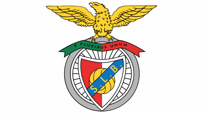
At the end of the 20th century, the club adopted a modern version of the logo, which focused on the eagle. Now he sits not on the tape but right on the wheel, and the artists have reduced the circle’s diameter, due to which the bird looks very large. After the 2008/2009 season, three yellow stars appeared over the raptor’s head, representing the 30 championships won. This version is only used on T-shirts.
Benfica: Interesting Facts
Benfica is a famous soccer club from Portugal with a lot of history and success.
- How It Started: Benfica began in 1904 as Sport Lisboa. After merging with another club in 1908, they started using an eagle as their symbol and got their full name, Sport Lisboa e Benfica.
- Winning a Lot in Portugal: Benfica has won more Portuguese league titles than any other team, making them a top team in Portugal.
- European Success: They won the European Cup in 1961 and 1962, being the first team to win it right after Real Madrid had been winning it often. This made Benfica famous in Europe.
- Their Stadium: They play at Estádio da Luz, one of the biggest stadiums in Europe, known for having loud and excited fans.
- Eusébio —A Soccer Legend: Eusébio, known as the Black Panther, was one of Benfica’s best players. He helped them win many games and is remembered as one of the greatest soccer players.
- Lots of Fans: Benfica has many fans and holds a world record for having the most members in a sports club.
- Great Youth Program: Benfica excels at training young players who star in soccer worldwide.
- A Strange Curse: After winning two European Cups, their coach, Béla Guttmann, left the team and supposedly said Benfica wouldn’t win in Europe for 100 years. Since then, they’ve come close but haven’t won a European final.
- Big Rivalries: Benfica’s games against FC Porto and Sporting CP are huge deals in Portugal. The game against Sporting CP was especially big because both teams were from Lisbon.
- More Than Soccer: Benfica isn’t just about soccer; they’re involved in sports like basketball and hockey. The club means a lot to Portuguese culture and society.
Benfica is not just a soccer team; it’s a big part of sports and culture in Portugal, known for its success, famous players, and huge fan base.
Font and Colors
The graphic sign Benfica combines the main symbols of its predecessors. The eagle was taken from the Sport Lisboa emblem. He is associated with nobility, power, and independence. The bicycle wheel first appeared in the logo of Grupo Sport Benfica: it represents the cycling sport that was dominant in this club.
The abbreviated name and Latin motto Benfica are written in simple sans-serif type. The colors are very symbolic: white stands for peace, red (# ED1C24) for nobility, and French Blue (# 0072BC), Cyber Yellow (# FFD400), and Philippine Green (# 008047) are reminiscent of the flag of Portugal. Additional colors are black and Philippine Silver (# B1B3B6).
Benfica color codes
| Pigment Red | Hex color: | #ed1c24 |
|---|---|---|
| RGB: | 237 28 36 | |
| CMYK: | 0 88 85 7 | |
| Pantone: | PMS Bright Red C |
| French Blue | Hex color: | #0072bc |
|---|---|---|
| RGB: | 0 114 188 | |
| CMYK: | 100 39 0 26 | |
| Pantone: | PMS 3005 C |
| Yellow | Hex color: | #ffd400 |
|---|---|---|
| RGB: | 255 212 0 | |
| CMYK: | 0 17 100 0 | |
| Pantone: | PMS 109 C |
| La Salle Green | Hex color: | #008047 |
|---|---|---|
| RGB: | 0 128 71 | |
| CMYK: | 100 0 45 50 | |
| Pantone: | PMS 340 C |
| Dark Gray | Hex color: | #b1b3b6 |
|---|---|---|
| RGB: | 177 179 182 | |
| CMYK: | 3 2 0 29 | |
| Pantone: | PMS 421 C |
