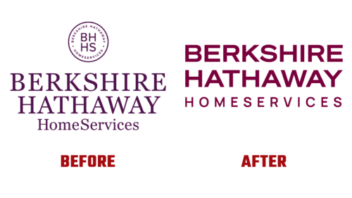
A world-famous brand logo needs to be understood by most. That’s why Berkshire Hathaway HomeServices, a global real estate company, decided on a redesign. It is dedicated to its 10th anniversary and has already been adopted in early 2022. 1000watt Studios designed the logo.
The new design summarizes the result of many years of work and the brokerage’s presence in more than 12 countries. It reflects the five principles that are key to the company:
- openness;
- honesty;
- durability;
- stability;
- trust.
Berkshire Hathaway HomeServices CEO Christy Budnick said the identity update was done with care and attention, as the logo pays homage to the past and sets the company up for an exciting future. To emphasize this, the experts used several design tricks:
- removed serifs;
- made the font bold;
- converted all letters to uppercase;
- aligned the lines on both the right and left edges;
- painted the lettering in wine color (Cabernet branding);
- removed the seal from the main sign;
- expanded the glyphs by flattening them slightly.
The reinterpreted emblem will fit perfectly in both traditional and digital marketing spaces. It is equally well adapted to modern gadgets and familiar media requirements.
The evolution of the style is also focused on the professional needs of Berkshire Hathaway HomeServices employees because the work process is built on both interpersonal relationships with the hand-to-hand transfer of printed materials and digital technologies with the display of information on mobile devices. All of this is observed in the new logo.


