


![]() Berkshire Hathaway Homeservices Logo PNG
Berkshire Hathaway Homeservices Logo PNG
The Berkshire Hathaway Homeservices logo features a complex yet presentable design comprising several elements. They are organically connected by a single palette, made in luxurious purple.
Berkshire Hathaway HomeServices traces back to AmerUs Home Services, a Midwestern real estate brokerage group. In 1998, MidAmerican Energy Holdings bought AmerUs and, in 1999, renamed it HomeServices of America. That same year, Berkshire Hathaway acquired MidAmerican Energy Holdings, placing HomeServices inside its wider structure through Berkshire Hathaway Energy.
Over the next decade, HomeServices expanded by acquiring established regional brokerages rather than building from scratch. In 1999, it acquired Semonin Realtors in Louisville and Long Realty in Arizona. In 2006, Harry Norman Realtors from Atlanta joined the group. Each deal added local agents, offices, and customer bases to a growing national platform.
The decisive shift came in 2012, when HomeServices bought the Prudential and Real Living real estate networks and announced that Prudential Real Estate would become Berkshire Hathaway HomeServices. The new network opened in September 2013 with more than 29,000 agents and 825 offices in 39 states. Around the launch, it added Prudential Fox & Roach Realtors with Trident Group, followed by Prudential Rubloff Properties in Chicago. By January 2015, the network had nearly 35,000 agents and 1,100 offices in 47 states.
The brand also had room for international expansion, unlike Prudential Real Estate, which used Pricoa in some markets due to naming restrictions. Berkshire Hathaway HomeServices hired Peter Turtzo to lead global operations. They continued to grow through deals such as Intero Real Estate Services, First Weber, Bennion Deville Homes, and Nova Mallorca Real Estate. By July 2022, the network had more than 50,000 real estate professionals and about 1,500 offices in 12 countries, competing with major names such as RE/MAX and Coldwell Banker.
Meaning and History
![]()
Berkshire Hathaway Home Services was formed over several years, like most modern American companies. The process involved many prominent figures who helped bring the company to a leading position in its field. The firm’s modern brokerage division operates under various brand names. This is the highest achievement in the real estate industry.
Berkshire Hathaway HomeServices owns one of the most remarkable logos in the real estate industry. It was once recognized for its bright purple color, which symbolized luxury, prestige, and quality. Another essential element was the ring, a symbol of unity, integrity, and security that emphasized the company’s reliability and stability.
On the eve of its tenth anniversary, the brokerage network updated its emblem using the iconic Cabernet shade. The evolution of style showed that modern brands strive for simplification: thanks to the strict sans-serif font, the inscription “BERKSHIRE HATHAWAY HOMESERVICES” appeared fashionable and concise. Moreover, minimalism manifested in the disappearance of the circular seal.
What is Berkshire Hathaway Homeservices?
Berkshire Hathaway Home Services is one of America’s premier residential real estate firms. It includes several brokerage divisions that provide quality services in home and commercial real estate purchases and insurance. The head office is in Irvine, California. The company’s employees are industry experts, so they know how to find the most advantageous offers for each client.
1998 – 2023
![]()
Berkshire Hathaway Home Services is one of the largest multinational holdings and upholds the highest standards of work. This is confirmed by the chic design, which combines classics, elegance, and perfect style. In terms of brand style, it fully meets the requirements.
Expressive letters on a white background, a harmonious color palette, and varied font styles and original colors all demonstrate a professional approach to the brand’s design and concept as a whole. The chosen style compares favorably with the designs of other companies operating in this field, underscoring its distinct significance.
For many years, Berkshire Hathaway Home Services has been part of the Berkshire Hathaway holding. Under the management of a commercial conglomerate, the company rapidly expanded its service offerings. It was created in 2013 and, at the same time, acquired a stylish corporate emblem. In the center was the inscription “Berkshire Hathaway,” which signified membership in a well-known brand. Above it was placed a round badge bearing the company’s full name and the initials BHHS.
This combination demonstrated a single tandem and met the same quality standards. Under the title block was part of the name “HomeServices,” which emphasized a specific business unit. The letters used to decorate the central part were drawn in strict straight lines, reminiscent of the press’s printed style. This design evoked associations with publicity, reliability, and durability. This directly reflected the peculiarities of the company’s work.
The inscription on the round badge is set in a softer, smoother font, symbolizing comfort and trust. The size of the letters in the inscription was different. This nuance made the emblem especially stylish and easy to read. In addition, the design was quite memorable. A distinctive feature of the emblem was also the colors. Designers chose only two colors that harmoniously complemented each other. In this form, the emblem is still used today.
2023 – today
![]()
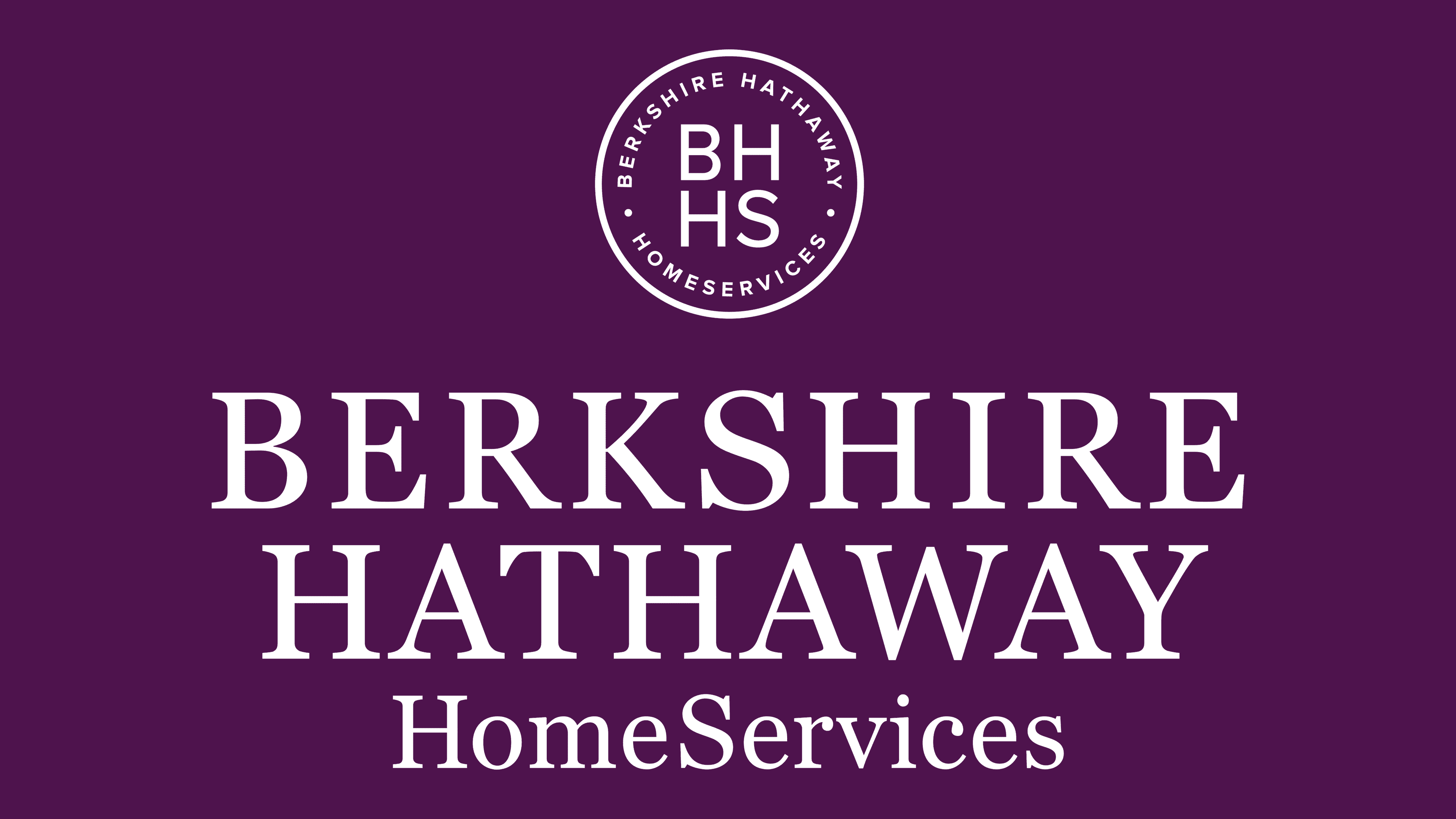
The logo adopted in late January 2023 is minimalist in style. Although its creation was timed to coincide with the company’s anniversary, the wordmark does not look festive; it is strict, simple, and concise. Designers reflected on the brokerage network’s work over the past decade and showcased a new brand grounded in honesty and trust.
Changing the emblem is a strategic step to attract clients. The Berkshire Hathaway HomeServices name is easily readable at any scale thanks to the clear sans-serif font, which roughly resembles Gomme Sans Semi Bold by Dharma Type. Developers retained the three-line arrangement of the inscription but aligned the words horizontally, so that the logo forms a rectangle. To do this, they had to experiment with glyph size and letter spacing. The evolution also affected the color: the emblem now uses the Cabernet shade, which has become integral to the company’s visual identity.
Font and Colors

The Berkshire Hathaway Home Services logo has an elegant design reminiscent of the main holding company. In the center, there is an inscription set in a confident, strict font. The same design was used for the bottom Home Services lettering, but on a smaller scale. This design symbolizes the connection to the owner and the Berkshire Hathaway holding, while emphasizing the importance of the company itself.
![]()
The top icon contains the company’s full name, enclosed in a circle. The inscription itself is located along the edges of this circle, completely encircling it. A smoother font was chosen, with rounded sans-serif lines. It symbolizes trust and comfort, which is especially important for customers seeking such services.
Inside the circle are also the first four letters of the name, presented in larger size. They make the logo diverse and modern. The coloring includes two colors: white and purple. Neutral white is used as the background. It demonstrates honesty and trust. The letters are purple.
This is a basic soft shade associated with luxury and the elite. Within the company, it symbolizes a special status. Berkshire Hathaway Home Services is the best of the best, so this color on the emblem looks very organic.