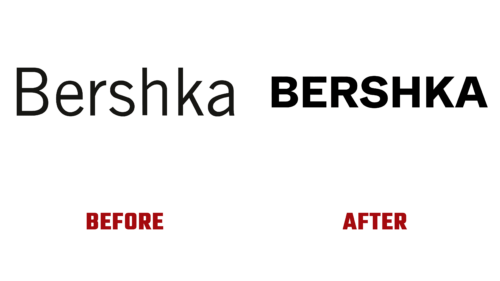
In April 2023, the fashion brand Bershka turned a quarter of a century old. That’s quite a respectable age for a fashion label that boasts 860 stores in nearly 70 countries worldwide. To celebrate its birthday, the brand decided to redesign its visual identity.
The youth fashion retailer, owned by Inditex Group, was launched in April 1998 and now wants to celebrate its milestone anniversary in style. It plans to hold several campaigns throughout the year and to present a refreshed image; it focused primarily on a modernized logo.
A young team from Germany specializing in typography and branding – Dinamo Typefaces – was involved in the logo’s development. With their help, the fashion brand chose a new style – the sans-serif font ABC Whyte, with sharp and even transitions, leaving behind the thin and tall letters. This font family was introduced in 2019 and was created by three designers: Erkin Karamemet, Fabian Harb, and Johannes Breyer.
As a result, the Bershka emblem gained new features: massive, almost block-like characters, small spaces between glyphs, even lines, precise angles, and geometricity. This appearance is in stark contrast to the old logo. Furthermore, all letters have been converted to uppercase, which was not the case before.
The parent company also intends to bring back the BSK logo for use in its teenage clothing line. In this way, the fashion brand boosts its authority among young people, hoping for considerable success. The new clean, and powerful logo conveys the diversity of the product line, allowing the brand to stand out effectively in social networks and attract the attention of potential customers.


