


![]() Better Call Saul Logo PNG
Better Call Saul Logo PNG
The Better Call Saul logo refers to the lawyer Saul Goodman. The emblem reflects his love of bright, tasteless advertising, which he uses to attract attention to his services. Visual asymmetry conveys an atmosphere of instability and secrecy in the life of the series’ main character.
Better Call Saul was named after the eponymous episode from the second season of Breaking Bad, where Saul Goodman first appeared. Screenwriter Peter Gould and producer Vince Gilligan were already considering a new project then to explore the ambiguous character who appealed to viewers. They have been nurturing this idea since 2009 and implemented it in 2013. Initially, it was planned that Goodman’s clients would be various celebrities, but this wasn’t easy to implement. Therefore, the developers settled on a full-fledged plot that tells the story of the main character and the people around him. A total of six seasons were shot, with 63 episodes. They combine elements of comedy, tragedy, drama, and neo-noir.
“Better Call Saul” takes us on an engaging trip into the “Breaking Bad” world, focusing on Saul Goodman, a lawyer known for his ethical flexibility. Created by Vince Gilligan and Peter Gould, Saul’s character, played by Bob Odenkirk, was so intriguing during their “Breaking Bad” days that they felt he needed his own show.
The show began development in 2013, right after “Breaking Bad” ended, with Gilligan and Gould leading the way. It delves into Saul Goodman’s past, originally known as Jimmy McGill, a small-time lawyer who gradually becomes the crafty Saul Goodman.
The show aired on AMC on February 8, 2015, and was immediately loved for its storytelling, acting, and visuals. Over six seasons, it explored Jimmy’s transformation and brought back “Breaking Bad” characters like Mike Ehrmantraut and Gus Fring.
“Better Call Saul” received many awards and nominations, including Emmys for its drama and Odenkirk’s performance. It wrapped up in 2022 with its sixth season, tying up Jimmy/Saul’s story and connecting back to “Breaking Bad.”
The idea for the show came from a “Breaking Bad” episode named “Better Call Saul.” Gilligan and Gould were drawn to Saul’s moral grey areas. They initially considered featuring celebrity clients but focused instead on Saul’s story and relationships. Over its run, the show mixed comedy, drama, and more, diving deeper into the “Breaking Bad” characters and exploring themes of morality and choice.
“Better Call Saul” added depth to the “Breaking Bad” universe and stood out as a deep character study, making it a significant part of its legacy.
Meaning and History
![]()
The developers of Better Call Saul meticulously crafted its universe, creating numerous emblems for fictional companies, warehouses, law firms, stores, and restaurants featured in the episodes. This made the show atmospheric and realistic, convincing viewers to believe in the story of the evil lawyer. Significant attention was also given to the show’s own identity. When filming had just begun, the logo looked like an advertisement for Saul Goodman’s services, and people were urged to contact him if they had legal troubles. Later, the designers removed almost all the inscriptions, leaving only the project’s name and adding the symbol of justice – a scale. The fact that one side is tilted down speaks of a disturbed balance of morality.
What is Better Call Saul?
Better Call Saul is a legal and criminal drama shot by Peter Gould and Vince Gilligan as part of the Breaking Bad franchise. It is a semi-comedic spin-off of the main show. Its central character is the small-time con man Jimmy McGill, who gradually becomes the egocentric lawyer Saul Goodman, portrayed by actor Bob Odenkirk. The series was created for the AMC network and aired from 2015 to 2022.
Pre-production
![]()
The production team created a preliminary logo for the series, which was used until 2015. The red inscription “Better call Saul!” is centered, broken into three lines, and slanted diagonally. It is executed in a casual, handwritten font. All letters in the words are connected except for the initial “B” and “S,” which are the only uppercase letters. Above the show’s name is a black polygon bearing the yellow phrase “In legal trouble?” that hints at the main character’s profession. Around are small graphic signs and words showing that the lawyer takes on any criminal cases:
- “Traffic accident” next to two colliding cars;
- “Drug dealing”;
- “Parking tickets” under a banknote;
- “Slip & FALL”;
- “D. U. I.” on an overturned bottle;
- “Bond fraud.”
In the lower right corner is Saul Goodman’s trademark phrase, placed in a black circle: “Sue ‘Em now.” The emblem’s base is a large orange quadrangle.
2015 – 2022
![]()
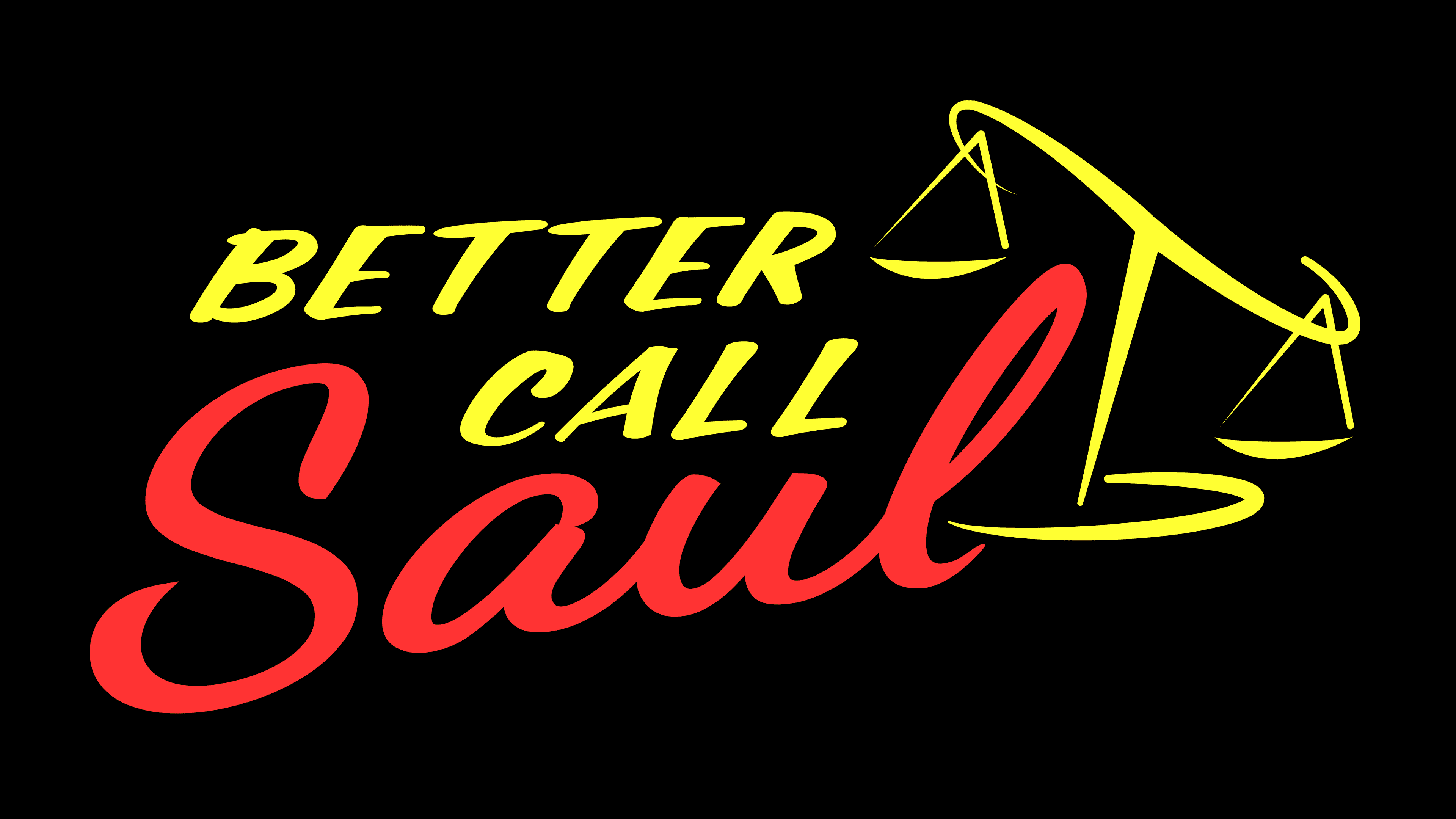
Designers significantly simplified the logo, leaving only the name of the criminal drama from all the inscriptions. They retained the diagonal rise, the red color, and the handwritten font of the word “Saul” but made the glyphs smoother. The phrase “Better call” is now in yellow, printed in uppercase. In place of the exclamation mark, scales of justice are depicted as a symbol of justice. They are formed from straight and curved lines. The scales tilt to the right side, indicating a lack of balance. This logo debuted in 2015 but was designed in the 1990s style, as the action in the series took place around 2003, when computer design was not yet popular.
Font and Colors
The title “Better Call Saul” is set in two different retro handwritten fonts. One is similar to Script1 Script Casual, created by Mans Greback, and the other is Dancing Script, developed by Pablo Impallari. The upper words are in uppercase and printed in letters. In the lower part of the text, all glyphs are lowercase and connected except for “S.”
The logo uses two colors: yellow and red. Fans noticed that the color palette plays an important role in the series’ symbolism. For example, “bad” characters often wear red, orange, and yellow clothing. “Good” characters, in turn, prefer green and blue shades.
FAQ
Why does Saul wear a pinky ring?
In “Better Call Saul,” Saul Goodman, originally Jimmy McGill, wears a pinky ring to honor his late friend Marco. Marco was Jimmy’s buddy and partner in small-time scams in Cicero, Illinois. This ring, once Marco’s, reminds him of their friendship and his past. It’s an important part of his story, showing how much Jimmy has changed to become Saul Goodman.
What is the real name of Better Call Saul?
In “Better Call Saul,” the character we know as Saul Goodman was originally named Jimmy McGill. Before he started using Saul Goodman as his lawyer name, this was his real name. The show tells the story of how Jimmy McGill becomes Saul Goodman.
Where was Better Call Saul filmed?
Better Call Saul was filmed in Albuquerque, New Mexico. This city also set the scene for Breaking Bad and gave both shows their unique look. Albuquerque’s scenery, buildings, and special spots play a big part in the show, bringing the characters’ worlds to life.
How many episodes of Better Call Saul are there?
“Better Call Saul” includes 63 episodes over six seasons.