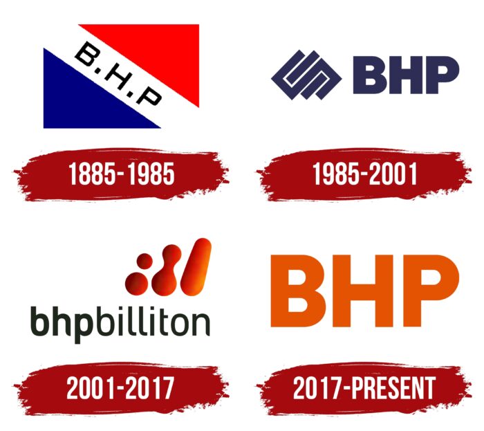
The BHP logo of the brand is made in a minimalist style, which is refreshed by bright colors. The main feature of the design of the badge is the massiveness of the letters and the absence of unnecessary elements. This indicates a clear definition of the goal and high professionalism. BHP focuses on improving the quality of services provided, directly reflected in the concise logo.
BHP: Brand overview
| Founded: | 1885 |
| Headquarters: | Melbourne, Victoria, Australia |
| Website: | bhp.com |
Meaning and History
BHP is an oil and gas corporation of Australian origin, which appeared on the market due to the merger of two large companies. But, the period of its formation began long before that. It has experienced many strikes and periods of decline during its existence on the market, which became an incentive for improvements. As a result, the management began to expand the scope of activities, improve working conditions and actively introduce new technologies.
As a result, BHP has achieved impressive results and taken a leading position in various rankings. The brand’s visual identity has changed throughout the entire period of work. The changes changed the general concept, colors, font, and design. But, in the last few years, the most concise and stylish version of those used in past years has been used.
This is a readable and recognizable emblem, consisting of only three letters – BHP. Powerful and confident letters demonstrate stability, while bright colors emphasize the brand name. This approach was not chosen by chance. The company is proud of its achievements and excellent reputation, so it is not afraid to express itself through an expressive logo.
What is BHP?
BHP is a rapidly growing mining company. The main activity centers are Melbourne and London, but some divisions are also located in other countries (Peru, USA, Chile, etc.). It specializes in extracting iron ore, oil, gas, and coal.
1885 – 1985
In 1885, the foundation was laid for the formation of the modern BHP. It all started with the discovery of significant mineral reserves near the town of Broken Hill, which is located in Australia. There were discovered deposits of lead and silver, which Charles Rasp decided to develop. To do this, he created the Broken Hill Proprietary Company Ltd.
The company logo was made in the form of a rectangular flag, divided into several parts. Inside there were two colored parts without inscriptions and one with an inscription. The latter was located in the middle. It was a wide diagonal stripe containing three letters of the company name, separated by dots.
Such a performance favorably emphasized the company’s significance and status and demonstrated stability and strength. This was also confirmed at the color level. The use of red conveyed energy, while blue symbolized reliability. A neutral white background was used to emphasize the black lettering.
1985 – 2001
In 1985, the company already had a copper deposit and a large number of oil production divisions. In connection with the expansion, the company decided to redesign. The concept of the logo was radically different from the previous design. It was based on a more massive font, complemented by an original graphic element.
The new version favorably emphasized the company’s image. The letters BHP are placed in the upper case of a stylish font. A feature was the absence of serifs. The company name was complemented by a geometric figure, presented in the form of overlapping squares and rectangles. She diluted the strict logo and made it more modern.
The design was a prime example of the first era of BHP. During this period, the formation and expansion of the brand took place. Blue colors on a white background reflected these changes. It symbolized the stability, reliability, trust, and improvement of the company.
2001 – 2017
In 2001, one of the most important events for the company took place. Broken Hill Proprietary Company Ltd merged with Anglo-South African firm Billiton. In March of this year, a deal was signed, and the renewed BHP Billiton corporation appeared on the market. Under the influence of the event, the management changed the logo again. The new emblem is radically different from the previous version.
The emblem was based on a new company name and an addition in the form of a bright graphic icon. It combines a continuous elongated drop, two merged dots, and two separate dots. With the inscription, he creates a single harmonious logo, which is a true symbol of the growth and development of the brand. For the inscription, a thin sans-serif typeface was used.
The first three letters were made with more massive lines, making the logo more stylish. The logo’s colors included rich orange, neutral white, and classic black. The first one showed vitality and growth; the white was used as a background, while black was traditionally used to decorate the lettering.
2017 – today
In 2017, BHP received a new logo that is still in use today. This version was the simplest and most concise of the brand’s visual identity options. The minimalist style was not chosen by chance – it was in line with the brand style trends of that time. It remains relevant to this day as well. The new version has been greatly simplified.
There was nothing superfluous here, but only the stylish name of the company, made in massive font. There are only three letters BHP at the base. This option became more recognizable as it attracted attention due to the bright colors and readable font. The creation of such a logo marked the second era of BHP’s development. During this period, the company strengthened its position in the market and began to develop actively.
Font and Colors
The bright colors and massive font can immediately recognize the company’s corporate identity. This combination is not unique but accurately describes the brand. Bright orange coloring symbolizes power, energy, and development.
In addition, the color is associated with a friendly attitude towards customers and partners. The white background emphasizes bright letters and symbolizes openness. This applies to schemes and methods of work. The presence of white represents the transparency of the business and the absence of fraud.
BHP color codes
| Persimmon | Hex color: | #e35302 |
|---|---|---|
| RGB: | 227 83 2 | |
| CMYK: | 0 63 99 11 | |
| Pantone: | PMS 1655 C |

