


 Bilstein Logo PNG
Bilstein’s history began in 1873, when August Bilstein founded the company in Ennepetal, Germany. In its first period, the firm produced leaf springs for carriages, working in transport-related manufacturing before the automobile industry shaped its later specialization.
The decisive technical point came in 1954, when Bilstein developed the first monotube gas-pressure shock absorber. The product changed shock absorber production and moved the company into a stronger position in suspension technology. After that, Bilstein expanded its range to shock absorbers, springs, struts, and other suspension components for different vehicles.
With a broader product line, Bilstein entered international markets and supplied products worldwide. According to the source history, the company operated in more than 20 countries and employed over 1,000 people. Its components were used by everyday motorists and professional racers, linking the brand to road vehicles and competition.
In 1973, Bilstein marked its 100th anniversary, recording a century of work from carriage springs to automotive suspension systems. In 1984, ThyssenKrupp acquired the company, giving Bilstein a new corporate framework. In 1999, Bilstein introduced an adjustable suspension system, extending its work in vehicle handling. In 2019, the company marked 136 years in business and presented an adaptive damping system, adding another technology to its shock absorber and suspension portfolio.
Meaning and History
What is Bilstein?
This is a manufacturer of components for automobiles and industrial equipment. The product range includes camshafts, shock absorbers, suspension systems, steering columns, and crankshafts. The company is focused on serving the global automotive and engineering markets.
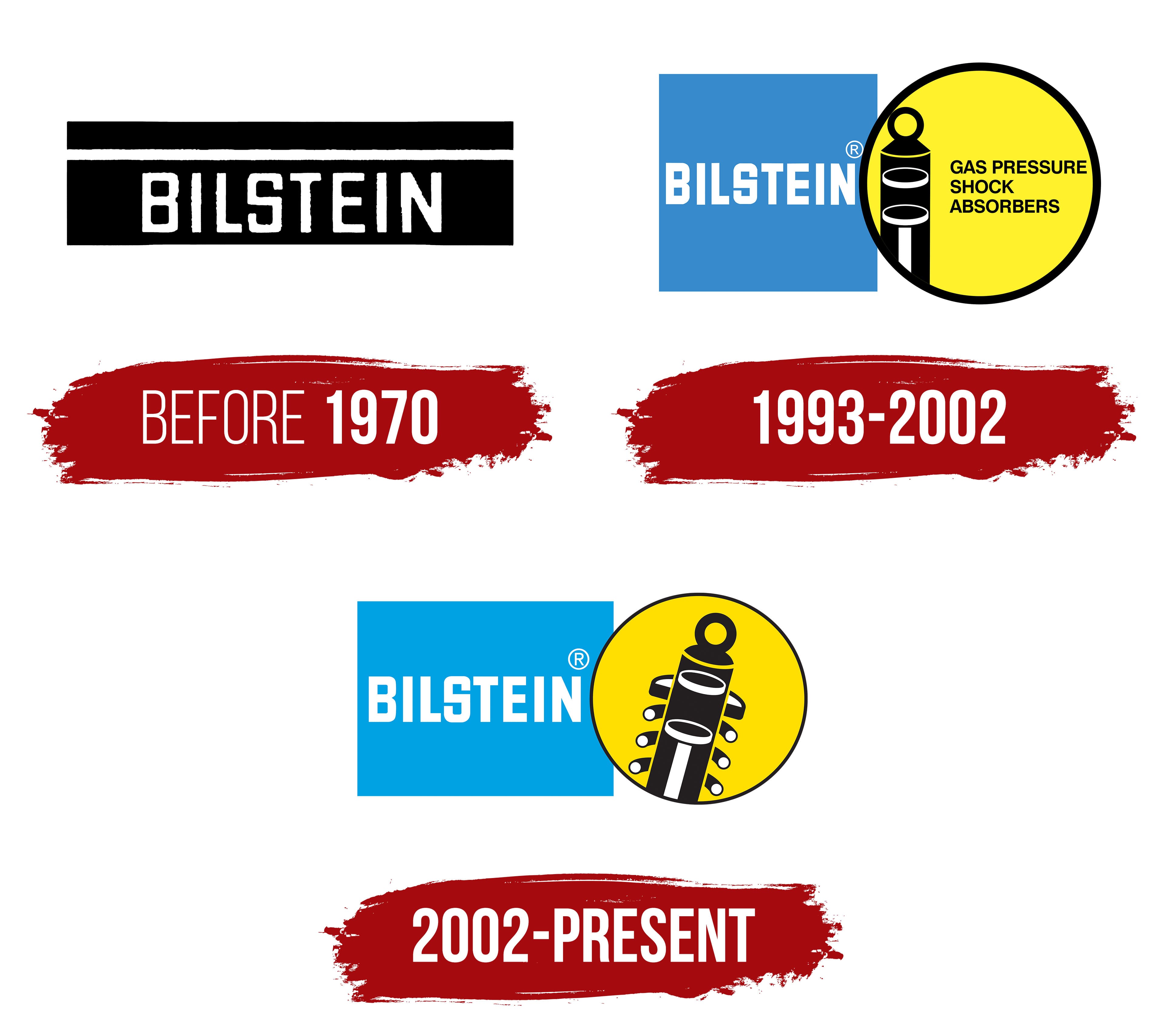
before 1970

1993 – 2002

2002 – today
The Bilstein logo reflects the company’s technical expertise in automotive suspension systems. At its center is a cross-section illustration of a shock absorber, highlighting the brand’s in-depth understanding of mechanical engineering. The black-and-white detailing makes the component appear almost like a technical blueprint, offering a glimpse inside the device and showcasing the precision and quality for which Bilstein is known.
The shock absorber is placed within a yellow circle outlined in dark, symbolizing energy and stability. Next to it is a bright blue rectangle featuring the brand name “BILSTEIN” in bold, all-caps lettering. The font is clean and slightly thickened, conveying a sense of strength and dependability. Its symmetry and sharpness reinforce a feeling of precision and technological clarity.
The combination of blue and yellow evokes sky and sunlight, creating a vibrant, energetic impression. These colors represent the company’s ambition and continuous drive for innovation and progress. The contrast between the white and black detailing of the shock absorber inside the yellow circle adds focus and visual sharpness, drawing attention to Bilstein’s professionalism.
The name “Bilstein” is derived from the founder’s surname, underscoring personal accountability and a commitment to product quality. The composition of the logo’s elements conveys technological capability and brand confidence, expressing Bilstein’s dedication to engineering excellence and the ongoing refinement of its products, which automotive enthusiasts and professionals worldwide value.