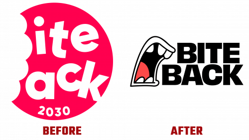
As part of a strategic move to reinvigorate its mission to create a healthier and more equitable food world, the Bite Back Youth Initiative has unveiled a new brand identity. This bold move reinforces the organization’s ambitious goal to cut childhood obesity rates in half by the end of this decade, with a focus on closing the health gap between economically diverse communities.
The updated Bite Back logo differs significantly from its previous design. Although the original logo featured the letters “B” to mimic taking a bite out of a calorie-rich snack, it drew criticism for lacking the seriousness necessary to carry out the organization’s important mission. The modern logo contrasts the cartoon mouth ready to “take a bite,” combining the playfulness of youth with a new edginess that signifies an aggressive stance against unhealthy eating.
This inventive approach to branding, the result of a collaboration between branding agency Wolff Olins and animation studio Animade, fundamentally changes conventional perceptions. To connect authentically with the youth audience, Bite Back uses a cheeky tone laced with wit and humor. This voice is symbolic of the organization’s young supporters looking to shake up traditional notions of food marketing.
Another key feature of the updated style is the disruptive color palette. Pulling from the bright hues used in junk food advertising, the new brand colors include provocative names like “Chicken Shop Red,” “Deep-Fried Yellow,” and “Unlicensed Lilac.” This design decision aims to replicate the marketing strategies of the very industry that Bite Back is up against.
The bold redesign is complemented by unique typographic solutions. Fonts with catchy names such as “Fried Serif,” “Sugar Rush Round,” and “Cereal Script” were utilized. Each of these fonts mimics common themes in food marketing but modifies them to promote healthy alternatives. The main Bite Back logo combines these fonts and an eye-catching mouth graphic, making it clear that the organization is willing to take a stand against unhealthy food norms.
However, the new design has not escaped criticism. Some have argued that certain aspects, such as the mouth animations and handmade protest signs, could have been refined to convey the message more convincingly.
The new brand identity is undoubtedly a bold but thoughtful maneuver to align Bite Back’s public persona with its lofty goals. While some points need to be refined, the new identity unequivocally signals the group’s unwavering determination to challenge unhealthy dietary and health norms, using branding as a key tool for its activism.


