The Bite Back logo epitomizes the youthful vigor and relevance inherent in a movement against junk food and intrusive marketing. As a visual manifesto, the logo serves as the public face of the campaign, resonating with the ideals of rebellion and informed choice. The logo acts as a visual transcript, expressing complex issues such as consumerism, individual health, and corporate ethics in one glance. It is a point of departure, forcing a deeper understanding of the movement’s goals and activities.
Bite Back: Brand overview
Founded in 2019, Biteback2030 was created by young activists from London who are passionate about equal access to healthy and sustainable food. Their roots run deep in the UK food justice movement, which has been given a new impetus by climate activists such as Greta Thunberg. With a clear mission, Biteback2030 champions the interests of young people by advocating for fundamental change in the food sector.
Since its inception, the group has taken active steps to raise awareness and drive change. They advocate for the introduction of policies that increase the availability and affordability of healthy and organic food.
Biteback2030 is now recognized as a formidable advocate for youth food activism in the UK and remains unwavering in its mission. They tirelessly inspire the younger generation to fight for change in the food industry while emphasizing the link between human health and environmental sustainability.
Meaning and History
2019 – 2023
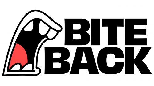
2023 – today
A youth activist movement opposing junk food and aggressive marketing in the food system uses a themed logo that matches its name and the protest it supports. The logo depicts a mouth wide open, either screaming or biting into food. The image has an informal style but uses an aggressive color palette: black (name and depth of mouth), red (tongue), and white (teeth and lips). The accompanying text is bi-level, large, very bold, uppercase, straight, geometric, designed to attract maximum attention.
The use of aggressive colors, such as black and red, is meant to convey the urgency and seriousness of the group’s mission. The wide, open mouth symbolizes either a call to action or a reference to the act of eating, reinforcing the movement’s focus on food-related issues. The bold upper-case text is an eye-catching element to draw attention to the logo and emphasize the open nature of the movement.


