The Black & Decker logo is full of friendliness, simplicity, and ease. The emblem expresses a desire to be accessible, always be close, and support the family of clients throughout their lives.
Black & Decker: Brand overview
| Founded: | September 1910 |
| Founder: | S. Duncan Black, Alonzo G. Decker, Sr. |
| Headquarters: | Maryland, U.S. |
| Website: | blackanddecker.com |
Black & Decker is an American brand founded in 1910 by two engineers. The main focus is on household appliances and tools for home and garden, which are sold in 100 countries. The annual turnover is more than 10 billion dollars, and owned by Spectrum Brands since 2012.
Meaning and History
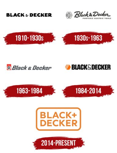
The development of the brand’s logo can be divided into three periods. The first period is the early years when the founders determined the direction of their work and searched for their niche. The second period is the heyday. The presence of the Hexagon trademark characterizes the logos of this period. The current branding direction has changed due to new owners. Modern logos are closer to family and home warmth.
What is Black & Decker?
An American retailer of home and garden products, power tools, and appliances. The company has several inventions, the most important of which is the modern handheld drill. The headquarters is in Towson.
1910 – 1930s
The first emblem consisted of the company name. The name was taken from the founders’ surnames: Duncan Black and Alonzo Decker. Each word is written in large, bold font, indicating equal partnership in the business. The black color of the inscription conveyed the technical direction of the work.
1930s – 1963
1963 – 1984
1984 – 2014
2014 – today
In 2012, Spectrum Brands Holdings acquired Black & Decker, obtaining the rights to the brand. The new owners completely changed the identity, developing a new concept of humanity and assistance for the brand.
The meaning behind the emblem remains the same. It still features two surnames, but the image has become more modern and friendly, as if written by a child in chalk on the pavement. As a result, it evokes positive emotions and trusts in the viewer.
The names are arranged on two levels with a plus sign in between. The entire structure is placed on a rectangular white plate with rounded corners and an orange border.
The combination of surnames shows the heights that two intelligent people can achieve through enthusiasm. In the beginning, the inventors had only $1,200 and were employees of a telegraph company. After founding a workshop and focusing on inventing useful tools, the friends achieved sales of $1 million in just nine years.
Retaining the surnames in the title pays tribute to the co-founders who steered the business and raised the company to its current heights. Decker’s son led the company until the 1980s, and Decker himself was inducted into the Inventors Hall of Fame.
The logo’s shape resembles a nameplate or a house sign. It indicates the box where tools are stored.
Font and Colors
The main color of the emblem is orange. The choice is an attempt to convey the company’s friendliness, indicating the comfort created by Black & Decker products. The color lifts the mood, helping people feel supported and cared for. The white background symbolizes renewal, fresh ideas, and new owners.
The font resembles Trenda Black with its massive, bold letters. The even glyphs convey the ease of use of the products. The uppercase letters and spacious gaps between the characters indicate the popularity and wide selection of products.
Black & Decker color codes
| Cadmium Orange | Hex color: | #e9832f |
|---|---|---|
| RGB: | 233 131 47 | |
| CMYK: | 0 44 80 9 | |
| Pantone: | PMS 1575 C |
| Granite Gray | Hex color: | #64666b |
|---|---|---|
| RGB: | 100 102 107 | |
| CMYK: | 7 5 0 58 | |
| Pantone: | PMS Cool Gray 10 C |


