
Bloomnet is updating the image of its floral network and focusing on florists as business owners. The brand appeared in 1988 and is part of the 1-800-Flowers.com, Inc. group. It helps flower shops receive orders, arrange delivery, manage marketing, work with online channels, and respond to customer demand. The new style from Goodside presents Bloomnet not through the romance of the profession, but through the platform’s value for stores.
The old mark looked too generic for a large network. The narrow sans serif, pale flower, and connection to 1-800-Flowers left Bloomnet in the role of a dependent service. The floral theme was readable, but the brand lacked the image of a strong platform for professionals.
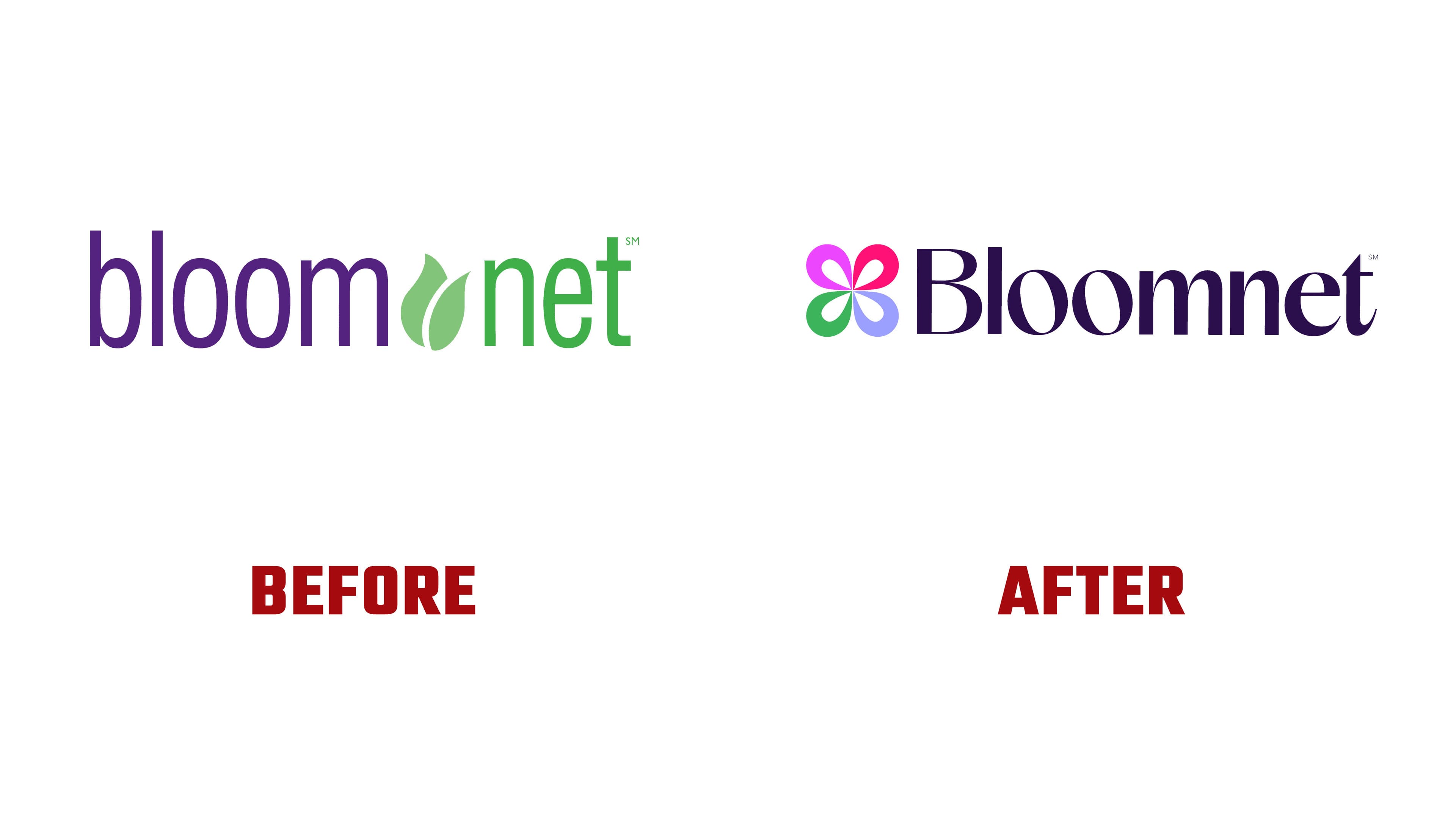
The new logo is built around a blooming letter “B.” The letter has been turned into an abstract flower made of overlapping petals. One symbol serves as both the first letter of the name and an image of a floral arrangement. The petals recall the layers of a bouquet, while the “B” shape connects the emblem with the brand name.
For Bloomnet, the new emblem shows a shift from a regular order network to a modern growth tool. The brand looks at florists as entrepreneurs. They arrange bouquets, manage sales, use apps, organize delivery, and respond to new customer needs. The logo conveys the idea of a floral business where craft and technology work together.

The icon received bright colors and a flexible system. The petals can change in scale, rotation, and color combinations while keeping the overall form. A Bloom generator was created based on the blooming “B.” With it, the brand team can produce different versions of the symbol for network materials.
The wordmark is set in a sans-serif. It looks more cohesive than the old version and supports Bloomnet’s role as a business platform. The identity uses Ivy Journal. The typeface adds a soft professional tone and balances the bright emblem.
Goodside preserved the brand’s connection to the floral field. Bloomnet no longer looks like just another service in the bouquet industry. The new logo presents the network as an infrastructure for florists.